Architectural and Interior Design Fails So Bad, They’re Actually Good
From garage doors on the 5th floor to toilets in the dining room, we’ve put together a list of the funniest (perhaps cringe-worthy) architectural and interior design failures over the past couple of decades.
Not Aligned
This construction is a perfectionist’s nightmare. When we hire a contractor and his team, we rely on them to build our house properly and safely. After all, they are the so-called experts in their field. From measurements to space, we are confident that they can do the job perfectly. But how did this happen?
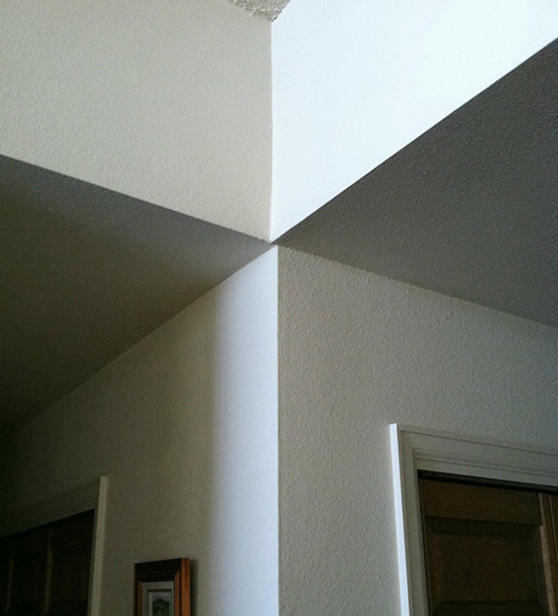
The walls are not aligned and it’s obvious that their measuring tools were not properly used, otherwise, the walls would, you know, line up.
Dysfunctional Balcony
The upper balcony looks pretty sweet, right? A perfect spot to relax and enjoy the fresh air. But the lower balcony? If you’ve ever played Sims, this kind of setup will look familiar.
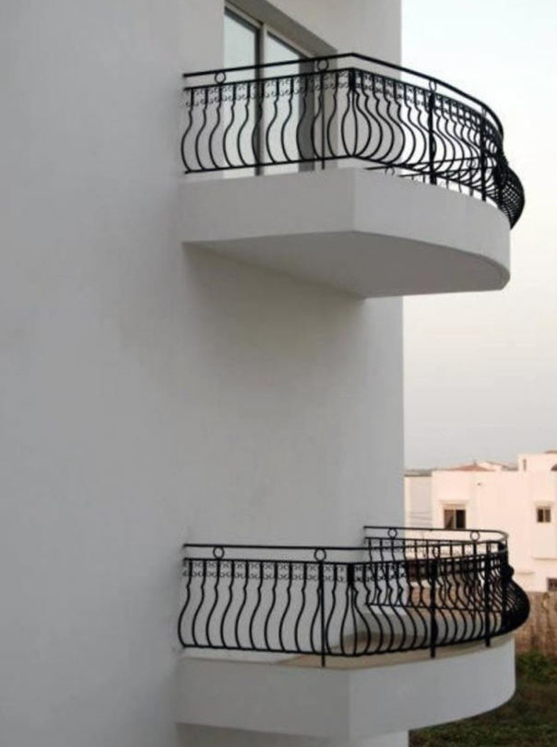
We were unapologetic indulgers of that evil pastime of putting sims in a room or on a balcony and then taking away the door to see how they deal with the situation. But it’s not the kind of thing we ever expected to see in real life.
Sole Window
This building stands strong with all its might, but if you take a closer look, you’ll spot the one and only window on the side. There’s a definite Being John Malkovich vibe to this construction.
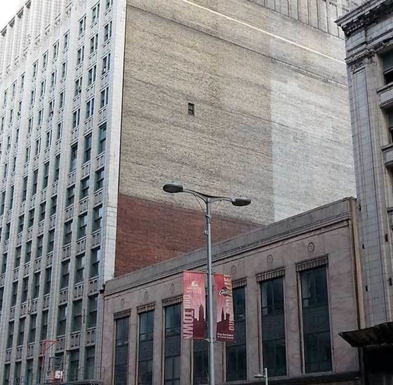
Who installed that lonely little window? And why? Another architectural fail with a fascinating backstory we’re dying to know.
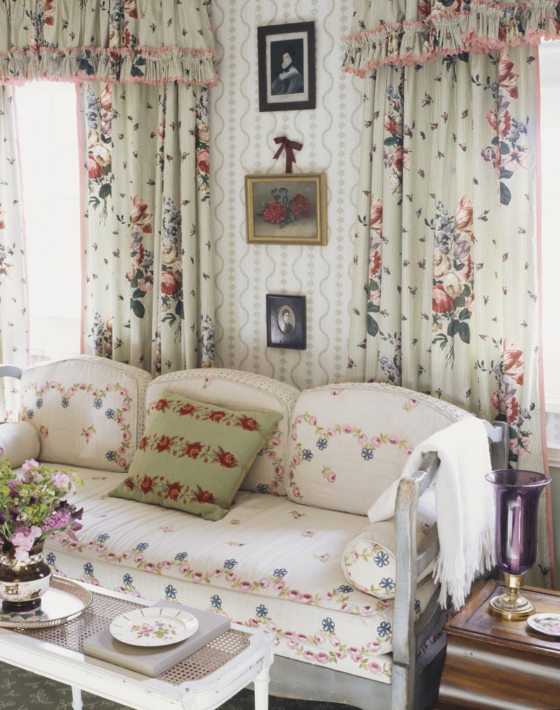
Large and Bold Prints
The 1960s were all about being free and enjoying the world around you. Unfortunately, some of that indifferent attitude also entered home design. The ‘60s really saw the rise of bright, bold patterns scattered across a room. After all, it was a time to live, so why not make their houses as crazy as possible?
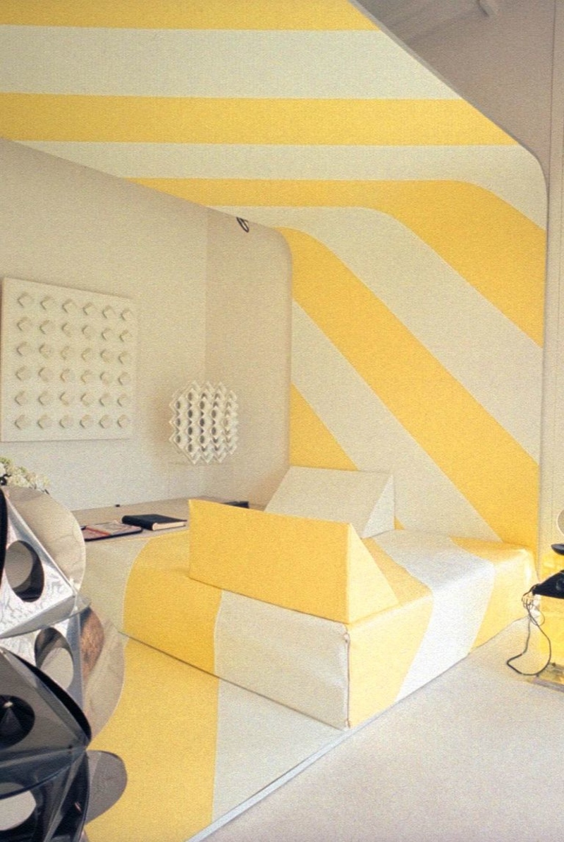
Unfortunately, those bright, floor-to-ceiling patterns aren’t a long-lasting decision. Not only are you bound to get dizzy after a few months of looking at that every day, but it also makes it difficult to create a comfortable, cohesive space.
The Futuristic Look
If you’re stuck in the present, you really shouldn’t try to live in the future. Unfortunately, these interior designers didn’t get the memo. Some designers opt for chrome finishes and sculpted side tables to really bring out that futuristic look.
The pieces never combine well with each other and the overall aesthetic is sterile and cold, rather than futuristic. If you’re aiming for a futuristic look, why not try something industrial instead?
Tetris Door
What to do when you and your house don’t agree on where there’s room for a door? Just force the issue. What’s the house going to do about it?
Here’s a beautiful example of this Tetris mentality: a zig zag-style door that subtly fits around an obstruction that would make most people think “hey, maybe a door doesn’t belong here.” Tetris doors. Coming soon to a Home Depot near you.
Minimalist Architecture Taken Too Far
Good thing that door is there, hey? I mean, you need privacy when you go to the bathroom. But walls? Walls are so last season. It’s all about openness now.
The trick is to just imagine the walls are there when you’re using the bathroom. All the cool kids are doing it.
No To Tiled Bathrooms
While tile countertops could be found in nearly every home during – they’re just not that cute. We’re not sure who came up with this genius idea, but they should be fired along with the interior designer that thought that this was chic.
Beyond being exceptionally difficult to clean, tile countertops also aren’t very durable. They chip and stain easily, and are prone to stains and hidden bacteria. Those are all qualities that make tile countertops a terrible choice for any space that will get remotely dirty.
The Infamy of Heart-Shaped Hot Tubs
This genius design idea was actually invented back in 1968, by a resort owner in Pennsylvania. Interior designers went crazy over it, and it quickly became a fixture in homes and hotels around the country.
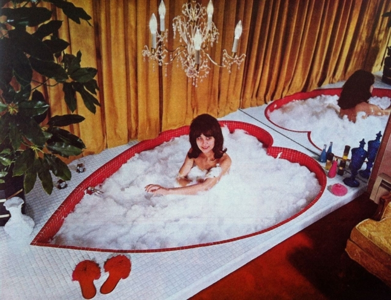
Nowadays, unless you’re on a romantic getaway or in a honeymoon suite, you’ll have a hard time finding one of these. And we couldn’t be happier.
Minimalist Balcony Design Gone Wrong
This architect took minimalism to whole new heights! Here’s hoping the tenants are happy to use their “balconies” for hanging plants and clothes, and nothing more!
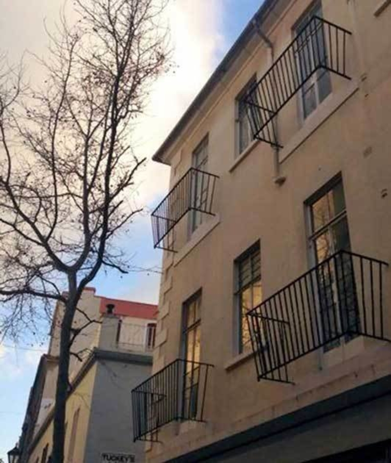
If you’re looking for some downtime with your cup of coffee, a good book and, a nice breeze, this is not the apartment building for you.
Pointless Valances
Matching window valances are an especially horrid decor choice, but window valances in general really aren’t that great. They add a little trim at the top of your window, but for what? There’s no real purpose of this really.
However, something about these hanging bits of fabric ages your space immensely. Even with the most modern design, window valances will automatically make you look like you’re living in a different decade. Since they don’t have a real purpose anyway, it should be easy to throw them out of anyone’s design plan.
Stairs, Stairs, and More Stairs!
Seems like the person responsible for this confusing staircase may have been a Harry Potter fan. But their construction, unfortunately, didn’t turn out to be nearly as magical as the ever-shifting Hogwarts stairs!
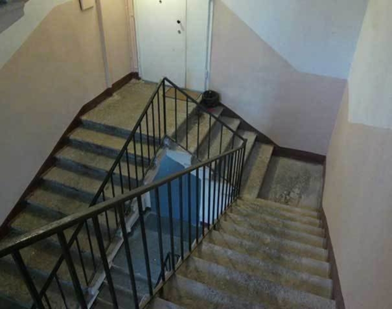
We can imagine the “delight” of the residents as they go through the daily ritual of heading down, then up, and then down again. We’re getting exhausted just thinking about it.
Why Does This Exist?
Conversation pits sound like a bad social situation, but it was once considered a design feature that changed the architecture of your home. In the middle of a normal room, the floor would drop into a pit with built-in seating. When dinner parties would end, all the participants would head to the conversation pit to end the night.
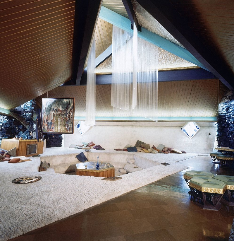
Thankfully, normal living rooms serve the same purpose as the conversation pit. Plus, they don’t require cutting a hole into your perfectly fine floor.
What’s With All the Missing Doors?
This house deserves a shout out for its hilariously poor design. If we consider the overhang and the stairs, it’s safe to assume that they’d lead us to, oh I don’t know, a doorway! Maybe there was one sometime in the past… which leaves us wondering where it went, and why the occupants don’t need doors anymore.
Whatever the reason, this house looks as absurd as it does mysterious. We hope there’s a functional door somewhere.
Mauve is Murder
The pale purple color invaded homes across the country, covering walls, ceilings, rugs, couches, lamps, all of it! And frankly, we feel that there is really is no need to tell you why you should avoid covering your home in pale purple.
The reason this became a trend in the first place can probably be linked to Georgia O’Keeffe’s death in 1986. After she passed away, a lot of her work became very popular, and as you probably know, mauve is a predominant color in her sunset and desert earth-themed paintings. And that’s where mauve should’ve stayed – in a painting.
Withdrawal Issues
We’re wondering what exactly the architect of this bank was thinking? Is it a new way of making sure no one reads your pin-code? Is this one of those new designs that force you to get a workout to get what you want out of it? That’s a pretty decent climb and solid squat you have to engage in to get your cash.
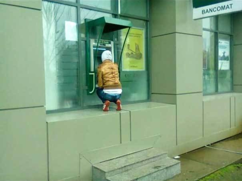
It may not be the most comfortable or convenient ATM in the world, but your glutes will thank you later!
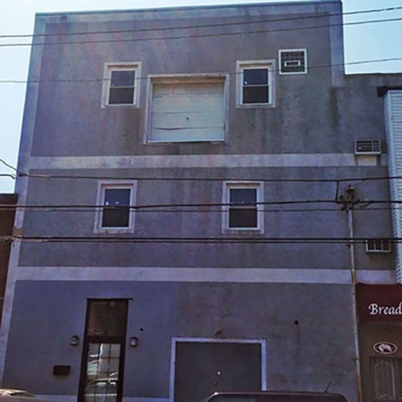
For Flying Cars Only
Okay, we understand the excitement. Flying cars are going to be pretty boss. But it’s still just a tad bit early to go installing a garage on the second floor of your house… and a massive, double garage at that!
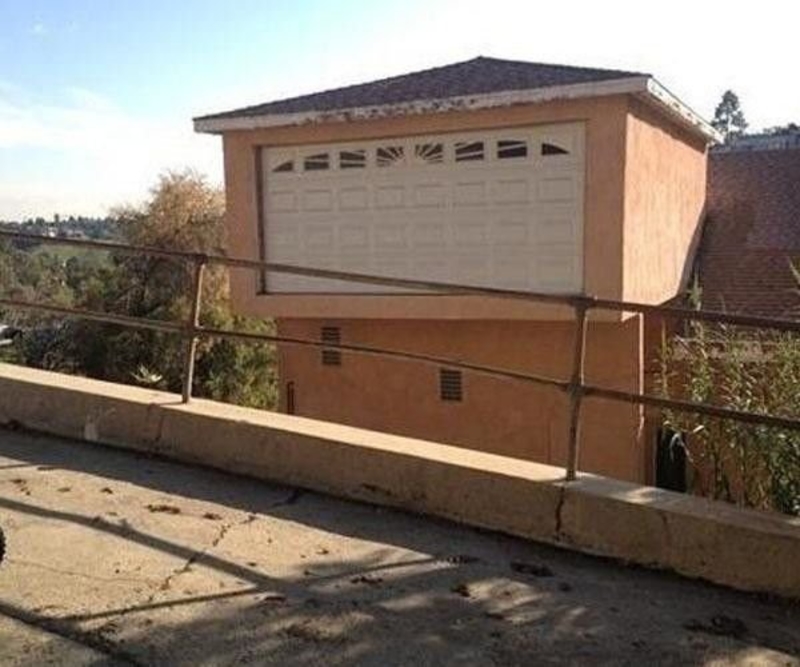
Tip: You need to save a lot of moola before you can purchase a flying car, and you have to wait a couple more years before its launch (if it’s even approved for public use).
Inaccessible Seating Area
Now here’s an innovative solution to the problem of finding yourself in charge of a haunted hotel. Bring some contractors in, and design yourself some seating areas that keep the ghosts happily occupied and out of the way of guests. Brilliant.
We’d love to see what other ghost-ready installments are to be found throughout the rest of the establishment.
Massive Leather Sofas Are An Eyesore
With space this big, the interior designer could have designed the most beautiful living space, but instead went for a cliche. Leather sofas, when done correctly, can look beautiful and homey. Unfortunately, the ‘70s brought us a trend of oversized leather furniture that dominates an entire space and can easily turn any family home into a man-cave.
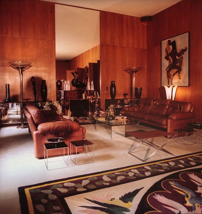
The trend reappeared in the early 2000s, but it looks like it’s officially died out once again. We’re hoping it doesn’t come back. The leather itself will never go out of style, but the imposing nature of a huge leather couch really ruins a room. Leave room for other things to exist in your room beyond your sofa!
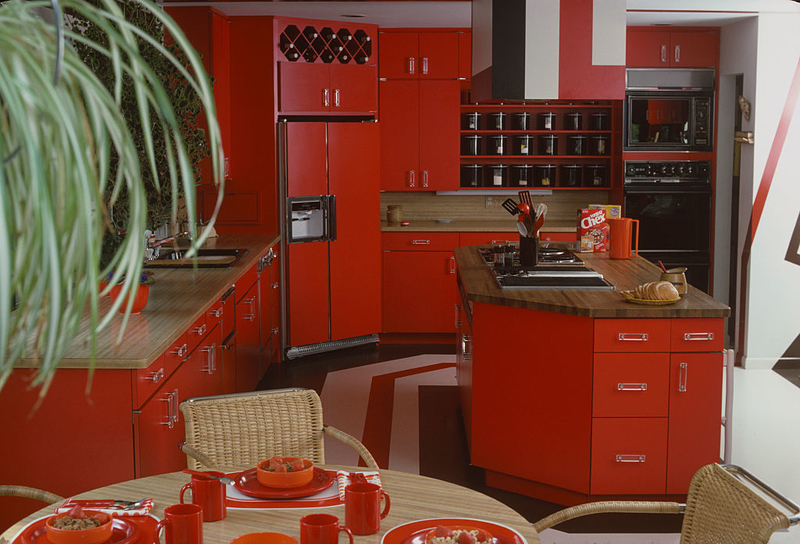
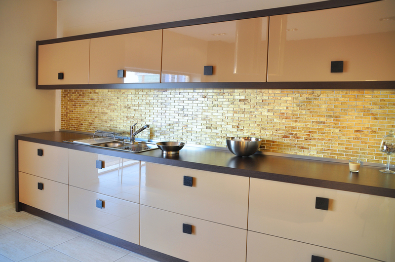
Tan Kitchen Cabinets, Don’t
Are you sensing a theme here? Bright colors are perfect accents, but they shouldn’t dominate your entire space. That’s why colored cabinets are such an egregious design mistake.
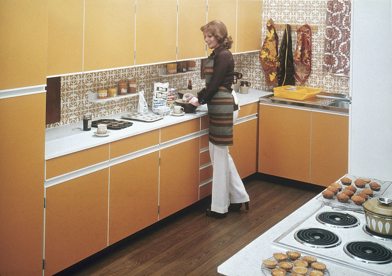
Burnt orange or puke green dominating your kitchen isn’t a trend we want to see again. Beyond being outdated, the bright colors simply don’t look good!
Terrible Beams
For those of you problem-solvers out there who are into modern architecture, here’s a challenge for you: come up with a way to have your giant beams and workable walkway too.
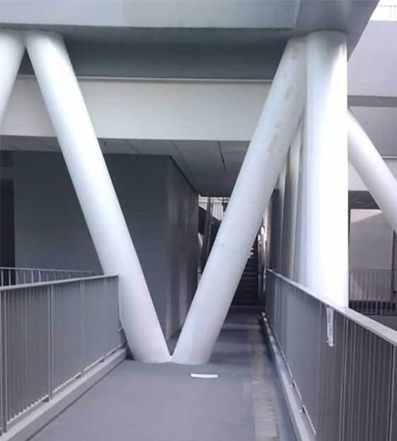
While it would’ve been ideal to simply avoid this fail at the planning stage, we’d love to know what could possibly be done to rectify the issue now.
10 Points for Ingenuity
Toilets tend to be the smallest room in the house. We all know this, and it’s something we all have to workaround. Yet, instead of, oh say, installing a door that swings out instead of in, this clever interior designer made a cutout in the door to fit around the throne.
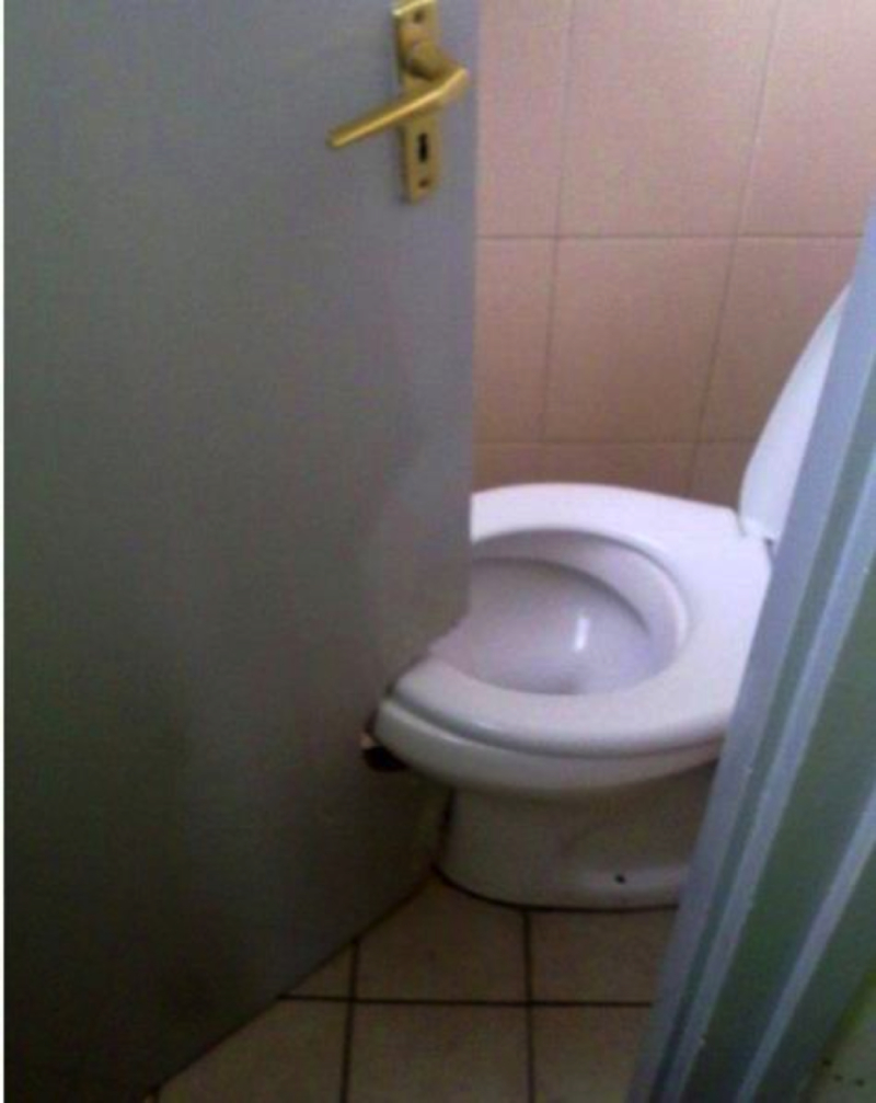
Kind of defeats the whole privacy aspect of having a door, especially if there are kids in the house.
Too Close for Comfort
The things people will do for a profit. We can imagine the owner of this property demanding that every inch of space be taken up with apartments, to ensure the maximum profits possible. With limited space and pressure from above, the contractor decided to create this hideous setup. But let’s look on the bright side: perhaps the intimate arrangement sparked chit-chats and friendships among neighbors.
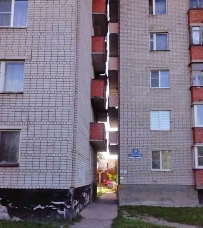
Privacy certainly isn’t something these residents get to enjoy. But let’s hope at least one Romeo and Juliet style romance flourished out of it.
Why Plaid?
How did this room go so terribly wrong with its design decisions? We’re starting to get the feeling that interior designers were just trying to ruin people’s lives.
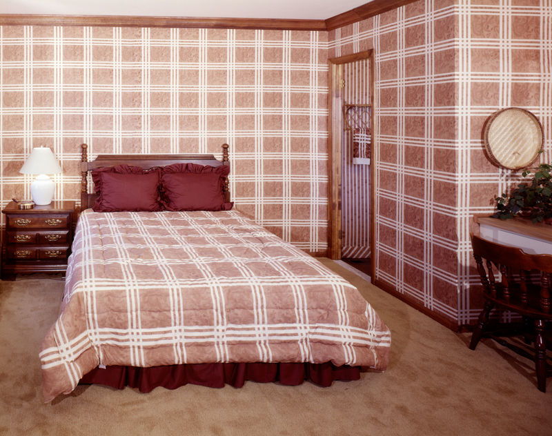
Plaid is a tough look to pull off in any situation, let alone plastered over your walls and bedspreads. If we never had to see this trend again, it would be too soon.
Animal Rugs Are Out
Zebra rugs were supposed to infuse a space with a kind of exotic flair during the ‘70s – but the design feels outdated and unnecessary. Plastering a zebra rug across your floor feels a little silly in the current climate. Plus, it leads to a rather cheesy-looking home design.
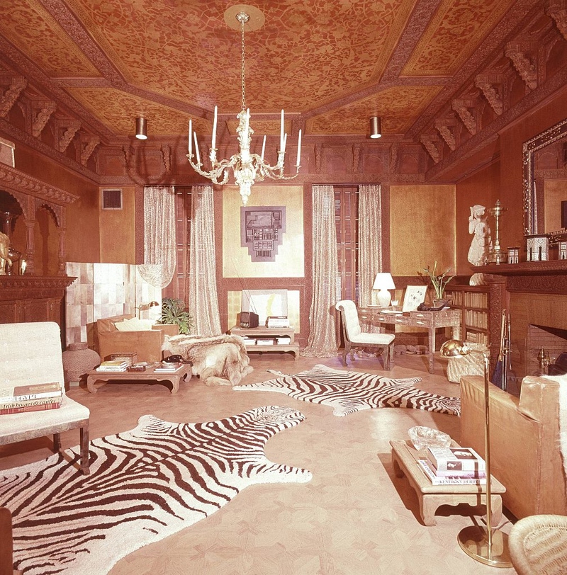
You really should keep the zebra rugs, or any animal rug, for that matter, far away from your home. Beyond the fact that animal lovers will have your head, the striped rugs don’t fit comfortably in any space.
Low Headroom
Someone clearly didn’t think through the logistics of this staircase. Unless it was designed by kids to keep adults out of their attic clubhouse, in which case, touché! Look at this guy, he’s not halfway up yet but his head is already hitting the ceiling.
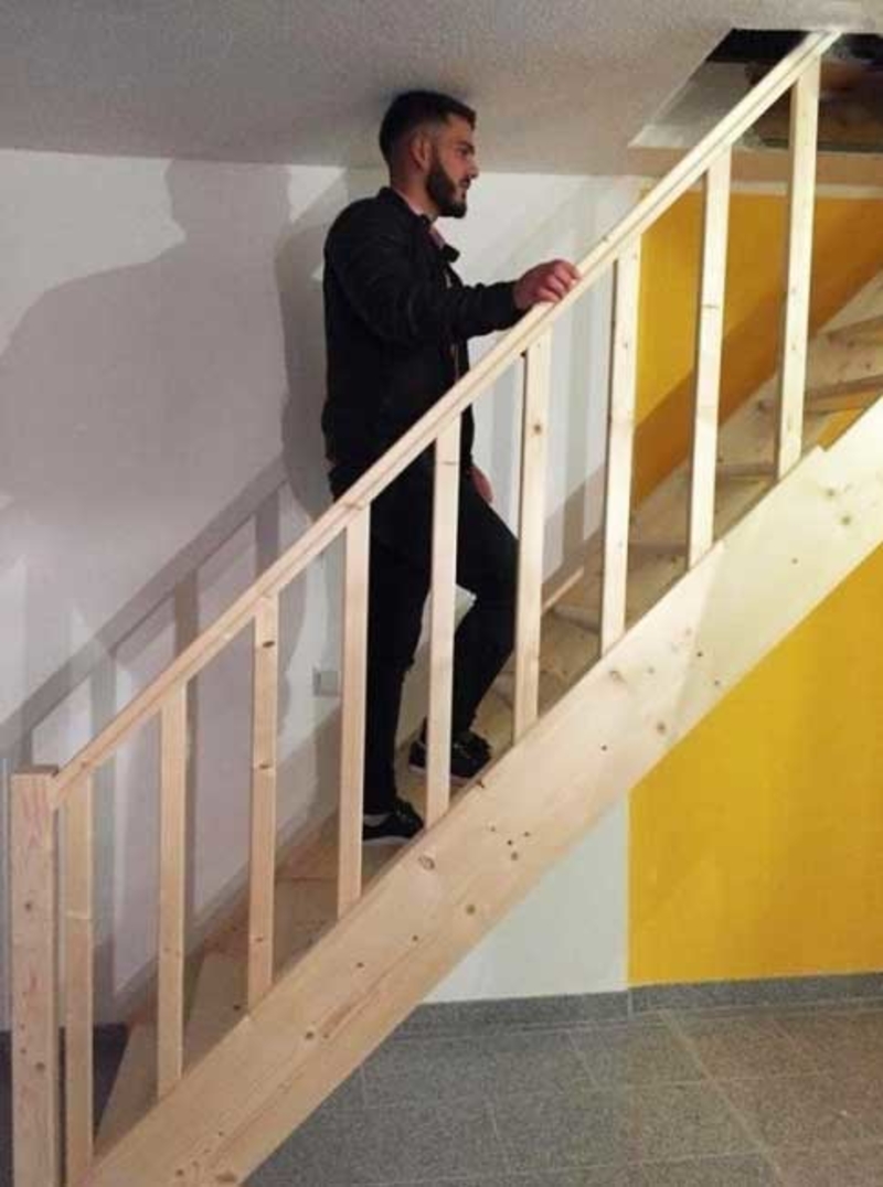
Seems like the homeowners either need to prepare themselves for regularly recurring concussions, or call in some experts to fix this disaster.
Stairs, Please
Okay, so there is nothing wrong with installing a door several feet above the ground. People do it all the time. They just usually remember to include a staircase, you know, so you can actually use the door. Is this an epic prank pulled on the unsuspecting tenants of room 70?
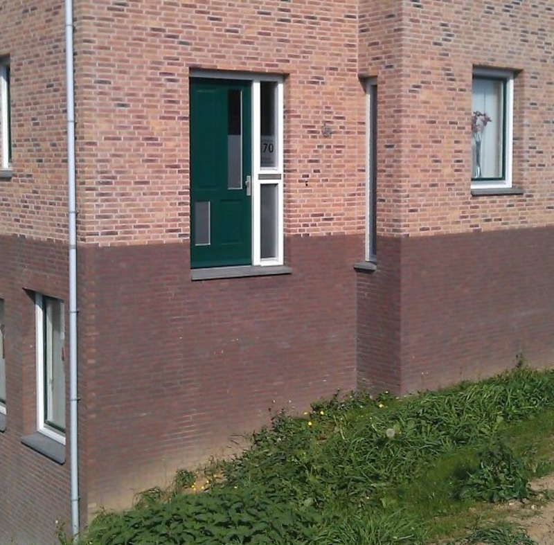
If so, we hope they were out when the prank was enacted, because if they’re inside and decide to head out before having their first cup of coffee for the day, they might not notice the missing staircase in time!
Flexibility Matters
Here’s another toilet you’d need some high-level yoga training (or contortionist skills) to be able to use. The only people we can imagine having a relaxing time on this toilet rig are the cast of Cirque du Soleil.
The rest of us would be straining muscles we didn’t know we had, trying to contort ourselves into a workable position without slipping in.
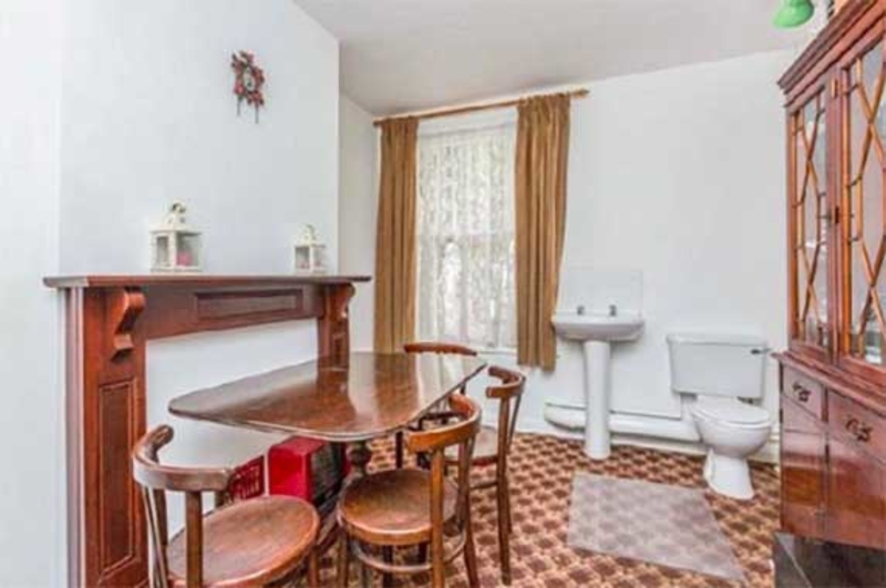
Unusual Dining
Composite rooms can be a clever, space-saving idea. But a combo dining and bathroom? What on Earth would have to be going on in your mind to make you come up with such an idea?
It is convenient, we’ll give them that. And guests will never have to awkwardly ask where the bathroom is. Though the situation they find themselves in will be decidedly more awkward to deal with.
Stop With the Ivy Wall Designs
While we appreciate the effort of someone not wanting to have a plain, white wall in their kitchen (or anywhere in their house), that doesn’t justify making your house look like a tacky fairytale forest. To all the interior designers out there – you have been warned!
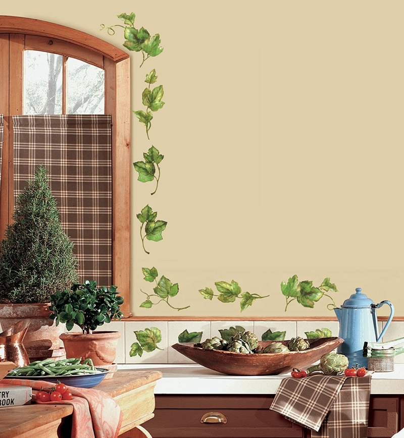
A few ivy vines on one of the wall’s borders? Yes. Covering your entire house in decorating flourish? Absolutely not.
Extraordinary Garage
Is this a garage or a storage area? With the size and placement of the door, we cannot imagine how a vehicle could squeeze itself inside. This “garage” would have a mini cooper feeling like a hummer. Our only explanation is that there is some kind of wizardry involved here that our puny muggle minds can’t comprehend.
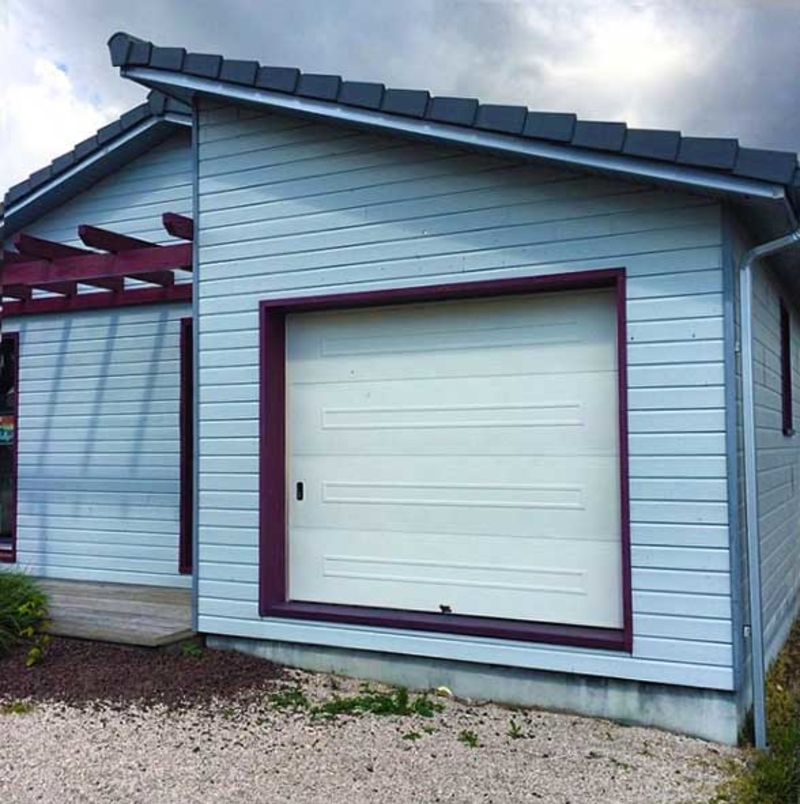
If there’s no magic afoot, then we humbly suggest this failed garage should be converted into an over-sized bin for rejected household items.
Room With a…View?
Windows: they’re pretty pointless if you can’t see out of them. Try telling that to the owners of this house, who figured building a window behind the chimney flue wasn’t at all counter-intuitive. We suppose the dream of an attic with a picturesque view got put on the back-burner, as the chimney was prioritized. Sigh.
What we’re wondering now is, how many other architectural disasters are lurking, in the depths of the house, behind this view-less window?
The Carpet and Wallpaper Duo Disaster
The colors in your home should combine nicely with one another. However, that doesn’t mean that every color should be perfectly matched. The ‘70s didn’t quite understand that. This era, unfortunately, introduced us to a design trend of matching wallpaper and carpeting.
Somehow, this trend always occurred in the weirdest colors, like bright orange or dark green. The result was a monochromatic look that didn’t leave much space for other colors to intervene. Please leave this trend in the ‘70s where it belongs.
These Wooden Counters Must Go
Alongside the bright, bold, far-too-colorful cabinets, the ‘70s touted the benefits of wooden countertops. While this trend can actually look impressive if paired with more neutral tones, wooden countertops aren’t an easy design trend to pull off.
When done incorrectly, wooden countertops result in a dark space that feels more like a dungeon than a kitchen. Modern materials are better suited to creating that light and bright look that’s so popular nowadays.
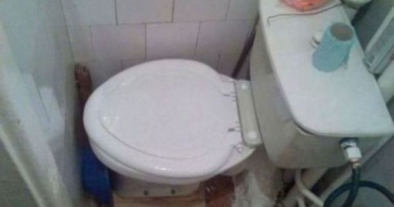
The Contortionist’s Toilet
Here’s another home decor fail for you: no matter how elegant your bathroom design is, if you can’t actually sit on the toilet, the aesthetic is going to rapidly wear thin.
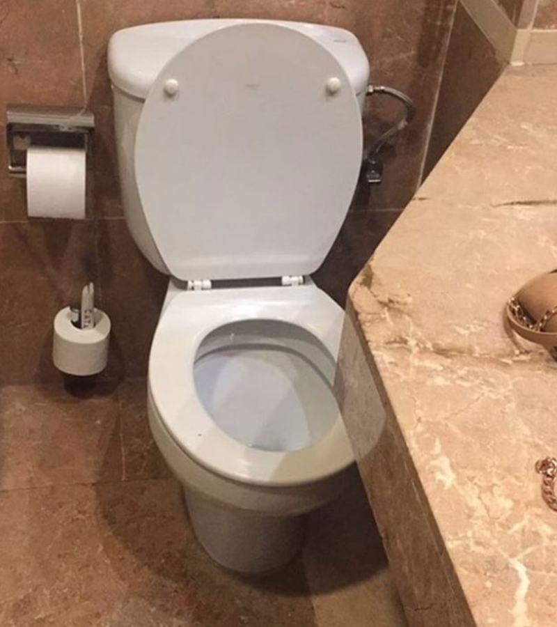
Marble counters are all well and good, but you kinda need to be able to actually use the bathroom. This is one fail we really can’t see any way of fixing without pulling everything out and starting over.
Compressed Window
This renovation fail is as creepy as it is illogical. What kind of person hates sunlight so much they need to cover 90% of their perfectly lovely window with bricks? The tiny new aperture, with its ability to let just a peek-a-boo of sunlight in, has us feeling decidedly uneasy.
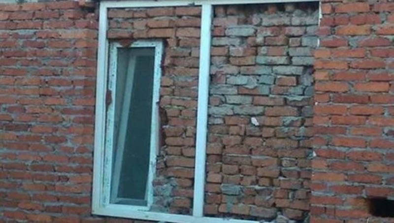
The room beyond can’t be anything other than a dungeon. And we shudder to think what might be lurking in there.
The Plastic Couch Cover
Originally, the ‘clear plastic cover over the couch’ trend had a very simple and functional reason: you could protect your furniture while still being able to look at it. However, many designers just adopted this as a home decor trend, and it’s definitely overstayed its welcome.
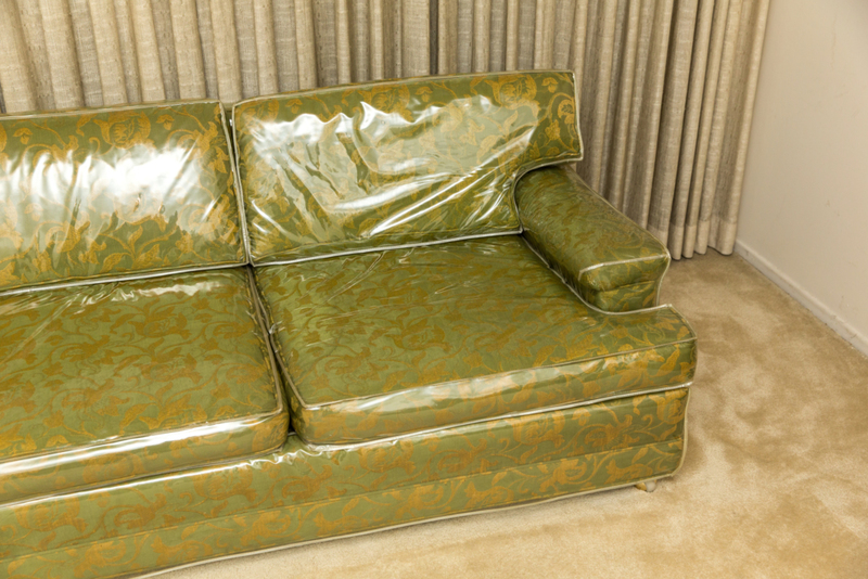
The cover does lengthen and maximize the life of your furniture, but it also looks like you’re living in a furniture store where everything is on display and in its original wrapping.
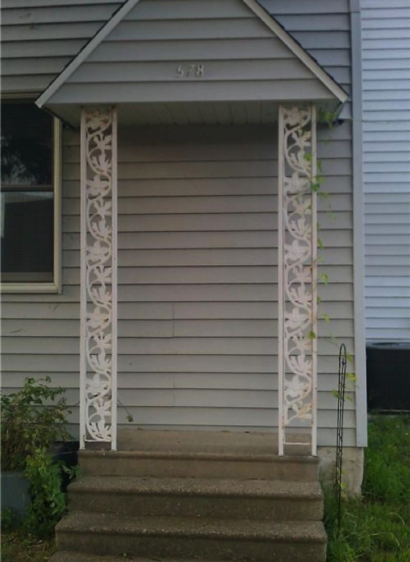
That’s One Way to Solve A Problem
What to do when you have a fire hydrant installed where you need your stair rail to go? Definitely not this! Sure, the curved railings fit perfectly around the hydrant. Can’t fault them there.
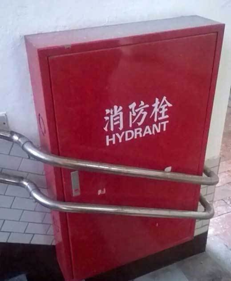
But we’re dying to know what they’re plan of action is if they ever need to actually use the hydrant. Here’s hoping that building has an eternally fire-free future!
Enough With the Wicker
Wicker furniture should always stay on the outside of your home. Unfortunately, during the ‘80s and ‘90s, interior design trends encouraged people to bring their rickety furniture inside the house.
Beyond being entirely uncomfortable for actual lounging, wicker furniture always looks a little out-of-place in an indoor space. Since that’s what your wicker furniture is made of, why ruin your indoor aesthetic with these pieces?
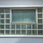
Window Blocks
Glass blocks used to be the ultimate way to create a light and bright bathroom space, without sacrificing any privacy. Unfortunately, they haven’t withstood the test of time. With so many new materials at our fingertips, glass blocks now tend to look cheap and dated.
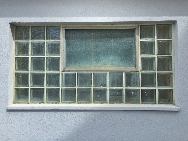
In addition, they’re not the easiest to maintain. The seal between the glass blocks tends to get dirty over time. The more yellow that seal gets, the older your house tends to look. We’re glad this is a trend that’s out of date and we hope that eventually, all interior designers give it up!
If Photoshop Fails Came to Life
There’s nothing quite like the quaint charm and beauty of a rustic, old building. And there’s really nothing like a construction fail plastered all over the face of such a formerly charming building
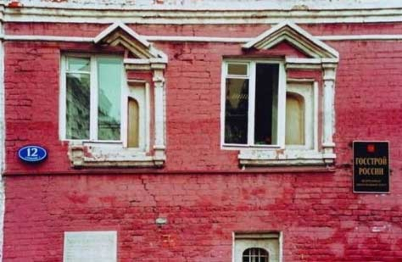
Installing new windows? Top idea. Making it feel like you’re having a brain aneurysm when you look at them? Not so much.
The Cheap-looking Lacquer Cabinets
If you remember ’80s movies, you surely remember there was never a house without glossy lacquer cabinets. In fact, the shinier the cabinets looked, the better. But as we’ve learned with other ’80s home decor trends, it’s probably best to just stay away. Far, far away.
Adopt a more modern look for your house and stick to marble or granite countertops and stainless steel appliances. Interior designers, please, leave the lacquer in the eighties, where it belongs.
Decades Past Its Prime
Terrazzo is a lot like linoleum. It’s durable and fairly versatile, which is why many designers used it from 1930 all the way through 1970 as their flooring of choice.
Today, however, terrazzo doesn’t really belong in the home. It looks a little cold and clean, making it much more suitable for your office building. Warmer materials are better for a house, which is why terrazzo should stay far away from your home decor plan.
Floral For No One
Floral used to be the thing to have in your home, particularly in the ‘80s. Want to buy a couch? Make it floral. Looking for curtains? Floral. Even pillows, pictures, and vases all had to be floral.
Unfortunately, floral now makes for a very outdated design. It’s a signature of a different decade that just doesn’t fit into the modern aesthetic. Using floral elements as accent pieces is perfectly okay, but implementing a floral theme throughout your entire home will turn your pad into a bad ‘80s movie. So why hire an interior designer that loves this pattern?
The Other Side
It’s common for householders to make extensions to their homes, especially those supporting a growing family. However, this particular homeowner had a burning desire to be different, demanding a contrasting design to offset her classic home.
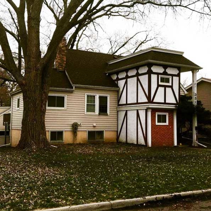
Everyone’s entitled to express their own unique style, right? We have no judgment for her at all. Okay, maybe one little bit of judgment: Ew! Surely she could’ve at least made the colors match?
Futuristic Garage
Since driver-less cars are in, it seems the world is already preparing for futuristic garages, in case flying cars will be the next big hit. Like this architect, who was clearly way too excited about flying cars.
We admire his advance decisions and hope the car will fit in this garage. But maybe someone should tell him, a futuristic car deserves a nicer looking garage.
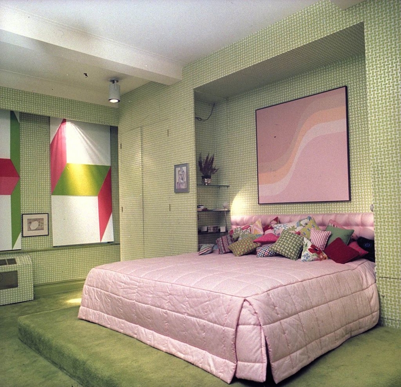
A Frilly Skirt For Your Bed? No
The ruffled bed skirt trend finds its origin in the ‘80s, where nearly everything was ruffled. The skirt should add a little feminine appeal to a room, making it a perfect choice for young girls.

However, we believe that the ruffled bed skirt trend should never make its way back into the mainstream. Modern design is minimalist and chic, so we’re not sure why interior designers are still using it.
Trick of Light
This may have not been done on purpose (although you never know), but the resulting reflection couldn’t be more perfect. We’re pretty sure we don’t need to explain why. However, we do want to commend the interior designer who combined his best styling skills with a great sense of humor, to create this masterpiece of refracted light.
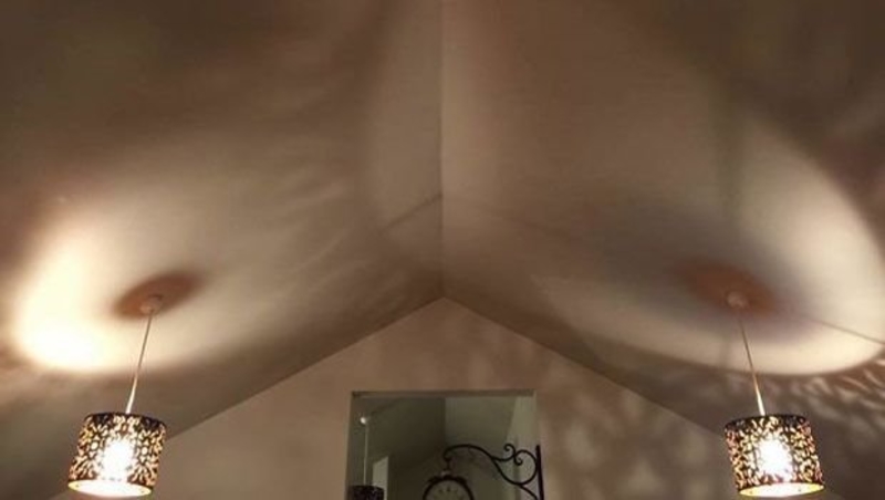
We just hope the homeowners aren’t intimidated while looking at the ceiling. It is a mighty distracting view!
Failing to Support Logic
This load-bearing column at a McDonald’s store is doing a great job of taking up a whole lot of room without actually bearing any load. Whose idea was it to install a giant, dysfunctional object that causes hassle and obstruction, without actually serving a purpose?
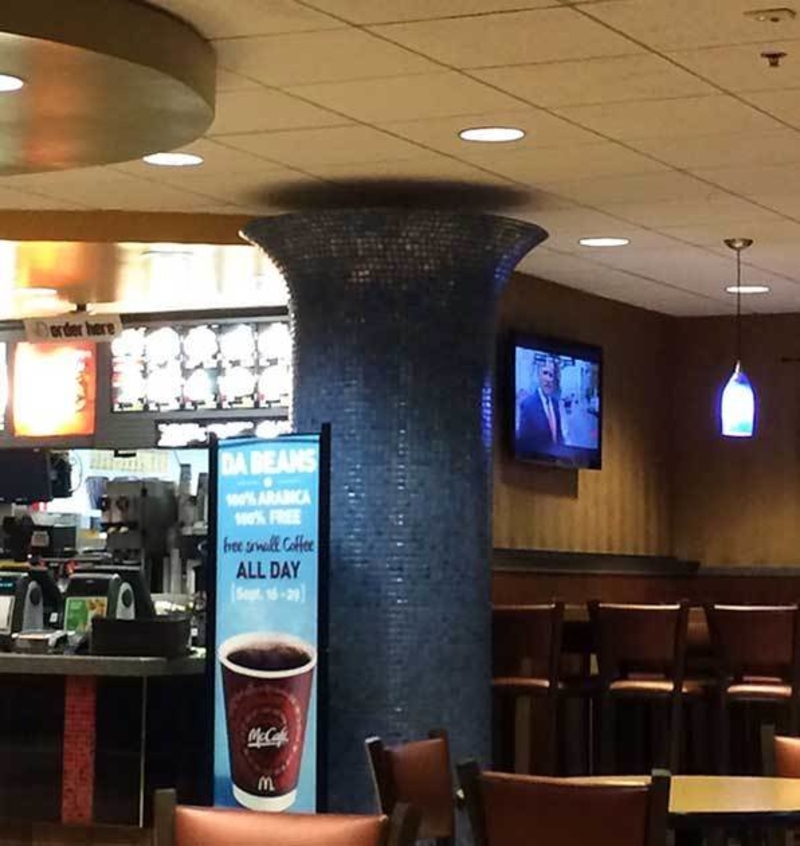
Unless McDonald’s is so ahead of its time it’s actually got some kind of magnetic technology going on here, we’d say this is a fail of epic proportions.
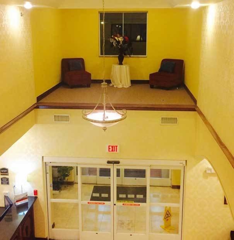
Jump for Your Life
Before signing a contract for a prospective apartment, there are many factors to consider… not the least of which being the emergency exit. In case of a fire, you need to have a safe and viable escape route. This particular apartment building decided to offer the occupants on the upper levels a different kind of exit: one that, in case of emergency, simply offers a different way to die.
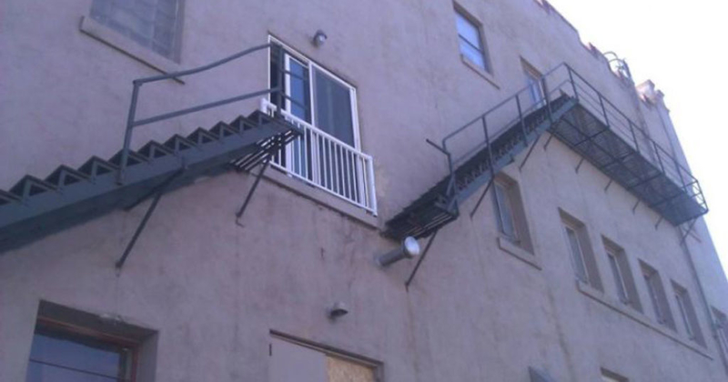
Unless you have the presence of mind and ninja skills necessary to notice the missing stairs while you’re running for your life, and avoid plummeting into the gap.
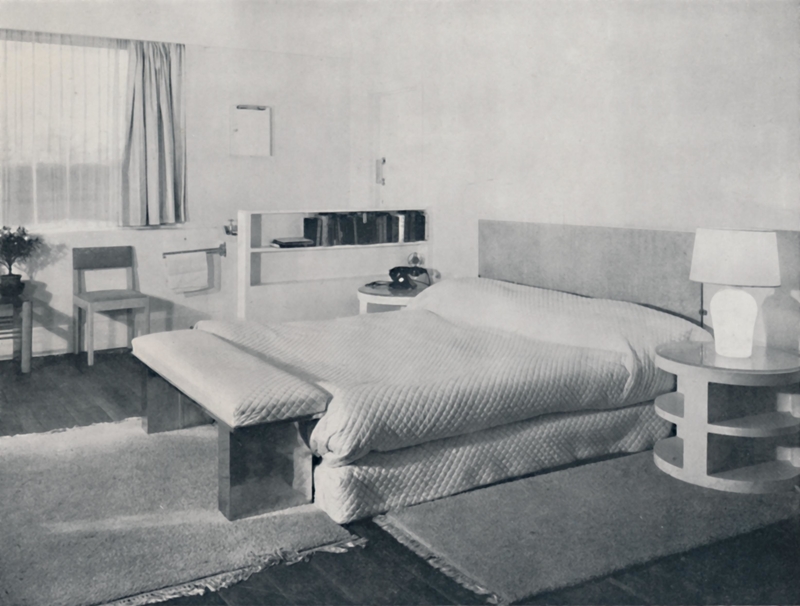
Round Beds Just Don’t Make Sense
Think about it. If human beings are vertically aligned, why in the world would they want to sleep in a round bed?! It seems nobody thought of this back in 1968 when round beds made their debut in the home design scene. Thankfully, they only lasted a few decades.
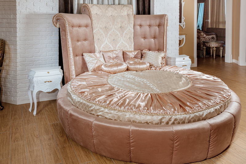
If you want to use a round bed as a groovy-looking furniture piece in the living room – go for it. But when it comes to your bedroom and sleeping comfortably, tell your interior designer to please stick to your run-of-the-mill, king-sized, rectangular bed.
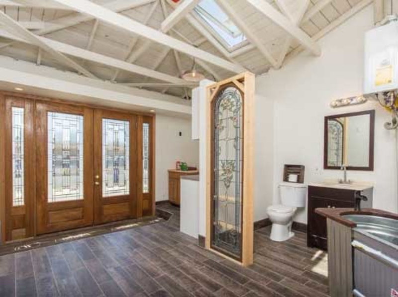
Public Bathroom!
This homeowner clearly has a unique—and very open—personality. We cannot help but conclude that, during the construction of his house, he specifically requested a grand entrance to his home, where guests are greeted by a toilet.
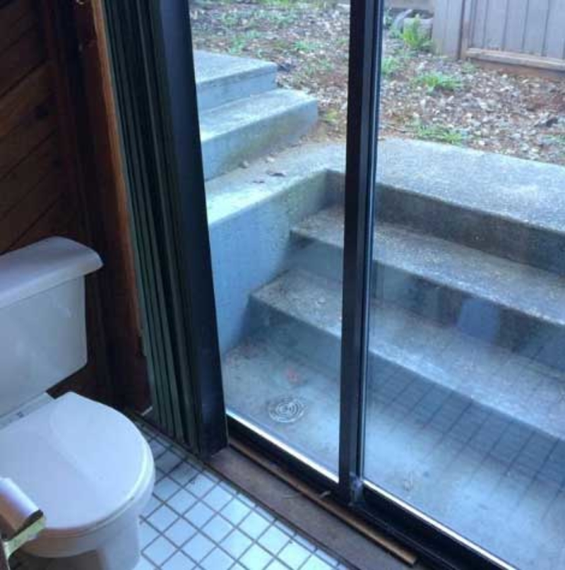
What a place to sit when you need to relieve yourself, gazing out the glass doors of the entrance to your house! People do pay more for rooms with a view, right?
Who Actually Thought of Carpeted Bathrooms?
Carpeted bathrooms were all the craze and the ultimate sign of luxury. But as we rethink it, we realize there are fewer things more disgusting and impractical than covering your bathroom with carpeting.
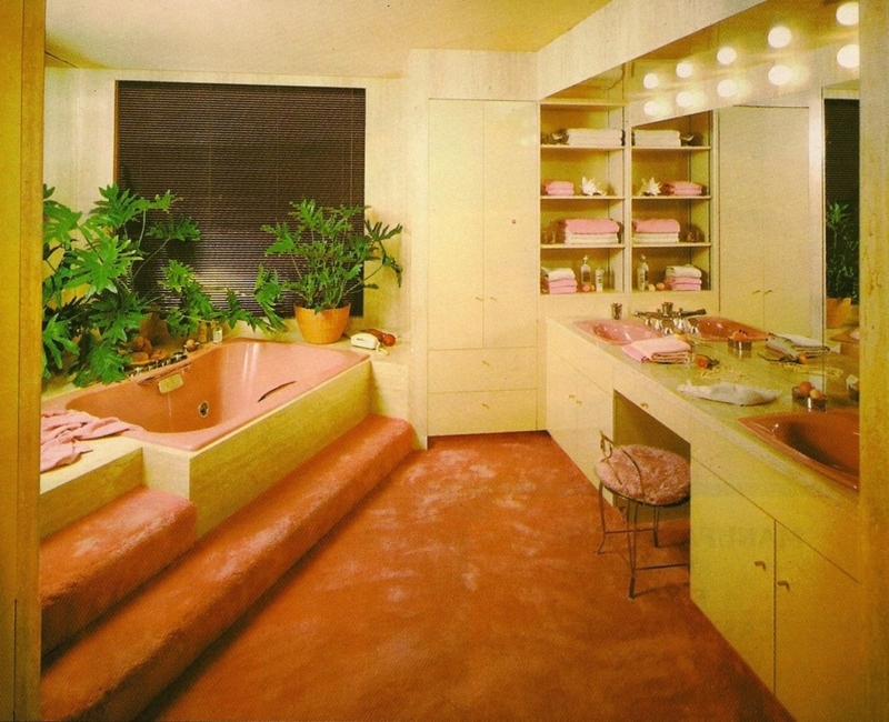
Yes, they looked fantastic when you saw them in a movie, and maybe it seemed comfy to get out of the bathtub and step onto a fluffy carpet. But folks, mildew, and bacteria are no joke…and they will come for you if you have a carpeted bathroom.
Deck Fail of Epic Proportions
This is what happens when you put your extremely heavy hot tub on a wonky deck. Instead of indulging in a refreshing and relaxing spa session with “stunning” backyard-in-suburbia views, this architect ended up creating a spectacle for the neighbors to gawk at.
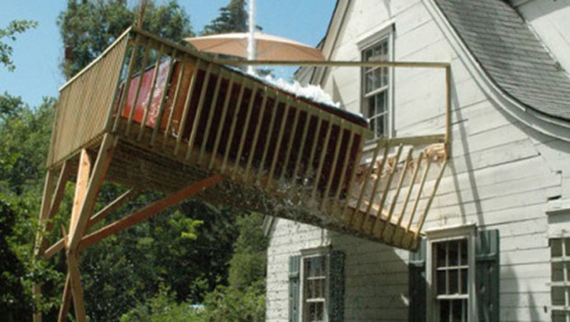
We hope no one got injured, but from the look of that overflowing bubble bath, someone probably had to leap for their life when the deck came tumbling down.
No Way Out
An emergency escape is designed for safety and security when emergent situations happen, like fire. However, this emergency escape (a.k.a the emergency spiral stairs of the building) is designed to put the residents’ lives in further danger. The staircase appears to have been installed a few feet to the side of the doors, which makes it impossible for anyone to use it.
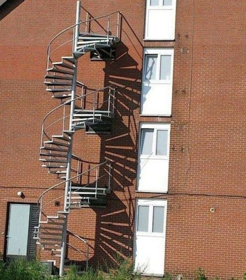
Here’s hoping it’s just leaning there, waiting to be installed properly… and we’ll throw in a bit of extra hope that said installation happens before the next fire drill!

Who Is Giraffe Woman? The Story of Her Groundbreaking Journey
World’s Largest 3D Printer Will Build A Home In Less than $100

How to Live More Sustainably With Your Four-Legged Friends

Health Rules That You Don’t Have to Obey

The Overlooked and Undermarketed: These Great Cars Never Stood a Chance

Fascinating Facts About Tom Cruise

What Is Actually Still Made in America?
Trap or Trip: Tourist Attractions You Might Want to Skip

‘The Sopranos’ Showrunner Finally Explains His Cryptic Ending

Toddler Yells Out One Word During His Adoption Hearing