
Every Pride Flag Explained
In June of 2020, the Supreme Court issued a massive victory for the LGBTQ+ community, and extended the protections of the 1964 Civil Rights Act to protect employees against discrimination based on their sexual orientation (via NPR). It was another huge step toward making the world more inclusive, and although there’s still a long way to go, the world has come a long way, too.
According to Our Family Coalition, America’s position on “gender norms” goes back to 1620, when the Puritans wrote the rulebook for their new society. Family was made of a man and a woman, and that man was the boss, and that woman was to “please your husband and make him happy.” It was just four years later that the first man was hanged for violating that, and the first two women were convicted for “lewd behavior” in 1649.
Fortunately, we’re past that now, thanks to the tireless campaigning of some incredible people. Today, few celebrations are as colorful as Pride, and the rainbow is just the beginning. We now know that the human experience is even more varied than the colors of the rainbow, and we’ve come up with some brilliantly beautiful flags to show it — so let’s look at what those symbols really mean.
The flag that started it all
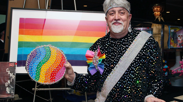
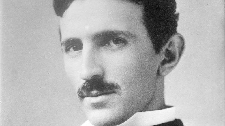
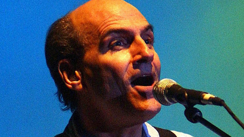
The most recognizable Pride flag is the rainbow one — and it’s got a fascinating history. Celebrants first raised the rainbow flag on June 25, 1978, at San Francisco’s Gay Pride Day, and according to CNN, it was designed by Gilbert Baker (pictured), a friend of the state’s first openly gay man elected to office. That, of course, was Harvey Milk, and it was Milk who asked Baker to come up with a flag for the community. The then 27-year-old Baker sewed that first flag by hand, and he didn’t just choose the rainbow and call it a day.
Each one of the colors means something: Pink (sex), red (life), orange (healing), yellow (sunlight), green (nature), turquoise (magic), blue (harmony), and violet (spirit). It also symbolizes the diversity of the community, Baker later said (via Refinery 29) that an image overhaul was desperately needed. Until the rainbow flag, the most recognizable symbol was the pink triangle that had roots with Hitler and Nazi Germany.
Baker died in 2017, but fortunately, he lived to see his flag design come to represent an entire community. He later says, “We needed something to express our joy, our beauty, our power. And the rainbow did that. We’re an ancient, wonderful tribe of people. We picked something from nature. We picked something beautiful.” There’s a lovely footnote to this story, too: In 2012, a piece of the original flag was returned to San Francisco (via WBUR).
Here's how the current flag lost some colors
The flag that’s commonly seen these days is a little different from the one Gilbert Baker designed in the 1970s. Specifically, it’s missing the pink and the turquoise — the sex and magic, one could say.
There’s actually a very practical reason for that, as Baker told Refinery 29. At around the same time he first raised the flag above the San Francisco streets, he was also working at the city’s Paramount Flag Company. The new symbol was such a hit that the community very quickly needed more flags than he could personally sew, and when it came time to commercially manufacture them, he found that pink and turquoise just weren’t colors commonly seen in flags, so it made making them tough. So, they were dropped, and the 6-color flag we’re most familiar with became the standard.
And it was just in time for a really, really dark period in the gay community: the AIDS crisis of the 1980s. Baker estimated that he lost about half of his friends, but said, “I’m amazed at the steel within our community; inside all that sorrow and all that setback, there’s this core of courage and bravery at so many people’s hearts.”
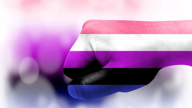
Showing solidarity
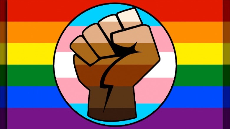
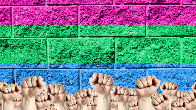
As far as exactly where this one came from and who first designed it, TriPride TN says that part is unclear. What it means, however, is very clear. The flag that has a combination of the LGBTQ+ rainbow and the raised fist is called the QPOC Pride Flag, or Queer People of Color Pride Flag. It was first flown at San Francisco Pride in 2019, and since then, it’s been regularly making the rounds on social media — particularly in conjunction with the Black Lives Matter movement.
The colors within the fist are meant to represent the rainbow of human skin tones, and in the version pictured, the blue, pink, and white stripes represent the transgender community. The symbolism of the raised fist is much older than the rainbow: According to National Geographic, one of the first uses of it was in a speech given by “Big Bill” Haywood, one of the founders of the Industrial Workers of the World Union. He explained, as he raised a fist: “Every finger by itself has no force. Now look. See, that’s the IWW.”
Since then, it’s been used by a variety of groups — including the anti-Nazi Red Front Fighters — as a symbol of resistance, triumph, and the fight against injustice.
Philadelphia's inclusive — yet controversial — pride flag
In 2017, Philadelphia made an attempt to be more inclusive, but just ended up making something super controversial instead. According to Vox, the Philadelphia Office of LGBT Affairs added two more stripes to the traditional Baker flag, and this modified version was flown over City Hall and hoisted over Philly parades.
Their official statement said that they’d added a brown stripe and a black one as part of their More Color More Pride campaign, and it was meant to be more inclusive to “people of color in the LGBT+ community.”
The pushback was swift, and it was summed up perhaps best by a friend of original flag creator Gilbert Baker. Charley Beal explained: “The stripes were not chosen for skin color — they were chosen to reflect the spectrum of color in nature.” It may have been well-intentioned, he said — especially considering Philadelphia’s problem with racial discrimination at gay bars — but the reaction Philadelphia’s flag got was deemed “indicative of a bigger problem within the LGBTQ community.”
The Baker flag's 2018 makeover
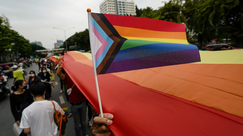
In 2018, the original Gilbert Baker rainbow flag got a makeover courtesy of designer Daniel Quasar. Quasar took the rainbow flag and combined it with the transgender flag, then added a few more stripes. What resulted was meant to “shift focus and emphasis to what is important in our current community climate,” and to become more inclusive while still showing there’s a long way to go.
Quasar explained to Dezeen that his goal was to keep the original meaning of the flag, while adding the colors of the transgender flag to be more inclusive. He also added black and brown stripes, which had the dual meaning of representing the LGBTQ+ communities of color, as well as people living with AIDS, and people who had died.
The direction of the arrow, Quasar explained, represented the “forward movement” that was happening, while there was still “progress that needs to be made.”
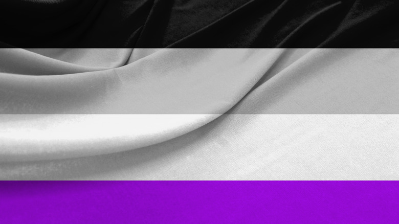
The colors of the bisexual flag have deep meaning
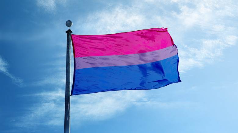
The tri-colored bisexual flag looks pretty simple: it’s pink, purple, and blue. But those colors have some deep meaning that carries over into other flags. Pride says the flag — which was designed by Michael Page and officially unveiled on December 5, 1998 — goes back to a symbol called the biangles.
The biangles — a pink and a blue triangle that overlap to form a purple triangle — were used at the first national bisexual contingent of 1987. Liz Nania designed the logo, and it was based on the pink triangles worn by gay men targeted by Nazi Germany. Nania added blue as the other typical color associated with gender, and the combination of the two became purple where they overlapped.
Then, Page took those colors and turned them into the flag. Now, the pink has come to represent solidarity, pride, and homosexuality (via Queer Art History), while the blue on the bottom represents heterosexuality. In the middle, they overlap: That’s seen as a combination of being attracted to men and women, as well as being a nod to the “lavender menace” slang term for bisexual. Cynthia Connors, a bi+ activist, says, “…the bi+ community has never been able to resist a pun or a joke.”
Bringing a new meaning to traditional colors
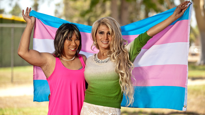
Navy veteran and designer of the transgender flag explained to Atlanta Magazine, “I was five years old, growing up in Arizona, and I prayed to God to turn me into a girl. … being raised Catholic, you pray to God for things that you want and he’s supposed to deliver, like Amazon. It wasn’t an overnight or same-day delivery, because it took 41 years.”
Monica Helms says that in 2000, she made the move to Atlanta — in part because it allowed her access to Washington, DC, where she became a trans advocate. The US Department of Veterans Affairs says that was the same year she unveiled her trans pride flag at a Phoenix, Arizona Pride parade, years after Michael Page — creator of the bisexual flag — encouraged her to make one to represent her community. By 2013, the flag design had spread outside of the US, and in 2014, her original flag was donated to the Smithsonian.
The colors are traditional: “light blue, for boys, pink for girls.” It’s the white stripe in the middle that’s arguably most significant, which she says represents “those who are transitioning, gender neutral, or intersex.” The idea, she says, came to her fully formed, and was with her one morning when she woke up. After she aided in the development of a directive outlining how the VA should treat trans veterans, she wrote: “Our … advocacy worked. It’s amazing to be told you’re saving lives.”
Created from confusion
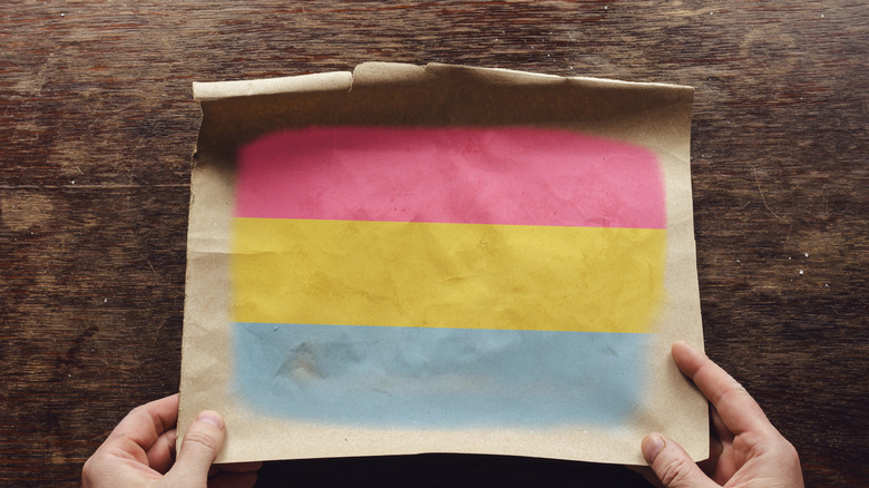
When Rolling Stone looked at what the difference between bisexual and pansexual was, they said that the latter “was birthed out of the confusion.” It can be incredibly confusing, but in a nutshell, “pansexual” means a person is attracted to people of all gender identities. (Bisexual, by contrast, means a person is attracted to only cisgender men and cisgender women.)
The term only really started gaining traction in the 2010s, as humankind as a whole was learning more about gender identity. And that’s when Jasper created the pansexual flag.
Jasper says (via Majestic Mess) that the flag represents the feminine aspect in the pink, the masculine aspect in the blue, and the yellow is everything that falls between the two extremes. They created the flag because the community didn’t have a symbol as unifying as it needed, and other pansexual symbols — mostly built around the letter “P” — “didn’t feel like a flag does.” They also say that the reception has been brilliant, and it’s been “an overwhelmingly positive experience.”
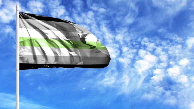
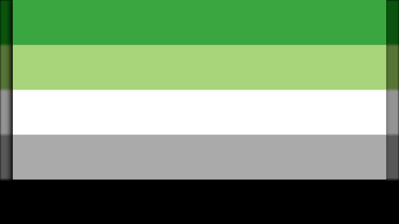
Defining the absence of desire
It’s only recently that some people have found a label for — and others who share — their sexual orientation, and that’s certainly true for those who identify as asexual. Asexual, says The Guardian, are those who don’t feel sexual attraction at all, and it wasn’t until the early 2000s that like-minded individuals started to find each other online.
The asexual (or “ace”) flag was designed, says Majestic Mess, by the community on the Asexual Visibility and Education Network. The black stripe at the top represents asexuality, and the purple stripe at the bottom stands for the asexual community. The other two stripes — white and grey — are meant to represent different areas on the asexual spectrum.
The grey symbolizes ace-spectrum identities like grey-asexuality (which Healthline says is experiencing only mild or rare sexual attraction), and demisexual (which is only experiencing sexual attraction following an emotional one). Finally, the white stripe represents the polar opposite of the black and asexuality: allosexuality. (That’s similar to pansexual in that a person can feel an attraction to anyone of any gender identity.)
The best of both worlds
The term “genderqueer,” says Vice, started in the 1990s, and there’s no one single definition for it. While some people see it as a term that covers everything that’s not cisgender, others see it as a term for an identity that fluctuates between the male and female.
The creator of the genderqueer flag is Marilyn Roxie, a San Francisco native to told Majestic Mess that they’re ironically more likely to identify as non-binary, simply because it’s more widely understood. The design was created in 2010 and finalized in 2011, and they say the need came about because they — and others — weren’t fond of the blue and pink that feature in other flags.
So, Roxie says that it was built around lavender, as the color that combined traditional gender colors pink and blue into a single shade. After multiple incarnations, Roxie decided on lavender and green. Why? Green is the color opposite lavender on the color wheel. They say: “I’m grateful and continuously surprised that people around the world have found the flag to be a useful personal or community banner under which to find connection and understanding.”
For those between male and female
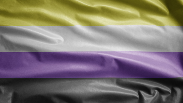
For a long time, the idea of gender has been binary: male and female. Non-binary individuals are those people who don’t identify as either male or female, and there’s a lot of other terms — like multigender and genderqueer — that fall under the umbrella of non-binary (via LGBT Hero).
In spite of the act that genderqueer exists within the umbrella of non-binary, it was the genderqueer flag that was created first — in 2010. Not all non-binary individuals identify as genderqueer, though (and the term itself can be controversial to some), and that’s where the non-binary flag comes in.
LGBTQ+ activist and entrepreneur Cade Hildreth says that the non-binary Pride flag was meant to compliment the genderqueer one, and it was created by Kye Rowan in 2014. The non-binary flag only has four colors, and each is meant to symbolize a group within the realm of being non-binary. The yellow stands for those who don’t identify as cisgender, white signifies multigender, lavender is — as in many flags — representative of a combination of pink and blue — and black is an absence of gender.
Acknowledging that we change over time
Few people are exactly the same person as they were, say, five years ago — and that’s the general idea behind those who identify as gender-fluid. According to Healthline, gender-fluid individuals are those who change which gender they identify with. It’s a shift that can happen quickly or slowly, over the course of a single day or over the course of years. The flag that was created to represent gender-fluid Pride was created by then-20-year-old J.J. Poole.
Poole — who identifies as agender — told Majestic Mess that they were heavily influenced by the other striped flags, and developed the flowing, pink-to-blue spectrum flag as a nod to shifting genders. Pink is, of course, the feminine and blue the masculine, and also included are a black stripe for a lack of gender, a while stripe for all genders, and a purple stripe that represents the combination of the male and female.
A Pride flag for those who don't identify with gender at all
The agender flag is a series of black, grey, and white stripes with a single green one in the middle, and it was created by then-20-year-old Salem from Staten Island. She told Majestic Mess that the flag came out of a low point in her life, and as she was struggling with everything that was going on around her, she was struck by how right the term “agender” seemed.
Those who are agender, says Cosmopolitan, don’t identify as a particular gender and “reject the entire concept.” That’s reflected in the alternating colors of the flag, which were chosen for very specific reasons — and, Salem says, have become pretty polarizing since it was unveiled. Some love it and some hate it, but the colors sort of chose themselves, when Salem took the purple that many other flags used as a combination of the feminine pink and the masculine blue, then found the inverse color on the color wheel. She explained, “I inverted it because genderlessness is not the same experience as those who identify as being between the male/female spectrum.”
Add the black and white stripe to symbolize a lack of gender, and the grey stripes to represent semi-genderlessness, and the agender flag was created.
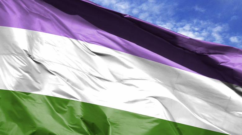
The complicated saga of lesbian Pride
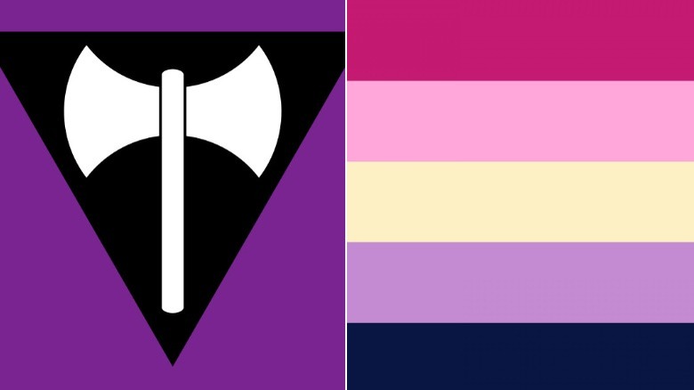
Lesbian Flag History has posted a timeline of the development of a lesbian Pride flag, and it’s incredibly complicated — and (spoiler alert) — there’s no 100% consensus on what’s right. The development of a lesbian Pride flag started in 2000, with Sean Campbell’s purple-and-black Labrys flag (left). Queer Story Files explains that the use of the double-bladed axe harkens back to the matriarchal societies of the Mediterranean, but not everyone has been thrilled with the use of the black triangle — in spite of regular use by women’s rights groups, it’s still a symbol used by Nazi Germany to denote anti-social behavior.
Then, in 2010, Natalie McCray created the red, white, and pink Lipstick Lesbian flag, but that was controversial, too. It was condemned as including only ultra-feminine lesbians, while having little meaning beyond representing shades of lipstick. (McCray was also condemned for making racist and bi-phobic comments online.)
In 2008, Erin Ptah unveiled her design (left, via Leif & Thorn) for a more inclusive flag. This one included two pink stripes to represent female couples, a yellow stripe for non-binary and intersex lesbians (in a shade chosen to reflect the sandy beaches of the island of Lesbos), a lavender stripe as a throwback to the Labrys flag and feminism, and a blue-black stripe for butch lesbians. She told Majestic Mess, ” [I] made a point of including references to as many different lesbian experiences as possible, so it’s explicitly celebrating all of us together.”
All the colors of the fur
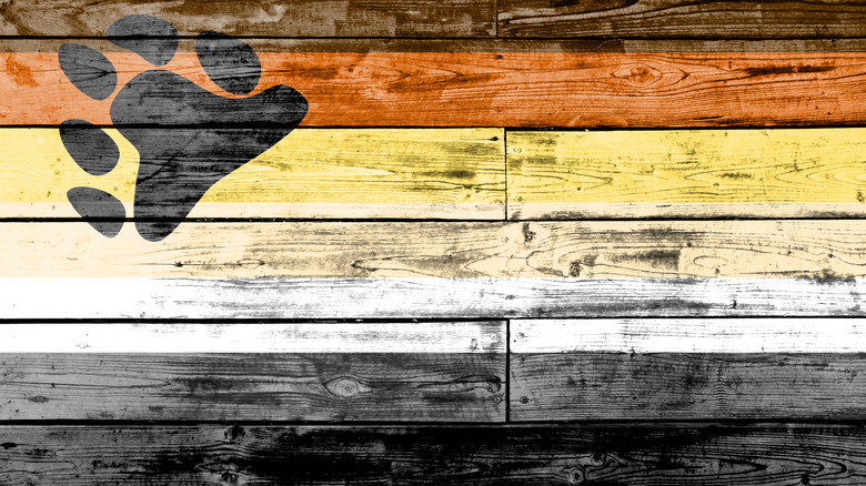
No one’s entirely sure where the term “bear” came from, but according to The Bear Society, it’s referenced a section of gay culture since at least the late 1970s… maybe. Pink News defines bears as “hairy, with a large build and over 30 years old. They are hunky, chunky, … and almost always with a full beard or facial hair.”
The International Bear Brotherhood Flag was originally designed to be inclusive: the colors are meant to represent both the wide range of fur colors seen in bears (the animal) as well as representing all the skin colors in bears (the humans). Queer Story Files says that the generally-accepted story is that it was created by Mr. Baltimore Bear Cub, 1993 (and Mr. Teddy Bear Leather of Virginia, 1994) Craig Byrnes, but there might be a little more to it than that.
While Byrnes maintains that he designed, financed, and developed the flag — including the pawprint, which he says came from American Bear Magazine — his former boyfriend, Paul Witzkoske, maintains that when he and Byrnes came up with four designs that were then put to the community for a vote, it was one of Witzkoske’s designs that won. What’s the final word? It’s unclear, but the skin-and-fur-colored flag has been the Pride flag for hairy gay men — and the men who love them — since at least the mid-1990s.
Unbroken
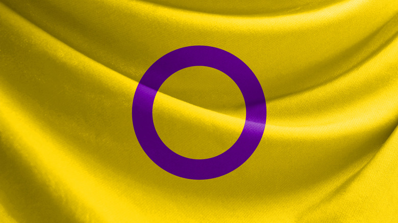
Intersex is a little different, in that it’s not a reference to sexuality or gender. Intersex Human Rights Australia describes it as “having innate sex characteristics (such as chromosomes, gonads, or hormones) that differ from medical norms for female or male bodies.” Many people who demonstrate such characteristics are subjected to surgeries or hormone treatments to “fix” their bodies, and the elimination of intersex genetics is wading deep into eugenics territory.
IHRU’s Morgan Carpenter designed the intersex flag in 2013, saying that while there was no one, single, unifying flag, the yellow-and-purple design was created as something completely unique and apart from the rainbow flags, while still tapping into some of the same symbolism.
The background is yellow because it’s neither feminine pink nor masculine blue, while lavender is a combination of the two. The simple, straightforward circle design was chosen because it’s “unbroken and unornamented, symbolizing wholeness and completeness, and our potentialities.” Since the creation of the flag, it has spread into global use, even appearing as one of the flags in Budweiser’s 2019 UK Pride campaign.
'Purposefully vague'
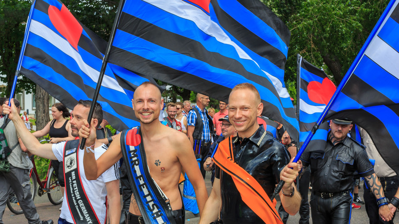
The Independent says it’s an “annual discourse”: should kink and BDSM be celebrated alongside Pride Month? Whether or not things like leather fetishes should be front and center at Pride parades has been hotly debated for a long time, with naysayers wanting things to be more “kid-friendly,” with others — like Nicolette Mason — saying (via them.), “Normalizing these things is a GOAL of pride.”
And that’s why the leather Pride flag remains a common sight at events across the globe. CRWFlags says that ironically, the design — which was created by Tony DeBlase in 1989 — was meant to be something of a placeholder that DeBlase hoped would inspire someone to come up with a permanent design. However, it very quickly became the permanent design.
It’s unlike other Pride flags in a few ways, starting with the idea that it’s meant to be a little more discreet. It’s also pretty vague, and DeBlase has hesitated to specifically say what the black, white, and blue stripes mean. There are some widely-used interpretations, though. One suggests the black and blue symbolize leather and jeans, while the white is honesty and understanding, and the red heart is love. Alternately, some interpret the white stripe as safety, consent, innocence, or solidarity with others.
The difference between 'many' and 'all'
Let’s explain polysexual really quickly, because it’s important. Cosmopolitan says that while pansexuals find themselves attracted to partners of all sexual identities and genders, polysexuality, on the other hand, means that an individual is attracted to many or most sexual identities, but not all. The term, says Dear Biary, is vague by design, and there’s no cookie-cutter way to be polysexual.
The polysexual flag was unveiled in 2012, and it was designed by a poly individual who wrote they were “saddened by the fact that we don’t have a flag… so I made one.”
It looks a bit similar to the flags for pansexuality and bisexuality, and that’s on purpose: The three kind of fit into the same area of the spectrum. Creator Samlin picked the pink and blue stripes from the bisexual flag, and replaced a few others. The green stripe symbolized attraction to non-binary, the pink is attraction to those who identify as female, and the blue represents attraction to those who identify as male.
Representing those who don't feel romance
Aromantic, says Women’s Health, is the term used to refer to people who don’t feel romantic love or attraction. The idea of having a crush on someone, or getting butterflies in your stomach when they walk into a room is something that just doesn’t happen to them, and they stress that it’s different than being asexual — it actually developed in the early 2000s when people in the asexual community started defining the difference between romantic and sexual attraction. Individuals can identify as one, the other, or both.
And that explains why the aromantic flag is a modified, nearly reverse version of the asexual one. The aromantic flag has black, grey, and white from the bottom instead of from the top (symbolizing, respectively, the sexuality spectrum and platonic relationships), and replaces the purple with light and dark green, to symbolize the aromantic spectrum (via Majestic Mess).
The two-spirit
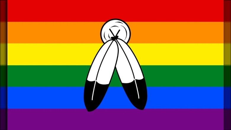
The Canadian Encyclopedia says that the idea of the two-spirit is prominent in Indigenous cultures, and refers to a person who embodies both male and female traits and characteristics, as well as the sexual identities of the LGBTQ+ community. Different tribes have historically had different words to describe those who shun traditional gender roles, for instance, female warriors or male healers. The term “two-spirit” was introduced in 1990 to be used across all tribes, and describe all aspects of the LGBTQ+ community within Indigenous groups, with the idea that some people have both male and female aspects coexisting in a single form.
Their flag, says Out Alliance, has multiple incarnations, and generally consists of a two-feather image on various other flags, like the rainbow flag. The University of Northern Colorado says that the feathers symbolize the connection between the male and female identities, and the circle at the top indicates their connection within a single person.
The flag flown by allies
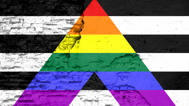
Vox says there’s a few ways for LGBTQ+ allies to offer support, and it includes things like donating to groups that provide invaluable services to the LGBTQ+ community (particularly youth groups), uplifting the marginalized of the community and understanding the challenges they face, reaching out to lawmakers on behalf of LGBTQ+ inclusive and protective legislation, and supporting the community’s many artists, entrepreneurs, and business owners.
When it comes to imagery, there’s also a flag for straight allies (those who aren’t a part of the community, but want to show their solidarity and support). And yes, the “A” stands for “Ally.” It’s unclear just who created the flag, but the University of Northern Colorado says that it first showed up in the late 2000s. The rainbow of the A stands for the LGBTQ+ community, and the black and white stripes signify both heterosexual and cisgender individuals.
230 thoughts on “Every Pride Flag Explained”
Leave a Reply
You must be logged in to post a comment.
The Mythology Of Loki Explained
The Real Reason These Classic Rock Hits Were Never Performed Live
The Creepy Truth About The Bones Found In Benjamin Franklin's Home

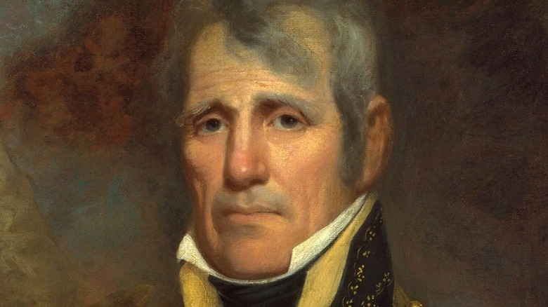
Inside The Paranoid Mind Of King Henry VII
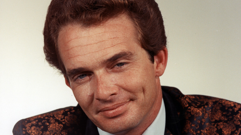
The Truth About Merle Haggard's Rough Childhood
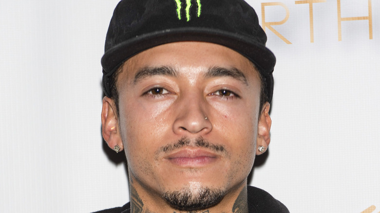
The Untold Truth Of Nyjah Huston

Here's What Really Happened To Melissa Caddick

The Most Dangerous Energy Drinks Ever Made

Roko's Basilisk: The Thought Experiment That Could Enslave The Human Race

Here's How Much Secret Service Agents Really Make


Hi! Do you use Twitter? I’d like to follow you if
that would be ok. I’m absolutely enjoying your blog and look forward to new updates.
I visited many web pages except the audio quality for audio songs present at this site is really excellent.
We stumbled over here coming from a different website and thought I might check things out. I like what I see so now i’m following you. Look forward to exploring your web page yet again.
I am actually thankful to the owner of this website who has shared this impressive piece of writing at here.
Heya i’m for the primary time here. I came across this board and I find It truly useful & it helped me out a lot. I am hoping to provide something back and help others like you helped me.
Fantastic goods from you, man. I’ve remember your stuff prior to and you’re simply too wonderful. I really like what you’ve obtained here, really like what you’re stating and the way by which you assert it. You are making it entertaining and you still take care of to stay it sensible. I can not wait to read far more from you. This is actually a great site.
I’ve read some good stuff here. Definitely worth bookmarking for revisiting. I wonder how so much attempt you set to create this type of magnificent informative site.
Hi there, this weekend is nice designed for me, because this time i am reading this great informative post here at my house.
It’s really a cool and helpful piece of information. I’m glad that you shared this helpful info with us. Please stay us informed like this. Thank you for sharing.
Pretty great post. I simply stumbled upon your blog and wanted to mention that I have really enjoyed browsing your blog posts. In any case I’ll be subscribing in your feed and I hope you write again soon!