You Only Had One Job! The Most Epic Marketing Fails
Now and then, you find yourself looking at some pretty lousy marketing when you realize that marketers, magazine editors, and advertisers failed to check their work. From questionable font choices to poor use of grammar, we’ve put together a list of advertising techniques gone wrong.
Mirrored Signs
Apparently, this company meant to say “mirror” and not a window. Or, they did intend to and just completely forgot about how the world works during the time it took to slap this thing on.
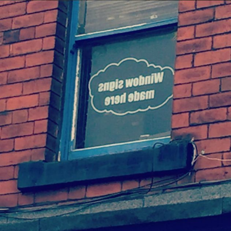
This doesn’t seem like a very solid advertising campaign for a company that claims they put these on professionally. Maybe they just opened? Hopefully, they’ve got it down by now.
No Thank You, Sir
The font choice on this work uniform may end up getting these delivery people arrested (or hit on), depending on where it is that they are. Alternatively, if they happened to stroll through the right crowd, maybe they’d get a different type of reaction. But it’s probably best not to take any chances and just redo the uniform instead.
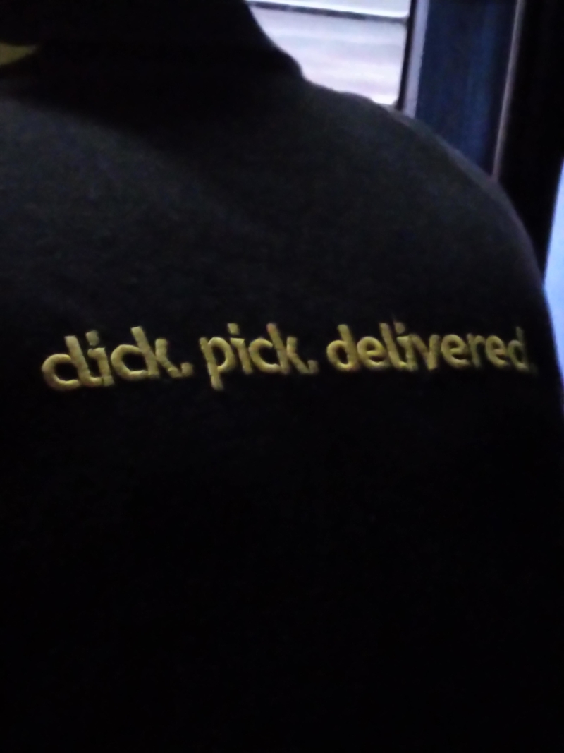
Did no one check to make sure they looked okay before they were used? Yikes! We wonder how many people want whatever this company is selling.
We Got It the First Time, Anna
Perhaps it was the Blind Onion next door that put together Anna’s sign. It sure seems like they went a little overboard with the whole “food mart,” thing, doesn’t it?
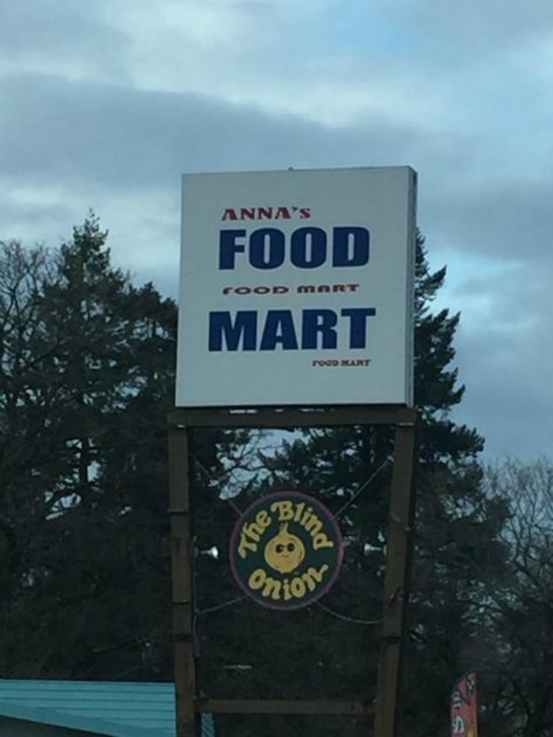
Okay, we get it; you’re a food mart. Geez. Wouldn’t the large print be sufficient enough to tell us that, though? The smaller words in the middle and at the bottom of the sign aren’t helpful. If anything, they’re just confusing. Did Anna really think this advertising sign was a good idea?
This Is Why Punctuation Is Important
This is a case of someone who was either too lazy to use some simple punctuation marks or wasn’t entirely sure how to go about it. They could have laid out a few different ways to differentiate between the lines.
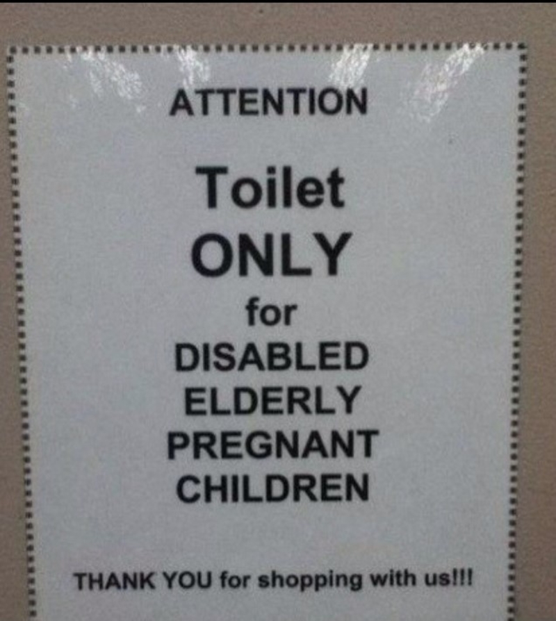
But, since they didn’t, it seems like that restroom is designated only for the disabled, elderly, and pregnant children. Next time use a couple of commas or even bullet points!
Can’t Get Through
Although it may seem as though someone’s bag is covering the ad’s phone number, that’s not the case. Nope, this company has, in fact, placed that orange backpack right over the last few digits of their number. This is a marketing fail, one that had to have at least gone through a couple of people to make it to the bench.
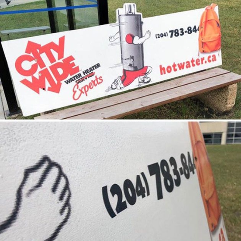
How do you expect to get business if no one knows how to get a hold of you in the first place? The bag also makes zero sense in the context of the ad, anyway.
Lost in Translation
Someone at this company took the easy way out when they were asked to translate a sign for this company. Instead of using a book or even Google, they went to a translator service. They typed in whatever this sign was supposed to say, and what they received in return was… a solid gold marketing fail!
The website they were using couldn’t connect, and someone either wasn’t paying attention or didn’t know English that well because this is awkward! Hopefully, some kind-hearted tourists helped them out by pointing out the error.
Build-A-Baby Factory
This poorly placed advertisement takes away from what is happening in this ad! At first glance, this bus quite obviously belongs to some kind of robot baby-making facility.
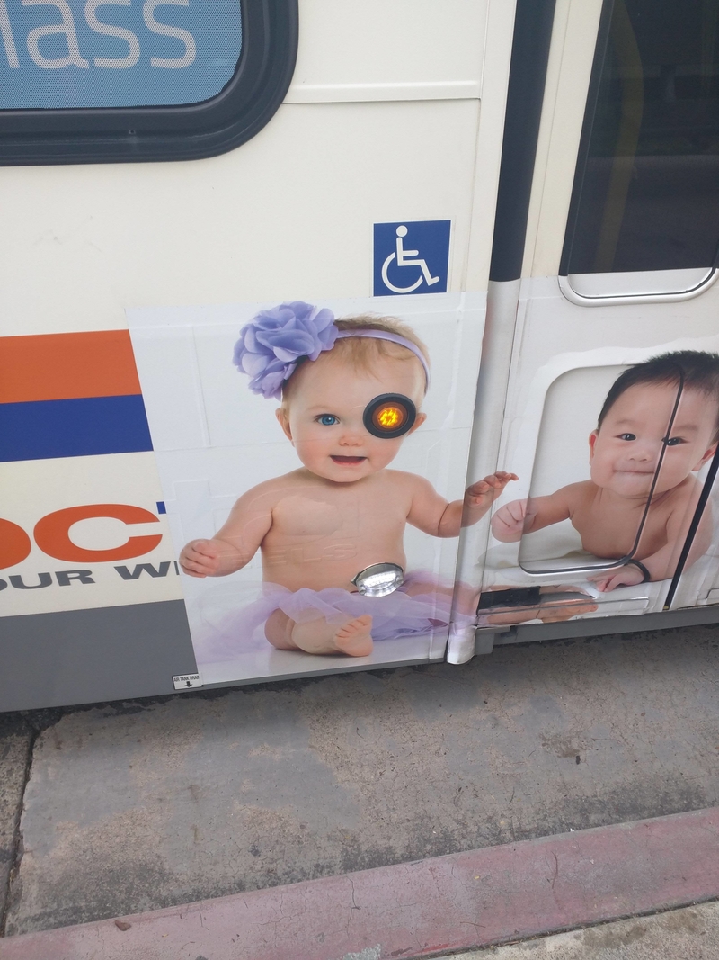
But then you realize that a marketing error is all this is — one so bad you forget what exactly it was you were looking at, to begin with!
Out of Order
This is another case of someone not thinking about how people read from left to right before reading from top to bottom. So, it seems as though this signage says, “SASA LELE,” whatever that may be. Luckily, it looks easy enough to rearrange the letters.
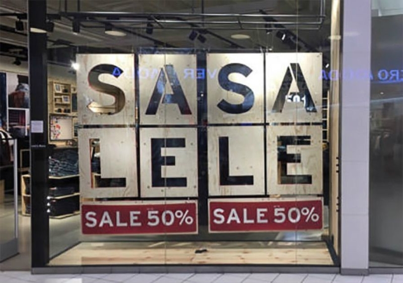
Hopefully, the manager realized that was the issue when that sale wasn’t bringing in any customers. Or maybe it was the manager who put it up in the first place?
Umm… What?
Many of the people who ran into this marketing fail felt that it made no sense. But, even worse is the fact that some felt like the takeaway from this ad is that the thing that’s for lunch is, well… you.
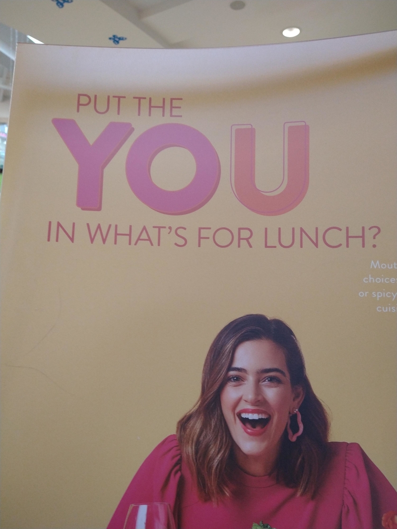
Combine that with the fact that there is no food pictured here, and the only thing on the poster is a picture of a woman, and you’ll understand why people came to that conclusion.
Waiting for a Lift
This guy is probably feeling a little left out of the joke – if that’s even what this was. It was either that or someone just really didn’t think about proper placement for this sign.
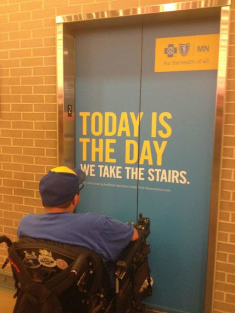
When you’re trying to make an ad with a point, the first thing you should do is try and think of everyone your advertisement could reach. Maybe this should be a few feet over near the actual entrance to the stairs instead.
Hammer Time Baby
Hey, always remember, if your baby is going to handle a hammer and nails, make sure they wear a hard hat. That way, if they’re going to hammer a plank to their thigh, at least their head will be protected. That sounds pretty ridiculous, doesn’t it?
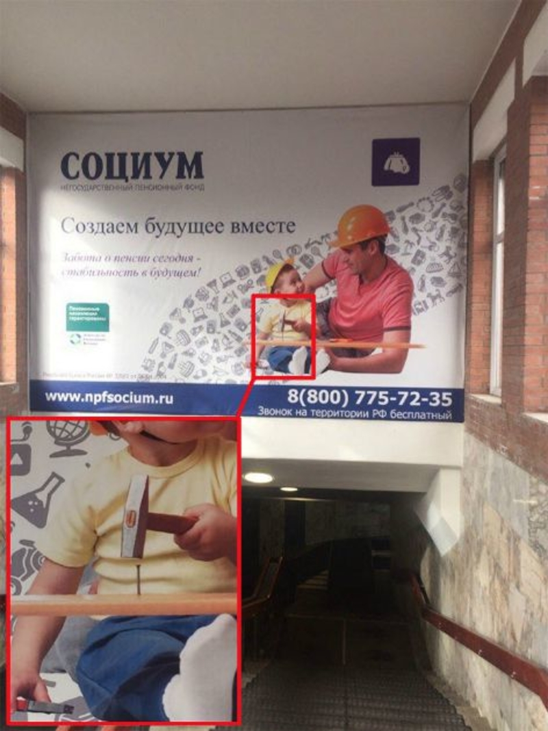
But apparently, in Russia, they teach kids to build things before they can even talk. The whole supervision thing doesn’t seem to be working, either, since disaster is one strike away.
Try Anything Once
Even if you were raised to try new things, you might be a little iffy about this one – we know we would be. This is why it’s essential to test your ads and ensure they look good (from all angles) before the public sees them.
Then again, maybe it’s been bringing in even more business. If not just to say, “you serve what now?”
Stick to Coffee
We love tea as much as anybody, but the person in charge of this design should’ve probably had that extra cup or two of coffee before they stuck this design template on an actual wall.
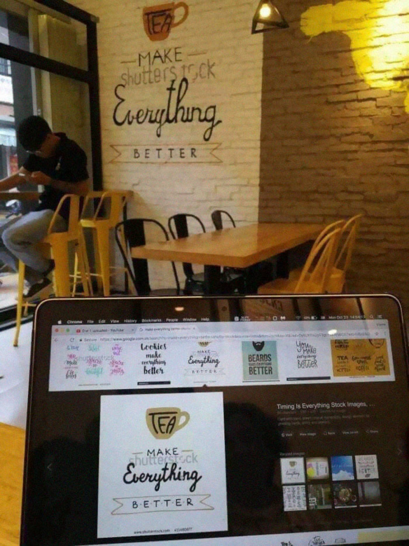
We understand how they could forget to erase the watermark from a screen. But not realizing it while plastering it on the wall?! Unless this is meant to be a joke, which, to be honest, would kind of make the whole thing worse.
Count Dracula, Your Sales Representative
It looks like Mr. Greenberg is much more than a sales representative. He’s Count Dracula! No wonder he’s number one. He must have drained the blood out of anyone who dared to compete against him.
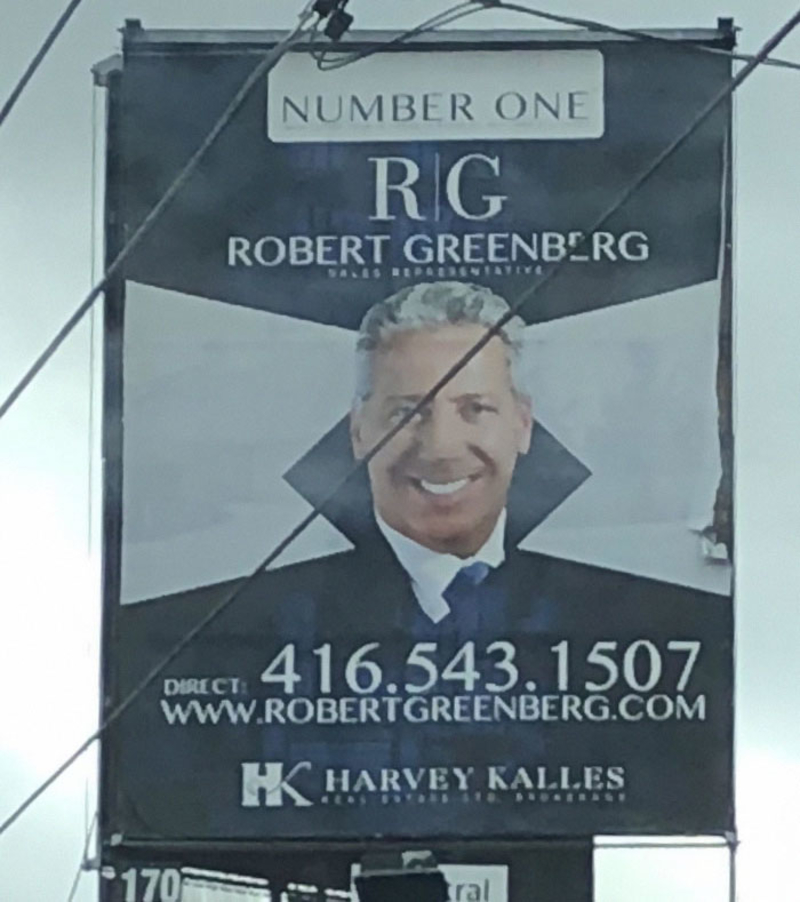
And to the design geniuses that decided to put a black tilted square behind a man’s face to make it look like a vampire collar…thank you for this marketing fail!
We’ll Take His Word for It
Bravo to Dr. Sam Daher and his wonderful 14-month Invisalign treatment, giving teenagers hope that nobody will ever have to find out they’re wearing braces again! However, Dr. Daher should’ve stayed away from marketing and flyer design.
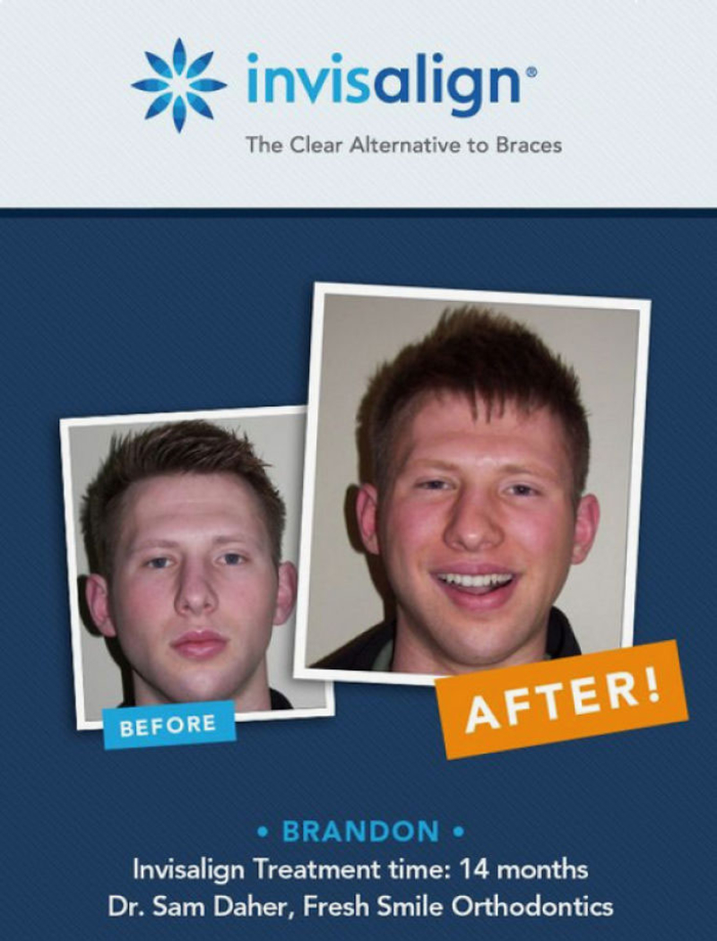
For future reference, doctor, a “Before and After” photo only works if you can see the difference, which is not the case since, for all we know, Brandon didn’t even have teeth in his “before” photo.
Self-Serve Kiosks for Drunks
Unless the guys at Taco Bell had the 2 AM drunks in mind when they built these self-serve kiosks, we don’t know what would compel anyone to create this.
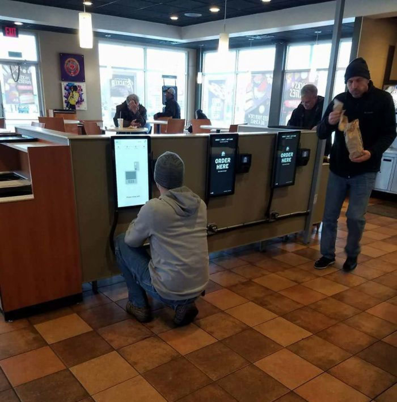
Sure, it’s perfectly convenient when you’re wasted and want to place your order while you’re lying semi-unconscious on the floor, but if you’re sober and taller than a five-year-old, this is extremely annoying.
Three Is a Good Number
Whoever designed this sign should pay more attention to phrasing. We get it; the speed limit is 20 mph because there are children on the road. Still, it could also be perfectly misconstrued as absolutely insane advice from parents that went a bit overboard when they decided to try and have siblings for little Jimmy to play with.
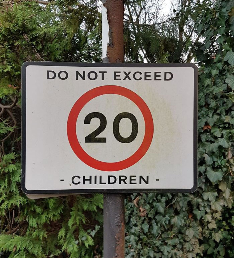
Do not exceed 20? We’d strongly recommend not having more than three! Unless you’re rich and have 150 nannies.
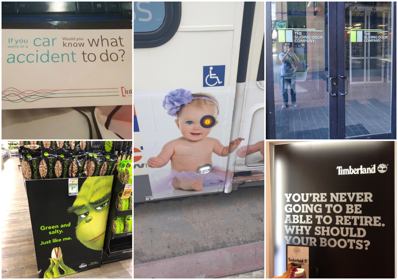
What Accident to Do?
Since when the majority of people read from left to right, and then from top to bottom, this sign has it all wrong. They tried to make it legible by using different colors to separate the phrases, but it still just looks confusing.
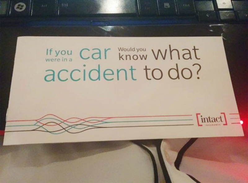
What makes it even worse is that it’s a sign talking about car accidents. This is the kind of thing that causes anxiety attacks, and most people don’t know what to do with those, either!
The New Sliding Door
Either that company really isn’t living up to its name, or they came out with a super cool new patent for a “push & pull” sliding door. Marketing fail? We think yes!
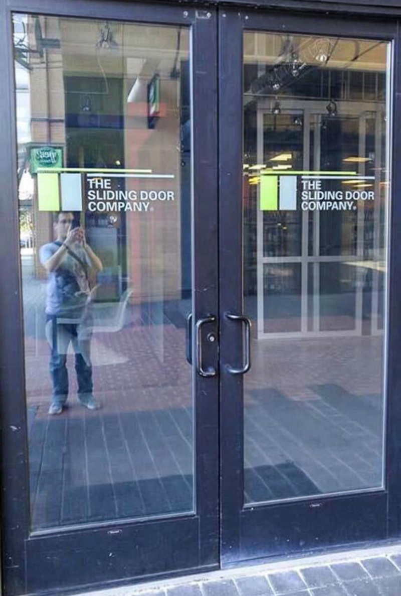
Regardless of what happened here, we don’t think any businesses will be calling The Sliding Door Company for new installations any time soon. They aren’t even using their own product!
Come on, Disney
It took us a couple of seconds to realize what exactly was going on here, but man, once we got it! Really, Disney?! That’s where you decided to cut the sign?
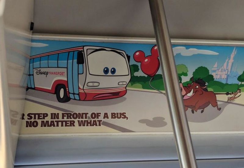
Thanks for trying to keep our kids safe, Disney. We appreciate it. Maybe you should look into hiring a better designer. We hope Timon and Pumbaa made it home safely.
Worst Phrasing Ever
Kruger & Matz have just won the prize for the worst phrasing and marketing failure ever. We understand that English may not be your first language, but if you’re going to advertise something, make sure it doesn’t have a double meaning! Especially one like this!
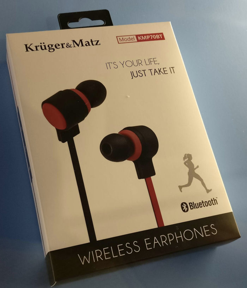
Also, is it just us, or are these wired earphones being falsely advertised as wireless ones?
The Headless Schoolboy
Printing something on the side of a bus can be tricky — the proportions, the placing, the moving doors. However, this is why professionals usually do it because otherwise, this smiling child ends up looking like a decapitated schoolboy.

Whatever this ad was promoting, it’s safe to say that sales won’t significantly increase this year.
They Care, Just Not About Her Eyes
We’re sure that was a lovely-looking nurse who fits in perfectly with the kind-hearted nature of the ad. However, the geniuses in charge of design just messed this up beautifully. Now, the nice-looking woman looks like an alien with extremely separated eyes.
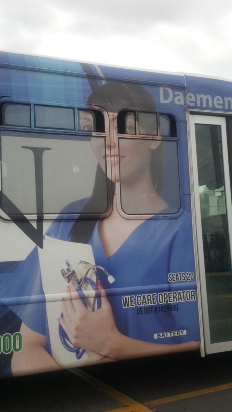
And we don’t know about you, but that definitely wouldn’t be our first choice next time we need to call a nurse.
Delicious Cheesecake
To be fair, some of those slices of cheese do look like an utterly delicious piece of cake. However, when looking over at that almost empty cup of coffee, thinking they used a tray of cheese as the dipping snacks just make us feel a little sick.
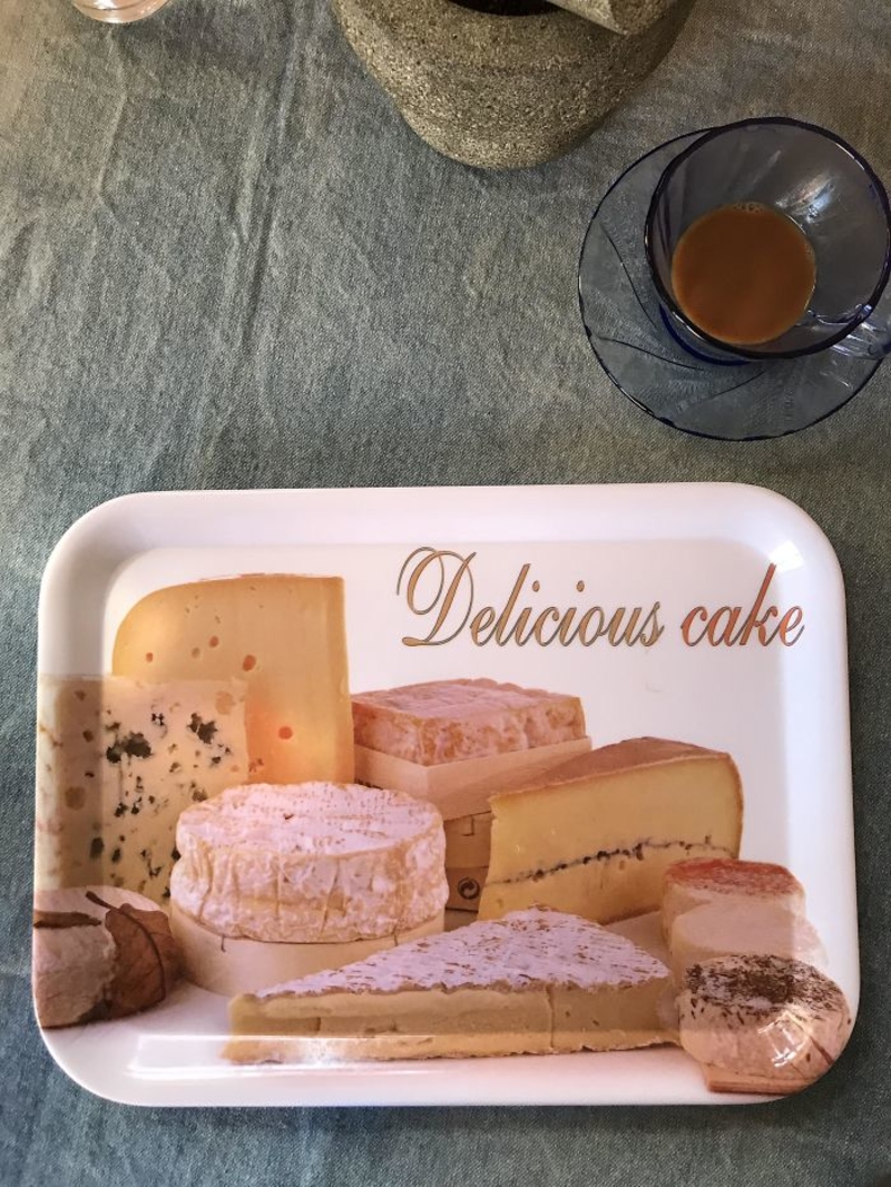
It’s a lovely picture, though. Too bad they weren’t advertising cheese. Pizza, anyone?
The Mice Bag
Come on, McDonald’s! You’ve been around long enough to know the importance of proper marketing. Then again, they’re truly offering a sweet deal right there. One dollar for 10 pounds of mice? That’s a bargain.
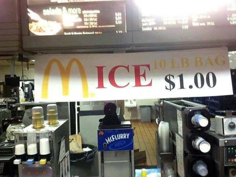
Just the phrase you want to see at your favorite fast-food restaurant — “10 lb. bag of mice.” Maybe it’s for costumers who have a pet snake to feed.
What Are Acronyms Again?
Whoever designed this sign looked around and realized that acronyms are all the rage when it comes to advertising.

There’s just one problem; it seems that he didn’t really get what acronyms actually stand for. For the designer, an acronym is an acronym for I have no idea how to do my job, but I can fake it till I make it, right?
Odds Are, It Probably Is Haunted
Real-estate rule of thumb: if a house for sale on the market is advertised as “Not Haunted,” it is, more likely than not, haunted. In our personal opinion, this sounds like something a ghost realtor would say!
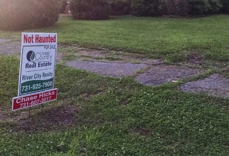
Despite this attempt to bring more attention to his business, we’re sure this did the opposite, which is why we’re calling this a marketing nightmare. Regardless of these claims, we’re still quite skeptical. What do you think?
They Suck at Socks
If these socks are truly meant for football fans, then how come they couldn’t get even the simplest of details, right? The lines alternate between 30 and 40 yards, making it nearly impossible to make actual progress on this field.
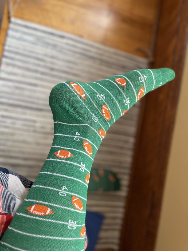
Think of listening to a sports anchor talking about a player running on this imaginary field. He’d probably say something like, “He’s at the 40, the 30, the 40.” These socks failed to reach their target demographic.
Unable to Help
Parking spaces for differently abled people is extremely important. People who park in them without need deserve their own parking space in hell.
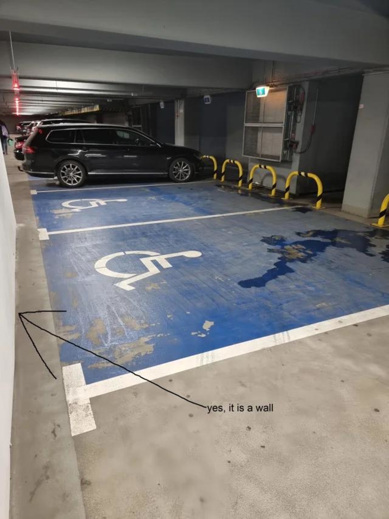
This time though, the fault is in the design. For some reason, the disabled parking place is placed next to a wall making it almost impossible for anyone — disabled or not — to actually park there. Remember that bad design choices influence real people.
All-In-One
This sign excels in honesty, but it’s still hard to believe someone would want to get in there. Maybe they should have thought of a better advertising technique. Possibly one that doesn’t put all the cards on the table at once.
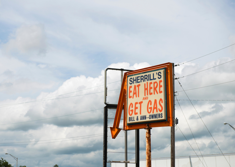
Feeding our bodies and getting gas for our cars are two things we know we would walk into a roadside joint for. But only when that separation is firmly held, which may not be the case here at Sherrill’s.
Sorry, We’re Open
As signs go, this one is pretty confusing. Not only will people not be sure if they are open or closed, but it also probably won’t attract too many people inside.
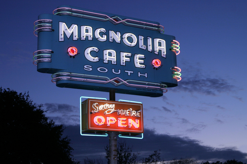
Maybe someone should let them know that they shouldn’t be sorry about being open. Unless they have something to feel sorry for, which, we must admit, would raise some questions.
Karate Psychic
They say it’s essential to diversify your business. This person took it very seriously and decided to offer two services that you might not combine naturally.
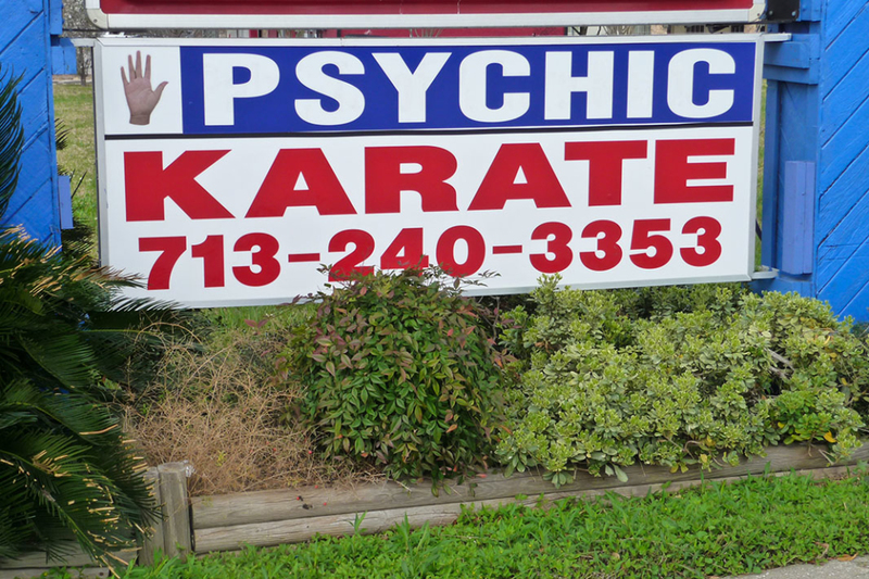
It’s either that or they made a huge marketing mistake. But then again, you can never know if psychic karate could be for you. Just think about working with your hands and you’ll get a good guess.
Beware of the Sign
There’s nothing more dangerous than a sign. Its bright yellow color, the black font, the “sharp” edges. Far more dangerous than the bridge beyond it.
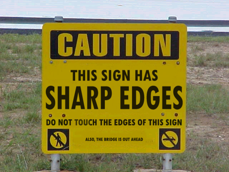
We do appreciate the humor, though, since obviously, whoever made this sign meant it as a joke. And if you’re not convinced, just read the cheeky fine print below that reads, “Also, the Bridge Is Out Ahead.”
Very Good Advice
In all fairness, it is probably best to remove the child from the clothing before throwing it in the washing machine. Especially since we’re talking about a “size 3 to 4 years”! Not that throwing anyone, at any age, in a washing machine would be any better.
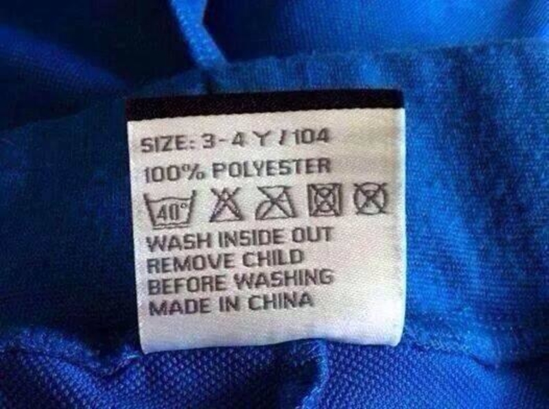
The most worrying thing about this label is that this doesn’t seem to be a grammar mistake or a question of a missing letter or punctuation. Did they really mean to write the word “child” there?!
The Best Nation in the Nation!
And this is precisely why America is “the best country in the nation,” because not only is America a country, and not an entire continent, but it is also the best country within one country!
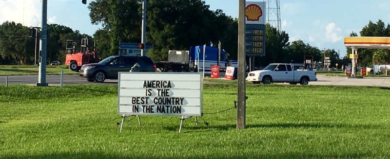
Bravo guys! We sincerely advise brushing up on your geography and grammar lessons. To avoid next time’s marketing fail. Though it seems this time the fail is in the education system.
Is That Necessary?
We applaud this store’s willingness to help its customers above and beyond, but really, guys? We don’t think adult people need a demonstration on how to use a toilet. And if they do, it sounds like they have bigger problems to handle.
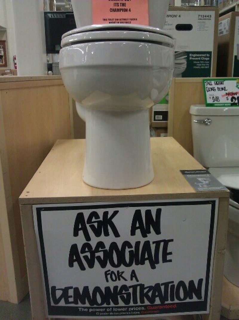
Also, if someone were to ask for a demonstration, how would it go down? Personally, we would be very tempted to ask just to see what happens.
Poor Nemo
We’re not sure what we think about this one! On the one hand, it could be considered a marketing fail — we wouldn’t recommend this place if you’re looking for a nice “Fish & Chips” place to take your Nemo-loving kids. And if you do, at least cover their eyes on the way in!
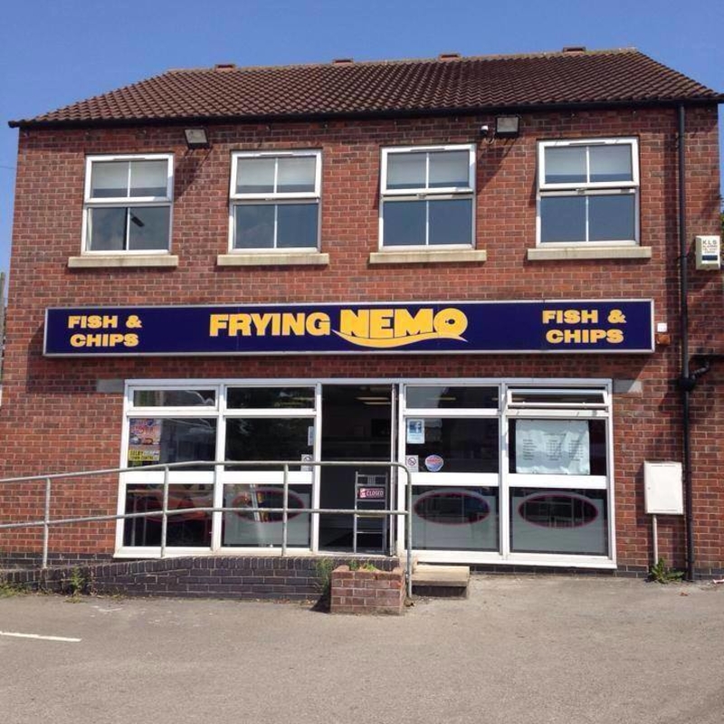
On the other hand, we do have to give them points for creativity. If you’re over the age of 12, you’re sure to have a big laugh with this one.
Do They Have Your Attention?
To spice things up, we put in a marketing mastermind! Whoever made this sign is a marketing genius. It is simply fantastic. Obviously, the person that was responsible for the restaurant’s publicity knew what they were doing. They know that putting up this word in the joint’s main window is undoubtedly going to make every passerby stop.
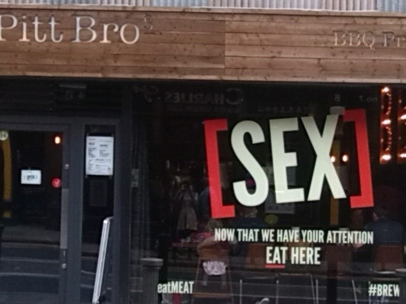
And even if they don’t end up eating there, they will surely remember the place. Now that they have your attention, why not eat there?
Mixed Signals
We feel like this sign is sending us mixed signals. It’s hard to understand if it wants us to come or to go. It says that they are closed but then it’s inviting us to come in and use our credit card. So, which one is it?
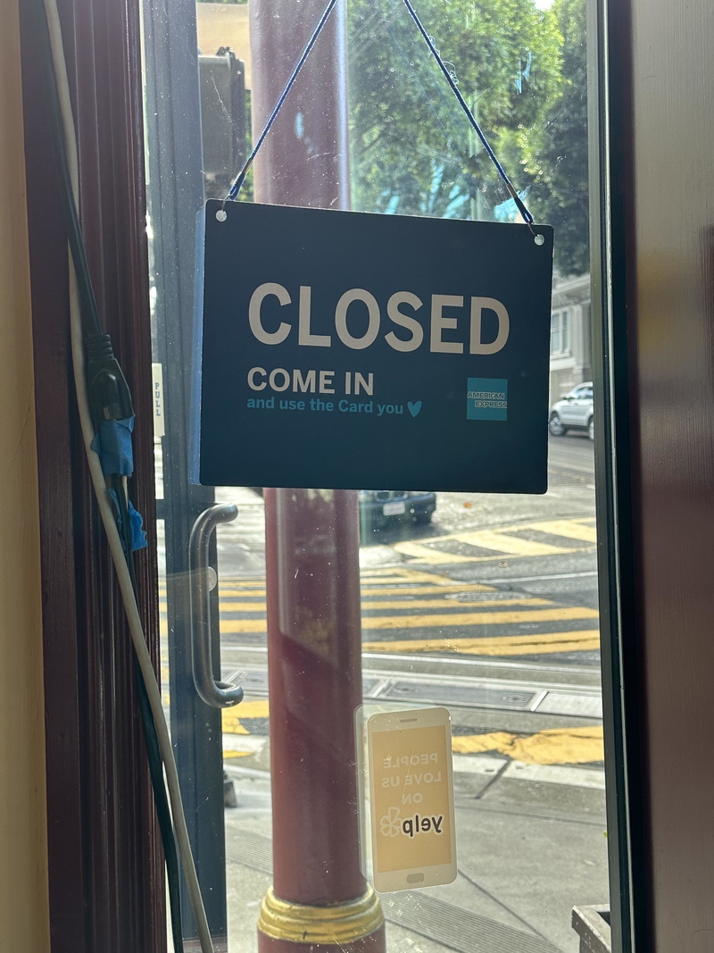
This whole experience is extremely frustrating and it kinda reminds us of what dating feels like, and we really did not need to be reminded of that.
Letting Off Some Steam
This clothing store should call someone to check on their lighting situation because we’re not sure what kind of people it’s going to attract as a “Swearhouse.” It sounds like a perfect place to blow off some steam. Also, the suits in the window class up the joint, so you know you’re going to be mixing with some high-class clientele while doing your swearing.
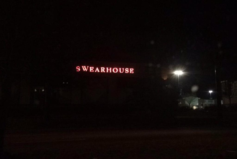
Hey mister, just because bad words are allowed doesn’t mean this is a shabby place. You know what? Maybe they should leave the lights as it is. There seem to be a lot of exciting business opportunities at Swearhouse.
Christmas Bazaar!
This was a lovely idea to raise some money for a worthy cause, but something got jumbled along the way. Although we all wish we could eradicate childhood diabetes, getting into fistfights with young sufferers is probably not the way to do it.
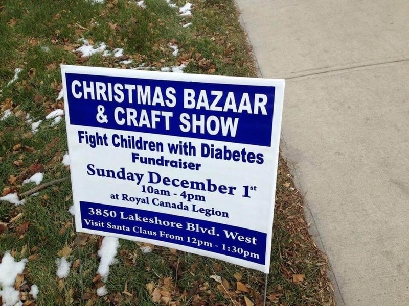
The point they wanted to make is obvious, but they really should have had someone else look this over before they rushed out to print signs. On a more positive note, a Christmas bazaar and craft show sounds lovely and an excellent place to get some holiday shopping done!
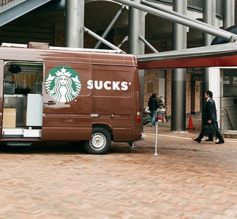
Starbucks Ain’t Got Nothing on Them
We are intrigued. Good for TireDiscounters for trolling the Pumpkin Spice Latte phenomenon and reminding us all that there is more to life than a warm and delicious PSL.

The new trend this fall is PSR, and frankly, it’s time for a change. Though you could take Pumpkin Spice Rubber to a completely different place, in which case, you’ve got yourself a marketing fail!
Philosophy 101
If my feet are shoes, why don’t they keep me warm in the winter? These questions and others will make this sign a staple in any philosophy class around. Even better, this sounds like a great assignment — please write a paper by Wednesday discussing the theory of feet being shoes.
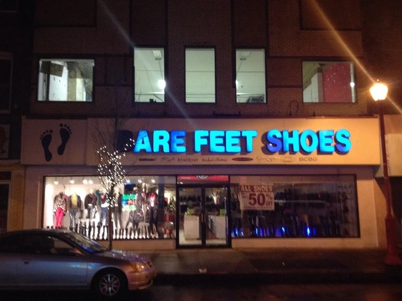
Though we’ve got to say the fail is only relevant when the “B” stops glowing. The sign makes this look more like an existential Google search than a shoe store. The 50% off sign in the window clearly shows that business is not booming.
In Case You Were Planning To
Apparently, the people that put up this sign don’t have much faith in humanity. We understand why there would be several safety signs around a swimming pool, but ‘Do Not Breathe Under the Water’? Seriously?
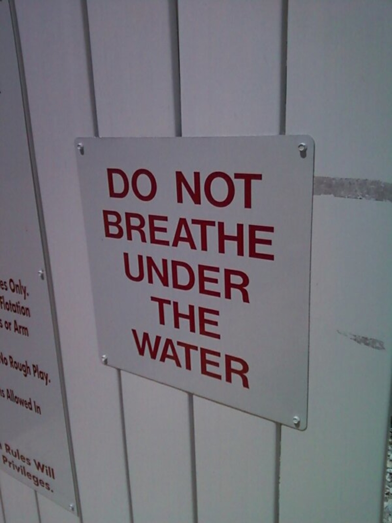
We’d certainly hope that whoever decides to go swimming would have enough basic common sense not to try and breathe underwater. But hey, then again, you never know.
Parked Illegally? You’re Fine
Illegally parked? Don’t worry about it, the car will be fine. This sign is just absolutely hilarious. It’s incredible what just a small missing letter can do; if only they had remembered to put the “d” at the end of “fine.”
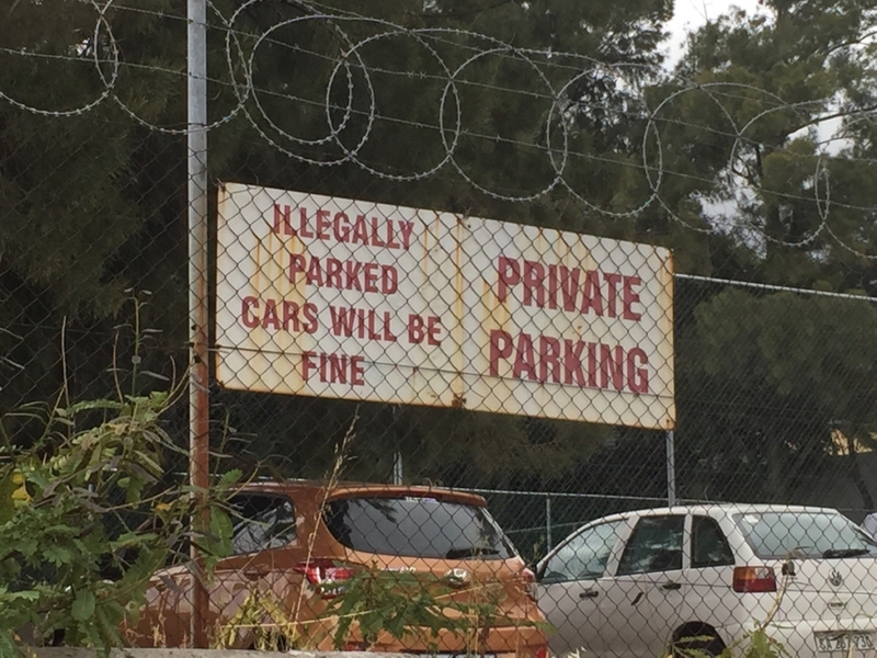
Although we must say, we’re happy they didn’t catch that mistake because this is ‘laughing out loud’ material. And it’s nice to know that even the illegally parked cars will be fine!
Poles Are for Your Safety
Hold the pole, not our attention! Here, the makers of this subway sign made it very known that there is to be no practicing dance of any kind on the poles of this moving vehicle. The message is clear: a subway car is not the place to put on a show.
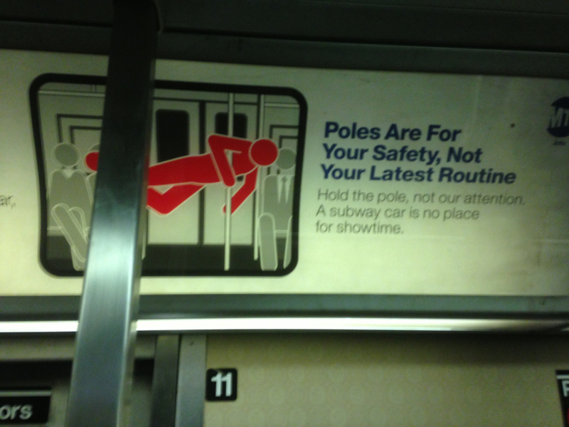
An effort ignited to target unruly, discourteous behavior or trains and buses in the Big Apple, signs like the above are intended to serve as a reminder of proper rider etiquette when on the subway.
Come Join the Fun!
Who knew cemeteries could be fun? When this church decided to advertise its summer camp, it didn’t think twice when it came to its ad placement. Or maybe their idea of fun involves being buried 6 feet under?
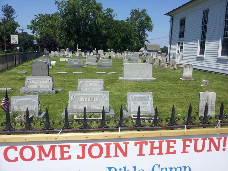
Obviously, not many parents would sign their kids up at this summer camp, no matter how desperate they were to get some peace and quiet around the house!
The Untrained Eye
We want to give all the people who were involved in designing this grace, but it’s very hard to do so when trains and ships look nothing alike.
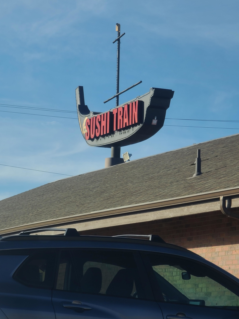
Even the untrained eye (pun intended) should be able to tell the difference between these two means of transportation, one has wheels and is used on the ground and the other is used for sailing at sea… Do we really have to explain this?
If We Can’t, We Won’t!
We guess this is a good motto if you never want to get anywhere in life! Of course, this isn’t the company’s real slogan, because that wouldn’t be good for business but unfortunately, the placement can make for an embarrassing blunder.
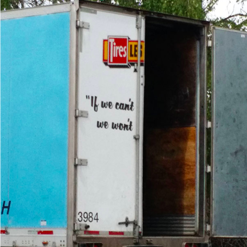
We wonder if this truck driver purposely left the door hanging open like this, just to get some laughs…
Les Miserables Vs. The Shining
Movie posters do a good job of capturing the real ‘feel’ of a movie. Is it a drama, or maybe it’s a comedy? At first glance, this regrettable position of Jack Nicholson’s face makes us wince with awkward delight.
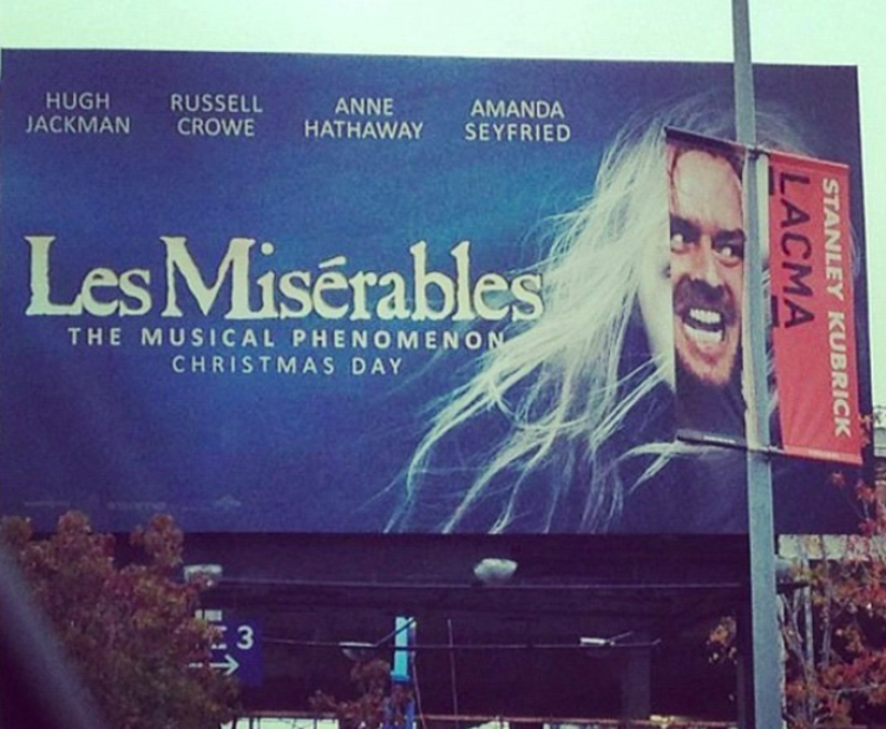
It’s a blend of terror and turmoil. Of course, this photograph was captured at the exact angle, which makes for some inappropriate humor that matches perfectly!
Knitwear and Socks
You know what they say, bad publicity is still publicity! So maybe this advertising ‘fail’ was on purpose? It sure makes you look twice, and you can’t help but smile at how silly it looks…
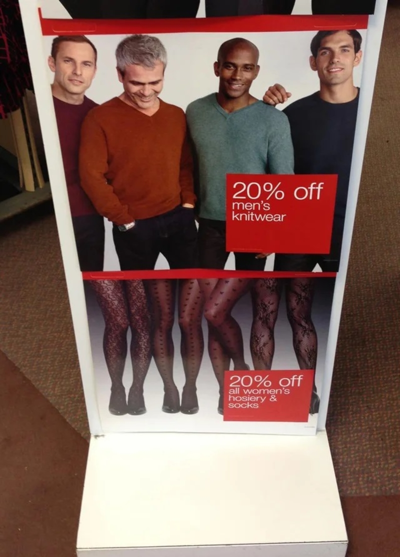
If they did this on purpose or not, it’s still quite funny! Now, where can we find those comfy sweaters? We’d like to pair them with some pantyhose.
Oh, Boy!
Now, this pop-up ad would be funny if it wasn’t so tragic! Google sure knows who to target when displaying ads. This one, however, may not have been at the exact right moment. Those who want to go on cruises typically don’t search for ships about to sink.
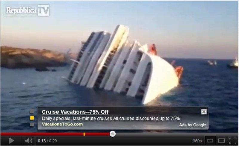
Luckily they captured this awkward yet hilarious screenshot of two very different cruise experiences.
Karma
John Lennon once sang that instant karma was going to get you, and he turned out to be more right than he could’ve known. For proof, behold these signs placed right beside one another.
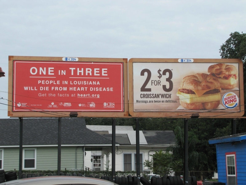
Eating a ‘croissanwich’ at Burger King might make your morning twice as delicious, but is it worth it? Just ask the people in charge of the sign to the left.
For Real?
It’s every advertiser’s dream to create an ad that gets plastered all over the internet, but that also depends on if your audience can actually see the ad. Whoever made this ad might want to learn a little about their audience.
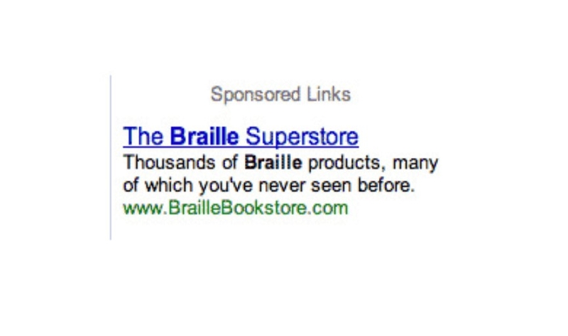
We’re sure this Braille bookstore has some amazing stock, but they might want to rethink their selected medium when it comes to marketing.
Long Yellow Things
These long yellow things were once so prolific they were called bananas, but things have changed, and with it, society has forgotten how to correctly pronounce their name. Say it with us, “BA-NA-NA.”
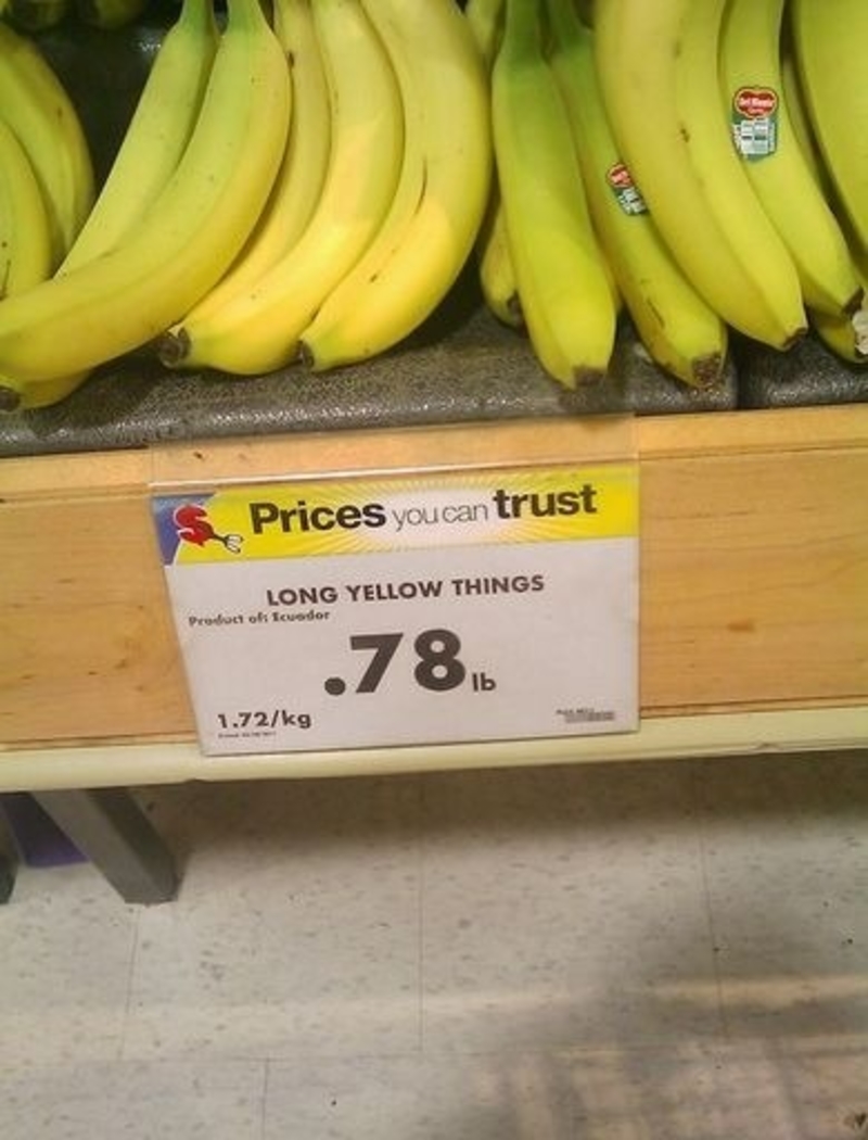
These long curved fruits grow in clusters and have soft pulpy flesh with yellow skin when ripe. They are tropical in origin and were considered a tasty, healthy snack back in the day, but now they’re only known as ‘long yellow things.’
Where Do We Sign-Up?
For many, it can take years and years before they get their first experience with osteoporosis. Often, it comes from a lifelong lack of calcium. Now that sounds like a lot of work and dedication, especially if you like dairy.
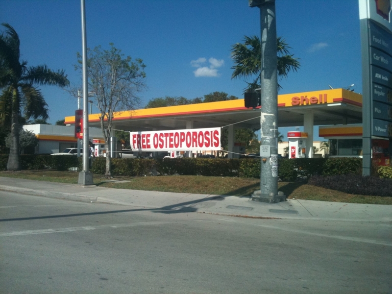
But who has time for that? Why would you go through that when you can get it right here for free?
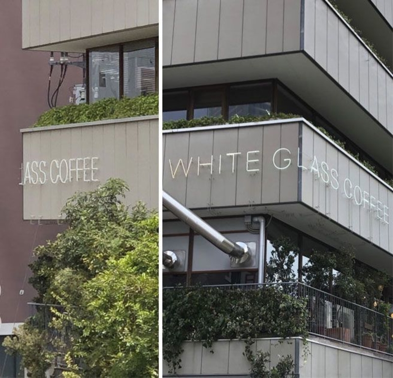
Keep Off the Glass!
It might not be the smartest thing in the world to place an ad with the word “break” behind actual glass. Someone took the message from this ad a little too literally and decided it was time to break some glass and cause a real mess — a real ‘glass’ act if you ask us!
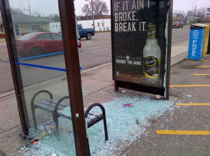
At this rate, advertisers should be very careful what they post on their signage; there might be some ‘glass’ warfare next time.
Proud American
America can no longer hide behind the facade it once had of being a land of the free and the home of the brave. America is now known for being incredibly discriminatory and controversial. If not, these two adverts below wouldn’t seem so compelling.
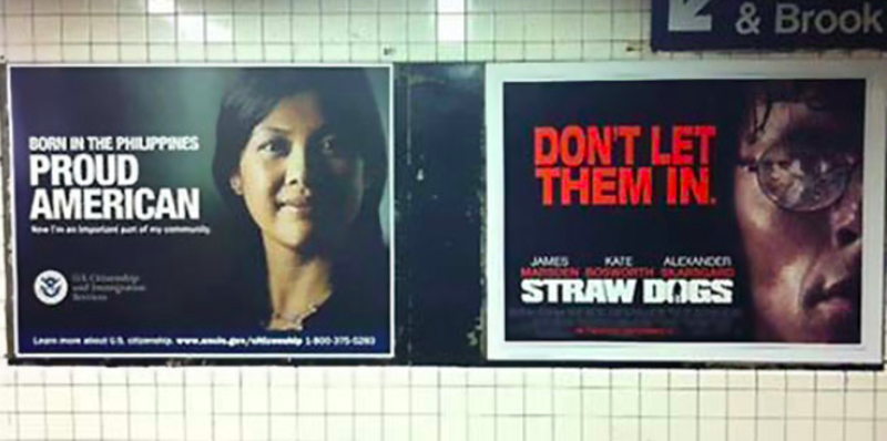
It would seem that discrimination in the twenty-first century in the United States is something quite ugly; hopefully, Americans can right their wrongs and be proud of something more worthy.
Vintage Ads
Ahh, the good old days when children were silent, women stayed in the kitchen, and the best things in life were wrapped in cellophane.
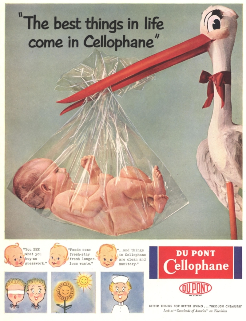
To be fair, this is an incredibly old ad. Back then, they didn’t know the dangers we know today. Ignorance certainly is bliss when nothing is dangerous, and you can trust everything you read. You know, just like we do with Instagram infographics.
People Are Eating Children
What were they thinking when they put the word children there? Apparently, what whoever designed this sign meant to say is that there are both people eating and children in this area, which is why it’s important to put a leash on your dog and clean up after it.
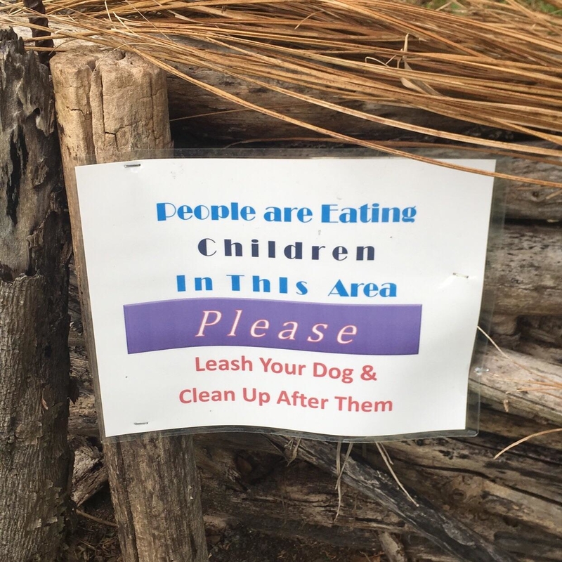
But from looking at the sign, you’d think that people are eating children in that area. This design fail is sure to make you break a smile.
McDonald’s
Oh, Macky D’s, America’s go-to when it comes to cheap, fast, and astonishingly disappointing food, finally they’ve put up a slogan with a more accurate meaning to it. We’ll venture a guess and say that this must be the work of a clever vandal.
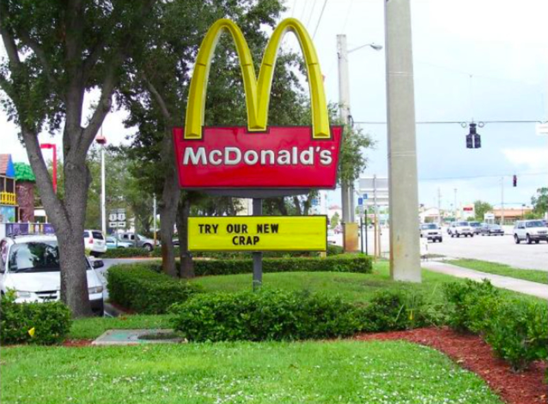
Sure, there are many who savor their McDonald’s meals, but that’s only because they grew up with it, and there is something very comforting about familiar food.
Oh, Dear!
This poor man’s face says it all. We’re slightly shocked yet very amused that this ad made it through quality control! The two ladies sitting next to him seem all too oblivious to his clearly uncomfortable expression.
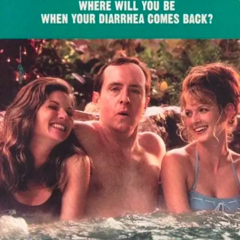
Luckily, this is only an advert and not real life! Can you imagine anything worse than having to go through this? The horror!
Thanks for the Reminder
What a downer of an advert… Yes, we know we won’t be able to afford to retire in today’s economic climate, but why use this bleak prospect to try to sell us some expensive, bulky boots?
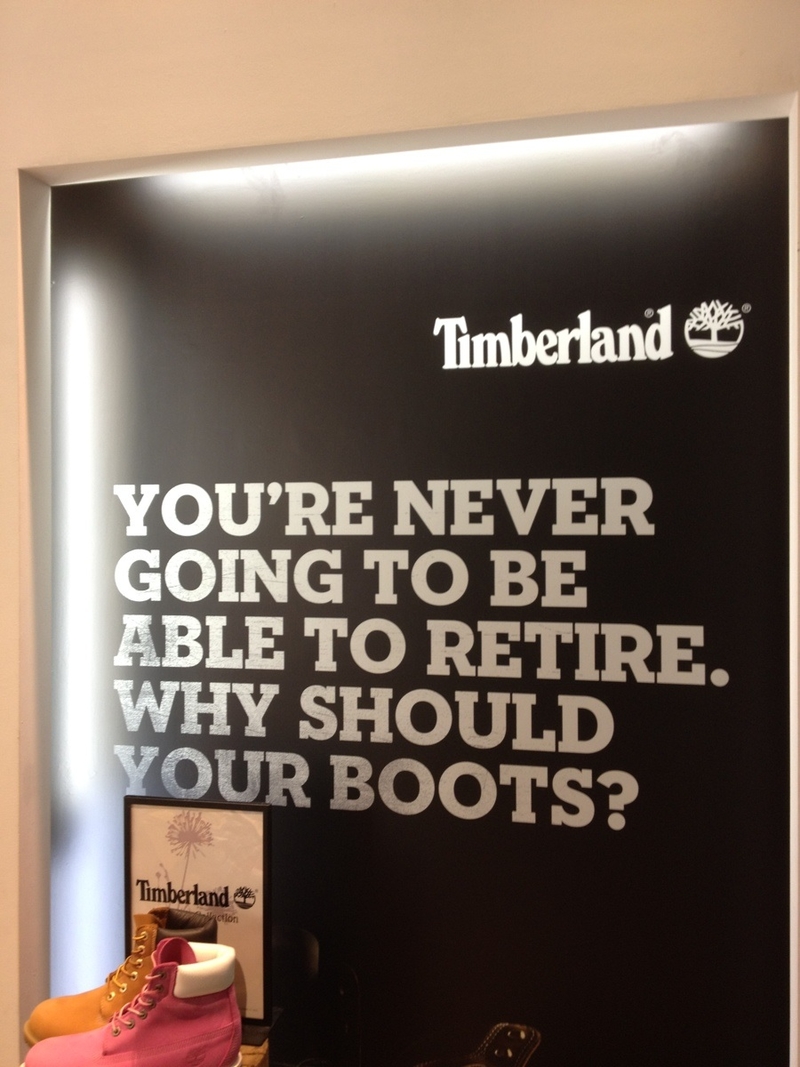
With such a disheartening message, we wouldn’t be surprised if Timberland doesn’t do so well. Good luck depressing your clientele into buying your overpriced shoes!
Take Easy
If you’re looking at this sign and thinking you have no idea what it’s trying to tell you, you’re not alone. We think they were going for “take it easy” but ended up taking it so easy and putting so little effort into it that they came up with “take easy it.”
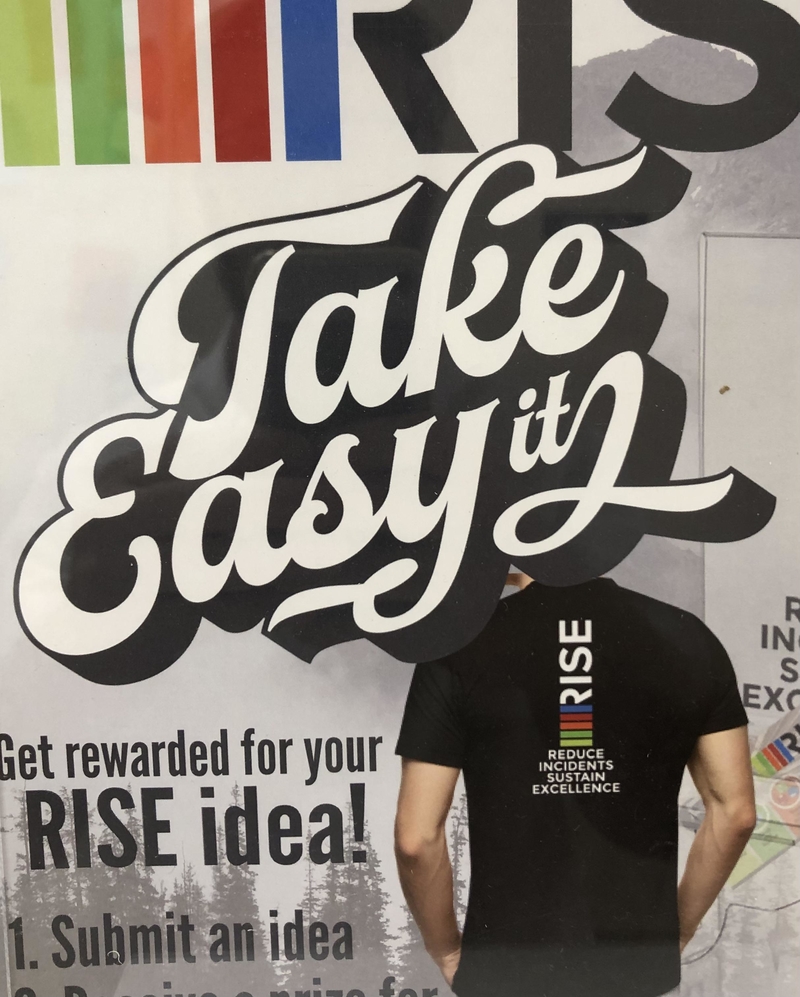
We wish someone would just tell designers typography can be hard to pull off, which is actually why we shouldn’t take it easy at all.
Good Job Rhyming
At least Jay Oreman doesn’t take himself too seriously; that’s always a nice quality in a man! Especially as his billboards must be plastered all over town, advertising his services as a realtor.
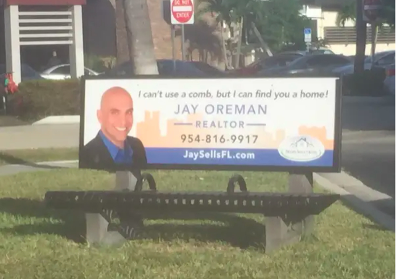
And just for being such a good sport, we’d give Jay a call. If we need to find a home, that is. For our combing needs, we’ll try someone else.
An Absolute Fail
Whoever was in charge of this must have thought that this is a great idea. We’ll just put the word ‘absolute’ on a dress and let a model wear it; what could possibly go wrong? Oh, so much could go wrong, so much!
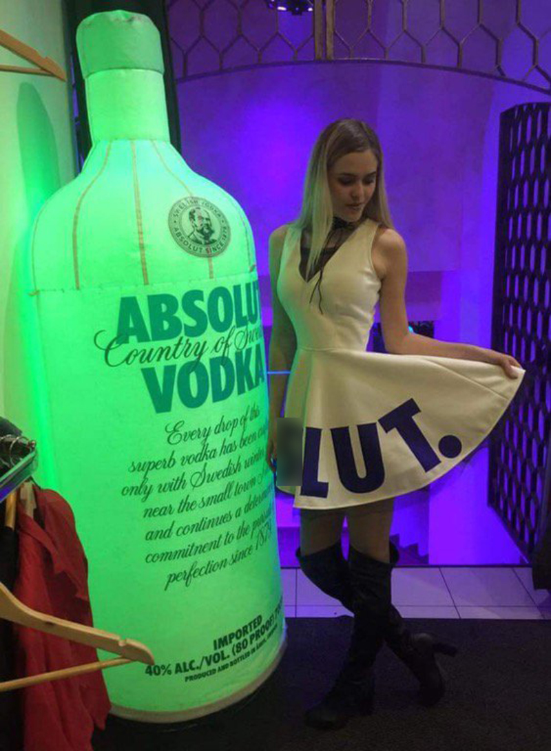
In this case, the problem is that at a certain angle, with some letters hidden, the word absolute can suddenly spell an improper term used to describe women.
The Grinch
Besides being a Christmas favorite, the Grinch is also one of our favorite characters we grew up with. This advert was done in incredibly bad taste, and we’re sorry to see the Grinch’s portrait used like this!
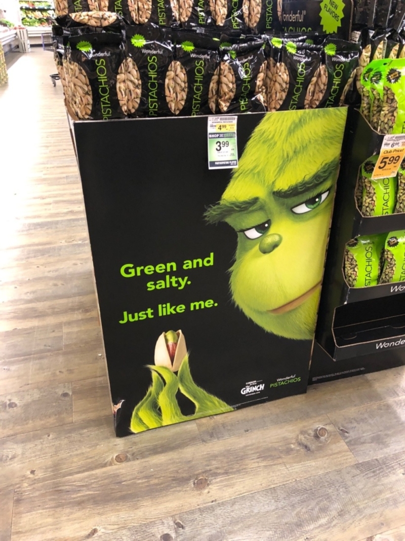
In real life, the Grinch would never agree to have his face used in adverts like this to promote some corporation’s greedy agenda! The Grinch may be grouchy, but he does have standards and prides himself on being anti-establishment.
Starbucks
As much as we love Starbucks, we can’t help but enjoy this advertising faux pas. It’s nice to know they also make mistakes even if they are a multinational chain of coffeehouses and roastery reserves and the world’s largest coffeehouse chain.
If only their Baristas could try a little harder when writing down our names when taking our orders, they’d be perfect. Is that too much to ask?
Why Even Bother?
This is a multi-leveled design failure. First and foremost, whoever it was that designed this building thought that it made sense to create this tiny yet lengthy window.
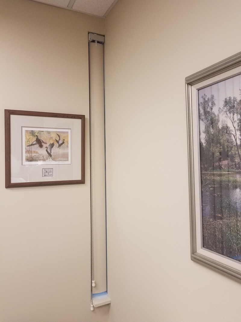
That in itself makes no sense. But the shenanigans continued when someone decide to put blinds on the window. Oh, did we say blinds? We meant one blind — singular… Yes, we’re just as shocked and speechless as you are.
Do What Now?
It’s all fun and games till someone gets skewered! We’re all for puns, but maybe you shouldn’t give folks ideas on how to treat their dates after dinner.
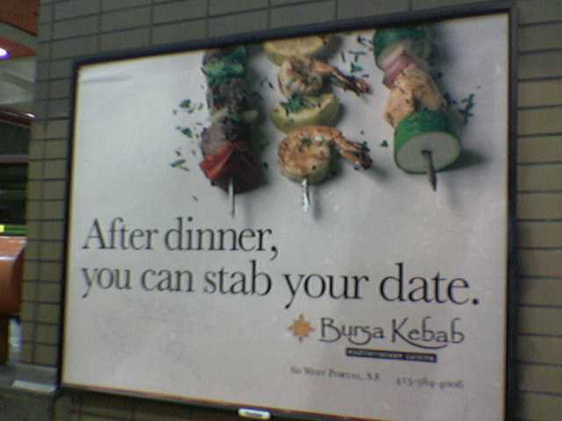
Mainly because their meals have skewers in them! It might be too tempting, especially if the date didn’t go too well. The combination of food and weapon placed on the same table is something we’re still trying to wrap our heads around.
Now That Sounds Like Good Advice
Reebok, nooooooooo. Why would they want to promote this kind of behavior? Not only will it alienate all the decent people in their audience, but it will give them a very, very bad reputation.
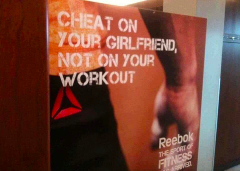
In today’s political and progressive climate, this kind of marketing would simply not fly… We’d prefer Adidas. Or anything else that doesn’t encourage infidelity, thank you very much!
Sadly, I’m Happy
Surveys are important because they help companies and places know what customers actually think. But, in order to truly get that information, it’s important to create a survey that’s clear and easy to answer, not one that sends mixed signals.
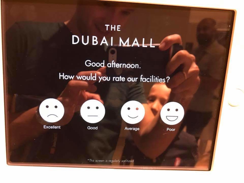
We really hope someone noticed and fixed this; otherwise, the Dubai mall will not going get any clear or real results as to how people actually feel about it.
That’s Just Cruel
Spending a night at a hotel can be difficult for some, especially for those of us who enjoy their home comforts and like to know exactly where everything is and what each switch does. This is why hotels should always opt for the simplest, most obvious designs.

But, alas, someone here thought they should hide the light switch behind the pillow. Is this some kind of sick joke by a designer who enjoys seeing people waking up from accidentally flipping the switch in their sleep?
Cash or Credit?
Want to pay for your parking using cash? Well, good luck finding the right machine for it. If you thought the sign over the machines will help you determine which one to use, you thought wrong.
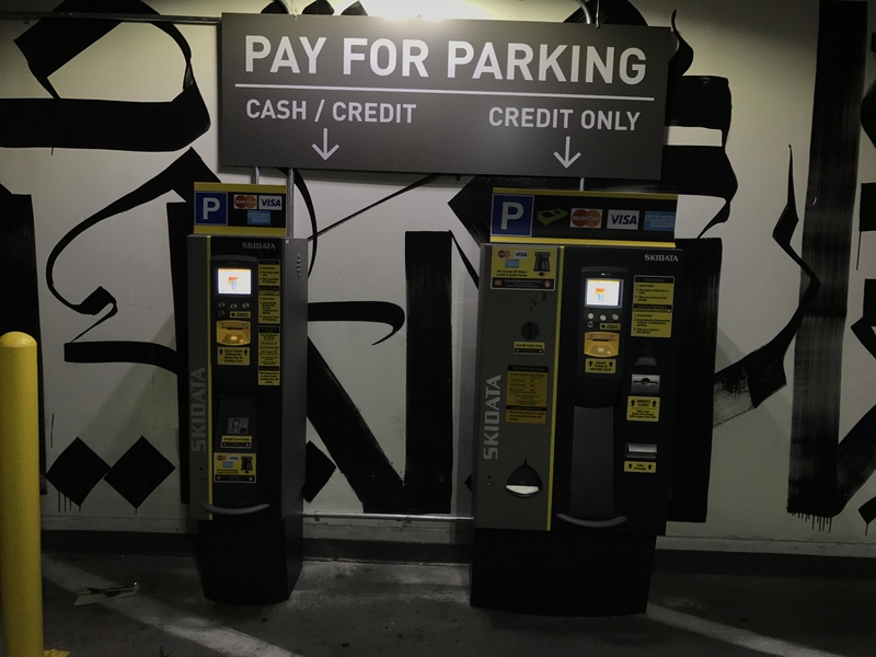
Unlike what the sign says, trying to feed actual cash into the machine on the left will be one tough job as it only has a credit card slot.
They Did Not Understand the Assignment
You could either rage at the insensitivity or laugh at the absurdity. Either way, someone took the term differently abled a little too literally here. Or this might be the classic case of firing the intern. No hope exists for a world that can’t even get the fundamentals such as inclusive toilets right.
This could, however, be an apt sign for the times we live in — bare minimums, all bluster, and little to no thought.
Challenge Accepted!
On the surface, this does not appear to be a massive safety hazard. The slides seem slow and small enough to prevent accidents. But it’s still tempting fate, even though the pole seems thoughtfully padded.
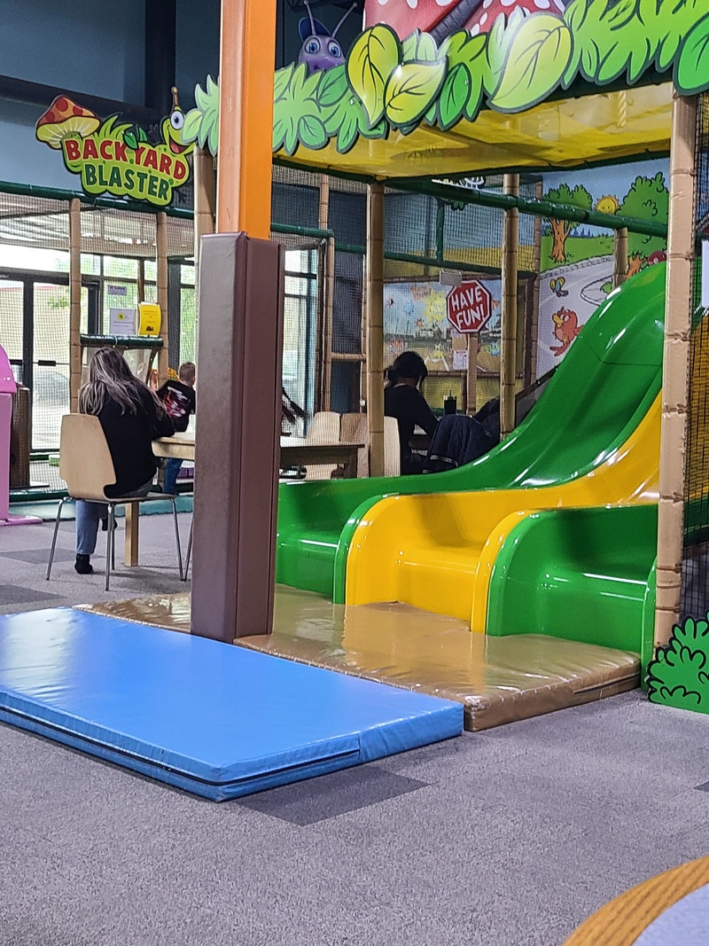
Whoever designed this has overlooked a crucial aspect – kids. Never underestimate the scale at which things can go wrong when kids hurtle down a slide. The chances of getting hurt on this slide might be low, but never a zero.
Find Us if You Can
Cryptic signs are excellent if you’re on a treasure hunt or on a quest to uncover secret societies. Office buildings? Not so much. The folks at Intermezzo (we think that’s what it says) might be testing visitors’ intelligence or don’t want you to find them.
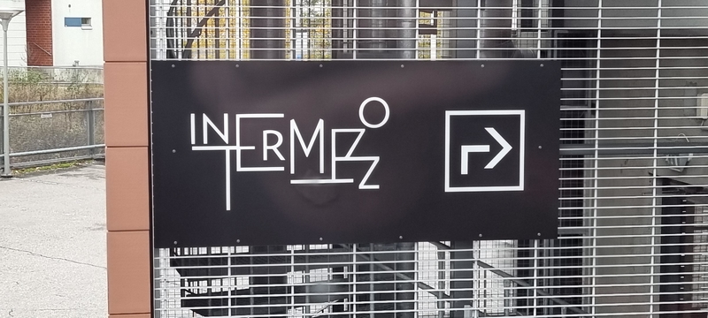
Color us intrigued! Still, something tells us this might be a clever stick drawing for a toilet. The joke is on all of us, any which way.
Because Life Is Upside Down
Someone somewhere in the Southern Hemisphere can probably read this sign — that is the hope, at least. Maybe this isn’t an apartment for humans. Surely, the sign is meant for bats, sick of upside-down cave dwellings and looking for a perfect new home.

For the rest of us, there is always neck pain. We live in a topsy-turvy world, after all. Design errors happen all the time. What happened to basic quality checks?
To Do or Not to Do
Signs sure aren’t what they used to be. Remember the good old days when they did what they were supposed to — offer clarity? This one exists to stop us in our tracks and make life a little more surreal.
Who knew going about your day could suddenly turn into a mini existential crisis? Do we take a step forward and risk it? Or turn around and look for an exit? More than one maddening way to find out.
Calling Beautiful Minds That Love a Challenge
That feeling when locating an apartment (presumably) is like solving a math problem. Is it a complex equation, an IP address, or a secret code? Nobody knows. We hope the residents have it figured out by now. It must have been a particularly dull day when someone came up with this.
Why be basic and make things simple and usable? There is no fun in that. Having visitors drop by must be wild for people who live here.
Where’s the Lie?
Accidental design flaw or a tongue-in-cheek message? Whether unintentional or otherwise, you have to admit “hell baby” is all kinds of hilarious. Babies look and behave like angels, but everyone knows they can be little hell-raisers.
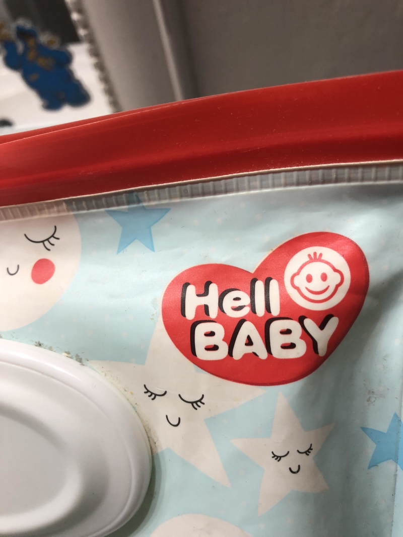
Parents (especially new ones) walk the fine line between “hello” and “hell” every day. Perhaps this brand could consider adding devil-inspired onesies and other baby accessories too. Now that’s what you call a business idea.
Feels Like SummOr
This innocuous display manages to offend designers and language warriors in one fell swoop. The glaring spelling error is inexcusable. How someone managed to butcher the spelling of “summer” and miss it completely is beyond us.
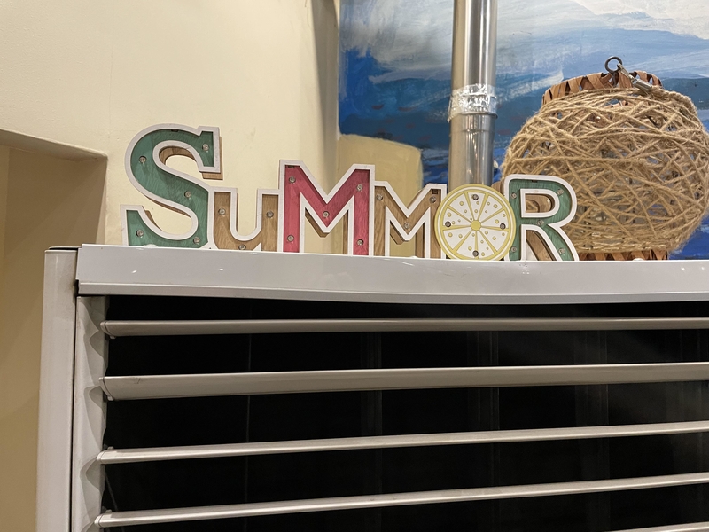
Regarding design, if only they had opted for half a slice of lemon to resemble an “e.” That small change could have fixed everything. For now, it looks like we’re in for a long summer.
These Folks Keep an Open House
Here we have a porch with beautiful shutters that serve no purpose — aesthetically on point, an epic failure functionality-wise. The shutters appear to be fulfilling only half their potential, neither opening nor shutting completely. Which of these came first — the porch or the shutters?
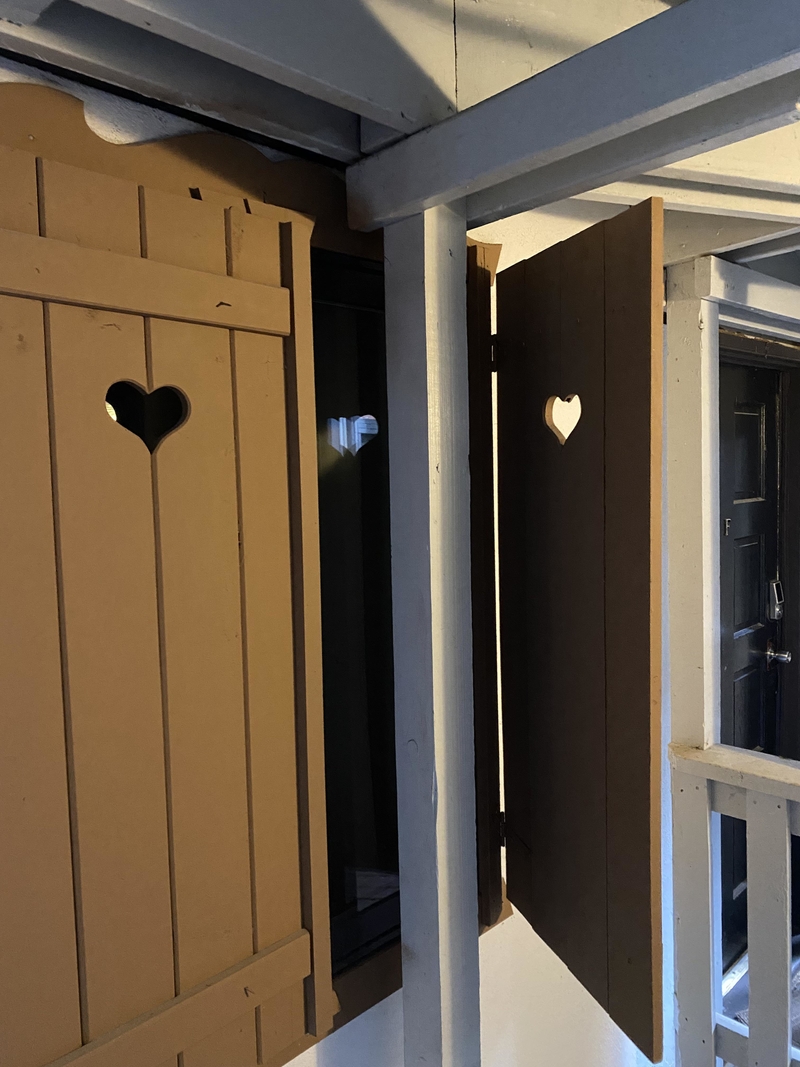
This might be a quirky landlord’s doing or an architect that woke up on the wrong side of the bed. Idiotic riddles for terrible designs.
Ha! Made You Look!
The oldest trick in the book — cutting off the eyes and mouth from a picture, where the attempt is usually to shock, terrify, or amuse. Does this sign achieve any of it? The jury’s out on that one.
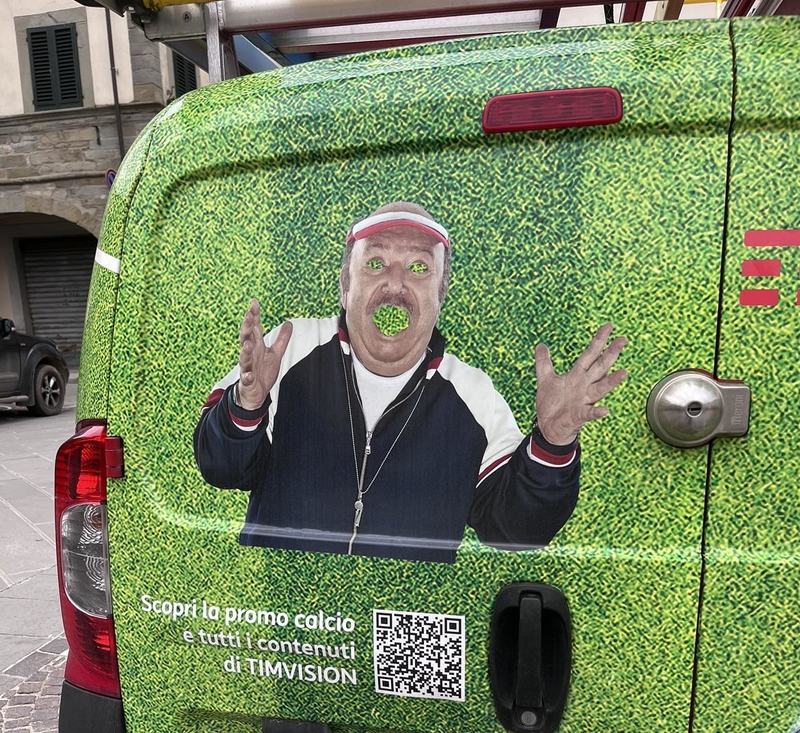
For a marketing gimmick, this is somewhat juvenile and appears to be a prank. We hope it is, for the company’s sake. Or, let us call it as we see it — a half-baked attempt to gain traction.
In Case You Didn’t Know, Volleyball Needs Arm Power
Larger than life and infinitely terrifying, this image is somewhat strange. Not something you want to see while wandering the dimly lit halls of a cruise ship. Look, we are all for artistic license and expression. We applaud every artist’s distinct or unusual style.
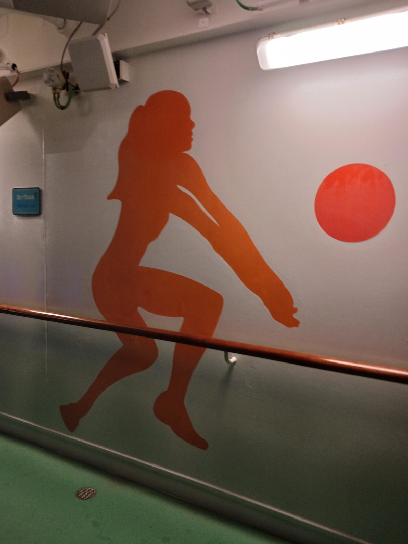
This, however, does not inspire and is most certainly an amateur’s doing; someone who loves volleyball but should probably stick to playing the sport instead of painting murals around it.
Yabba Dabba Doo!
The yearbook committee dropped the ball on this one. First, there is the terrible pink font on grey background. Second, the nonsensical, incoherent, and loopy little quote.
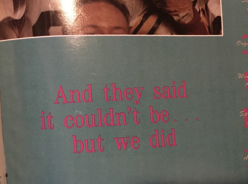
People were either too thrilled about another year ending or could not care less. This yearbook gives us serious “let’s just get on with it” vibes. We get it, though. Life really can be that way sometimes.
Hieroglyphics for the Digital Age
Is anyone else confused? It looks like this sign reads, “get paid to draw a burger.” Thank goodness for the bottom text summing up this sorry excuse for a hieroglyphic. Sometimes, it is alright to let the emojis be. Just use words to get the message across.
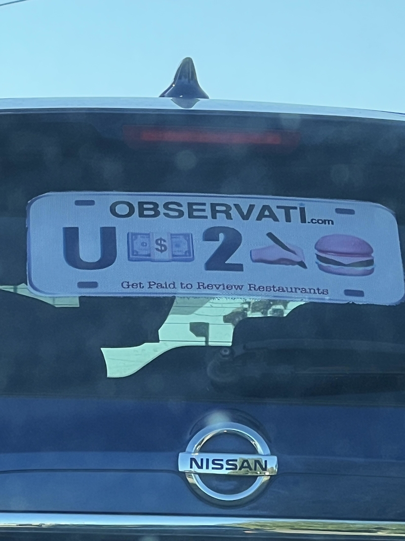
Let’s not forget the bizarre domain name. “Observati” sounds more like a silly cult than a business. This marketing collateral points to a business nobody would take seriously.
If the QR Code Fits
This poster in Brazil reads, “Get your water purifier here through the QR Code with a special discount.” Judging by the sign, the company seems reluctant to offer discounts. Sure, they did their bit by putting it out there, but only a lucky few customers can probably avail of the discount.
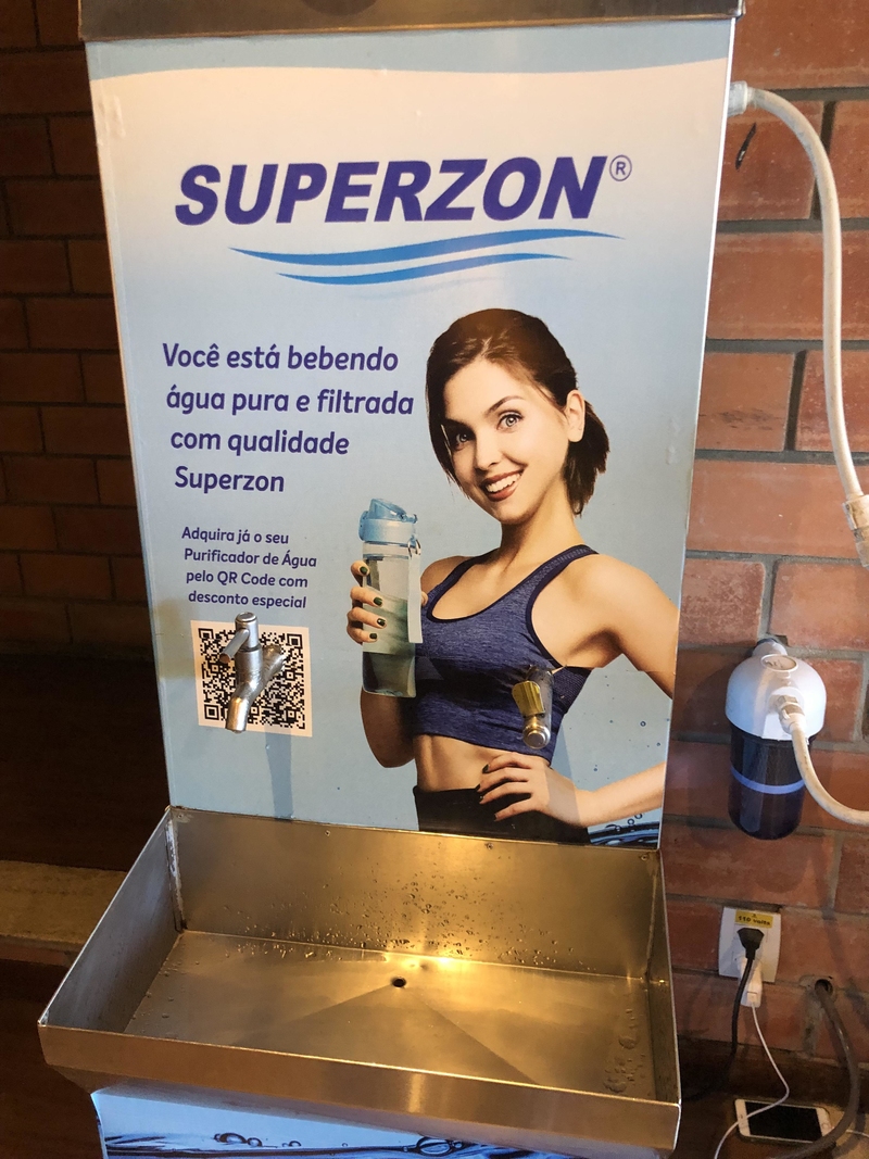
Water spouts on the QR code are just one of the problems. Check out the terrible photoshop! It is enough to make customers run miles away.
The Thing About Size and Whether It Matters
It is easy to see why this could be confusing. How is the XL bar longer than the XXL? Brace yourself for incoming jokes about girth and size. Jokes aside, though, most chocolate bar measurements typically indicate candy weight, not the size — which is why measurements on the wrapper and what we see can seem skewed.
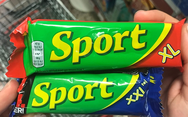
We know, right? They should put that on the wrapper so customers don’t feel cheated.
Complex Breath Work
The message might be missing an “it” after “breathe.” Even with the correct grammar, this quote remains vague — from the mysterious “it” we breathe to the depletion of love from our systems. It sounds like a lot of complicated inner work, and most of us aren’t ready for it.
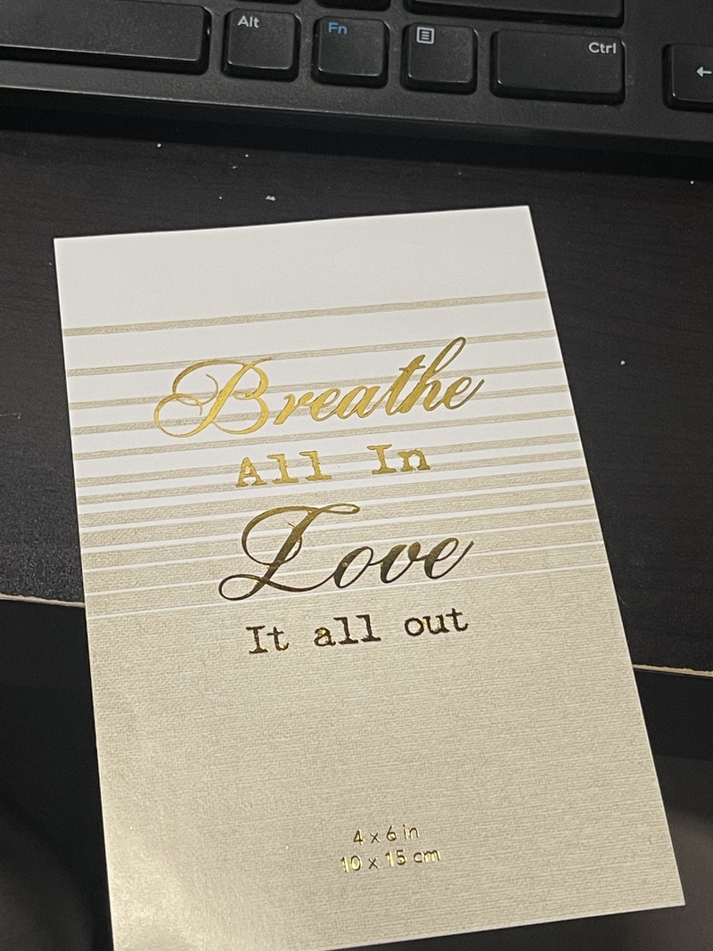
The quote might work better for a yoga/meditation studio or a dragon having a bad day. For a generic greeting card, this is trying too hard.
Why Are Good Bike Racks So Hard to Find?
This bike rack design is so bad it could be a showcase of everything a bike rack should not be. Did a bike thief design this? The intentions behind this seem malicious, apart from being ineffective and ridiculous.
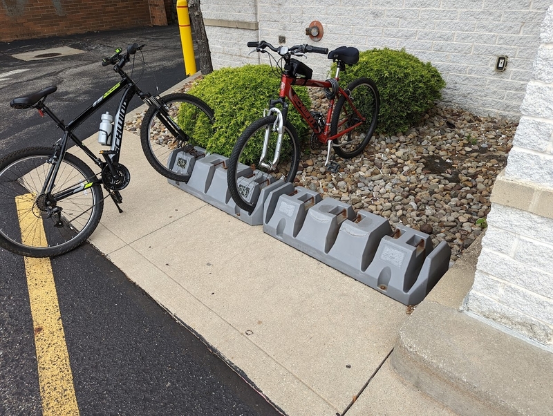
This plastic contraption cannot hold a bike upright or secure one with a U-lock. Thieves could easily lift the whole rack, as is, onto a truck and take off with the spoils. And in the event that some genius could, the sidewalk is too narrow to keep the wheels off the road.
As if Finding Parking Wasn’t Infuriating Enough
The sign probably means no parking during school hours unless you are there for school, in which case you have a two-hour limit. Also, there is no parking to the left of the sign and two-hour parking to the right.
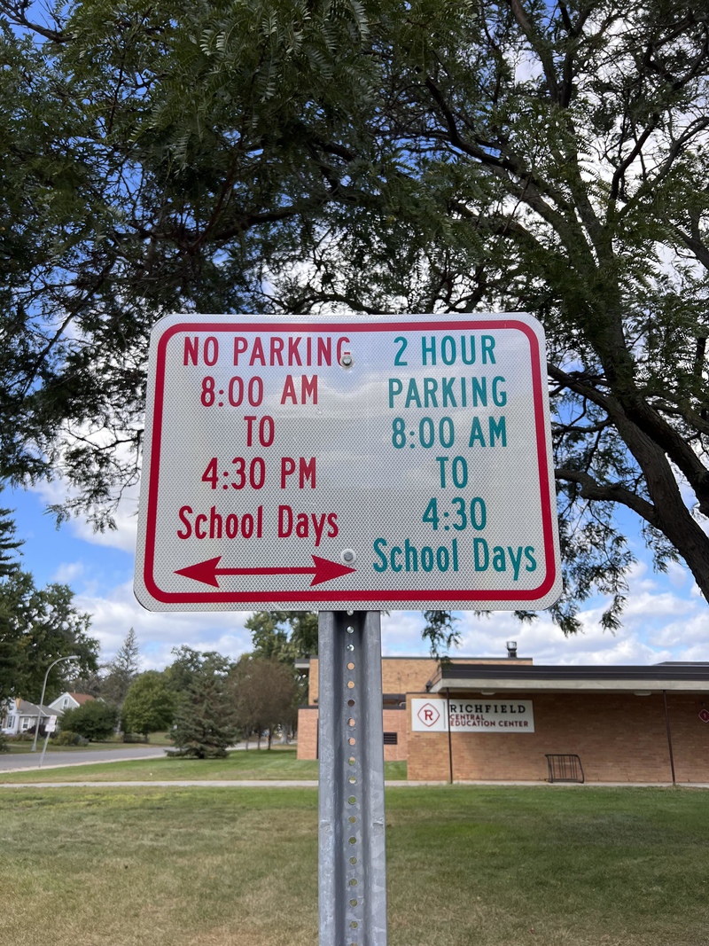
It is hard to understand it from the bad, bad signage. They could have made it easier by using arrows on each side rather than an arrow on one side that points both ways!
Not Soap, Radio
The soap might be “joy-inducing.” The pun is baffling. It turns out the joke is a reference to a 1950s social experiment. The prank usually had a teller and two listeners, one of whom, was already in on the joke. The teller of the joke says, “An elephant and a hippopotamus are bathing. ‘Please pass the soap,’ the elephant said to the hippo. ‘No soap, radio,’ said the hippo.”
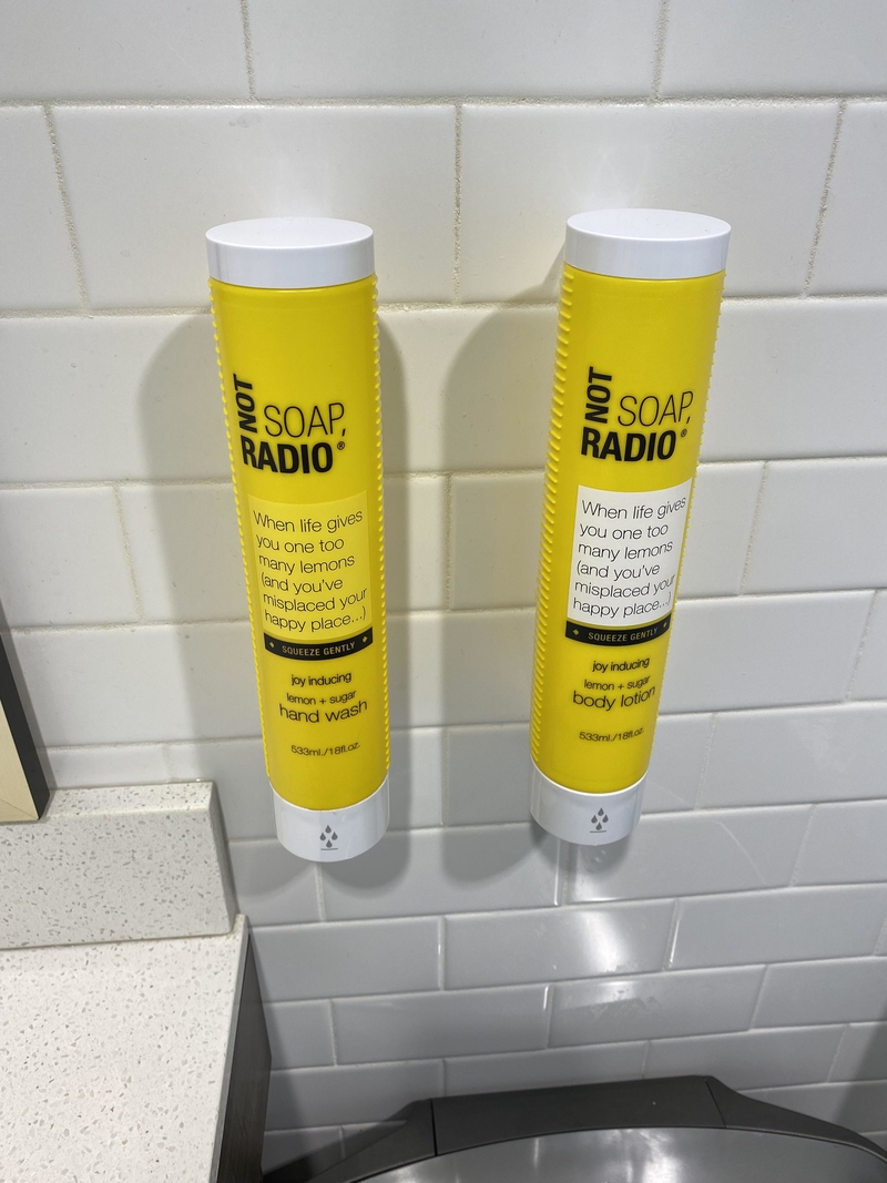
The accomplice laughs at the punchline, leaving the second listener perplexed. The listener pretends like they get it (demonstrating the social pressure to conform) or expresses confusion.
When Functionality Trumps Design
It looks like a bad design, but the real aim is for the shoes to absorb shock and pressure. One wishes the shoes were prettier, but shock absorption isn’t pretty now, is it? The optics and design must reflect the gravity of the purpose.
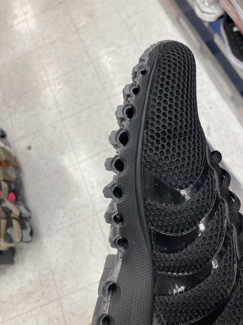
Admittedly, it does look like you can store several things inside the holes. Think accumulated mud, gravel, and tiny stones. Or pens and bobby pins. One can never have enough of those.
Falling Slowly, All Eyes on Me
If you’re going to fall, you might as well do it in style. What doesn’t kill you should be discussion or Instagram-worthy, at the least. Not sure what the company was thinking while putting this up — an amusing billboard or advertising hook.
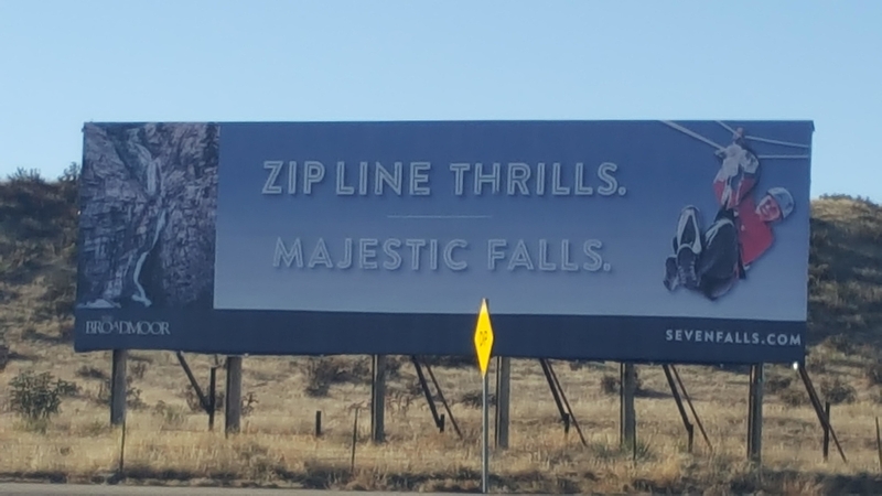
No matter how you look at it, the unfortunate wording is probably not great for business. The sign makes an excellent chuckle for those driving past. Whether people will sign up for falling majestically is up for debate.
Drink at Your Own Risk
Ah! Kid-flavored drinks — these are best served fresh and ideally without sugar. This drink contains a ton of zesty and (ahem!) unique ingredients. But you have no control over how the concoction will eventually turn out.
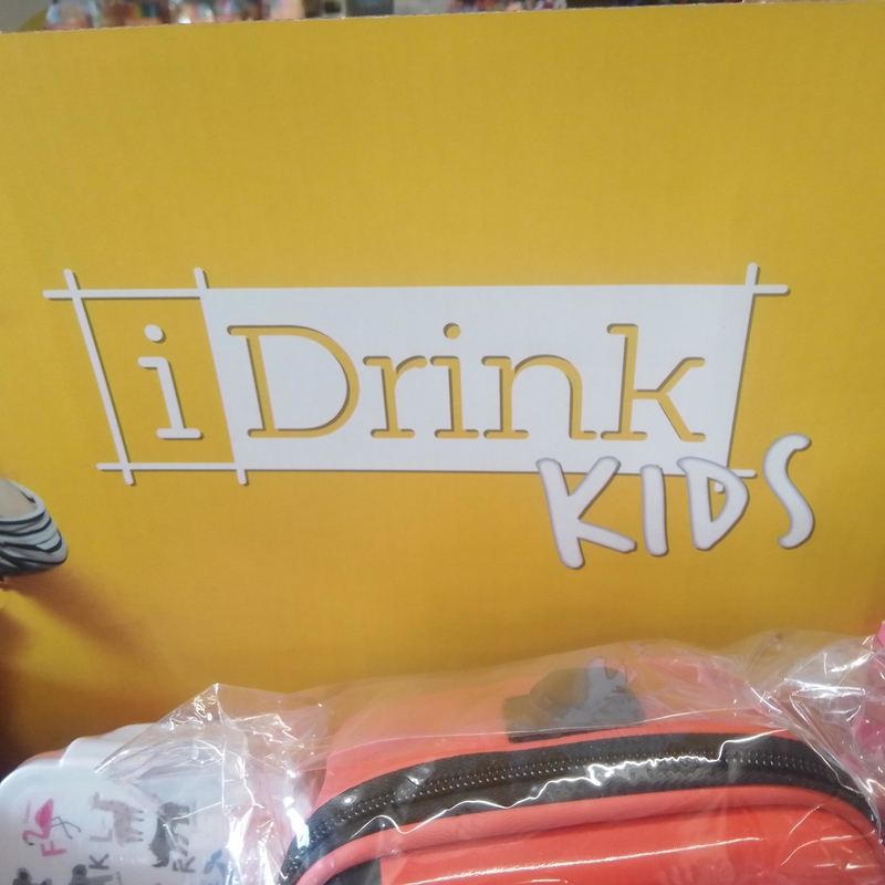
One might have a basic grasp of the concept and how to put the drink together. Ultimately, the key is winging it. The results? Nothing is quite as fulfilling and satisfying. The rewards are worth the effort.
Poké Bowl or Toilet Bowl?
This logo makes a case for running designs past multiple people. What looks like a cooking pot to some might look like a toilet to others. When you see it, you can’t unsee it. Is that supposed to be a fresh bowl of street food?
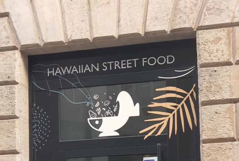
We can only see stale street food going down the can and a case of violent food poisoning. All in all, a decidedly unappetizing logo for a restaurant.
Who Lives Here, Pray Tell?
Either the people concerned ran out of money but needed to comply with building rules, or this is a terrible design due to poor interior plan coordination. That looks like a bathroom window, does it not?

If one were being whimsical, the upper floor could be home to pint-sized residents. A gnome, perhaps? Or maybe it’s a cat plotting world domination. This is the only explanation we will accept for a window that looks like an afterthought.
Excuse You, That’s Quite Enough Fibre for Today
For anyone looking for another reason to avoid eating vegetables, this is it. The sign on the van seems legit enough. We wouldn’t call this a marketing fail, more of a happy accident — a work of art designed to delight children and overgrown kids everywhere.
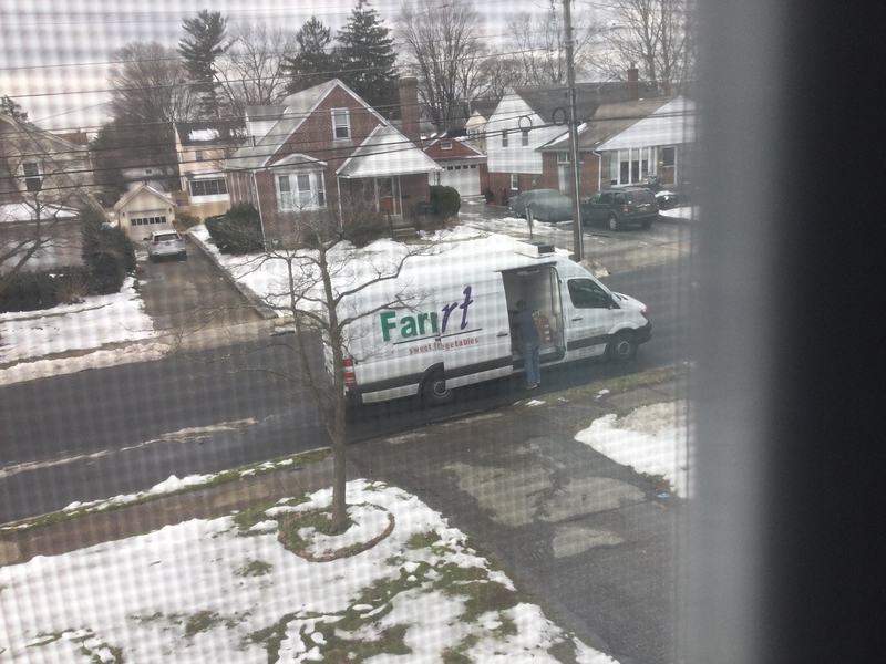
What did we tell you, mom? Vegetables do make us gassy. If you listen closely, you can almost hear the collective woop coming from vindicated teenagers everywhere!
Philosophy for the Inebriated
A notebook with motivational quotes? What’s not to love? This delightful pearl of wisdom sounds like stuff one would say in an emotional drunken stupor, with some slurring and swaying included. Not the most inspiring learning tool we have seen, this notebook won’t do for scribbling serious notes or great thoughts.
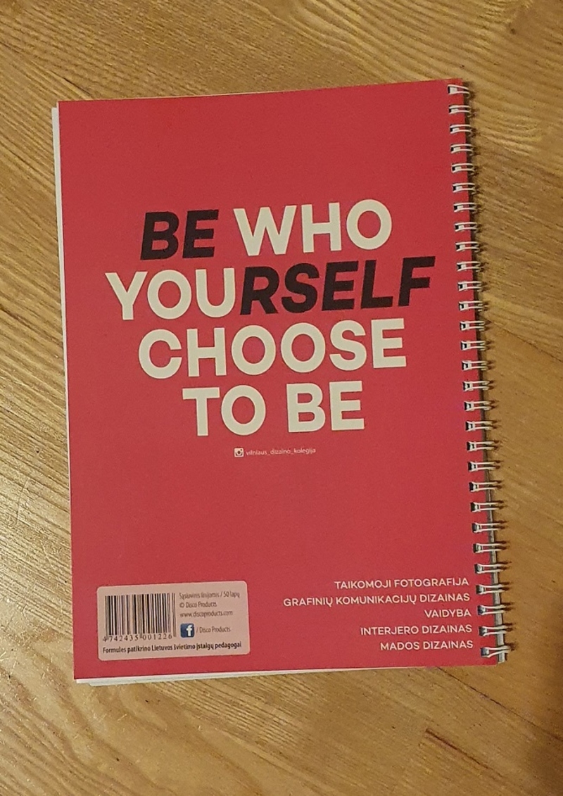
It might be better off as a journal — for times when life is confusing and blurry and takes the wind out of your sails.
Can You Smell What This Place Is Cooking?
Brown Breeze is an odd choice for a name. Imagine someone thinking this was a good idea and saying, “That’s it! That’s the name of my restaurant!” It must have been a particularly long day. To everyone else on the planet, this is a terrible name for a dining establishment.
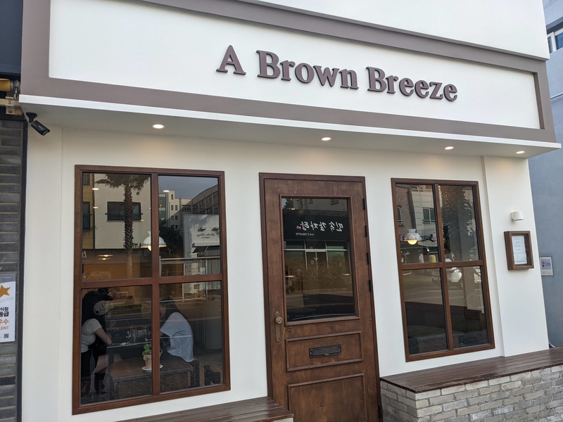
Brown Breeze instantly awakens the olfactory senses, triggering memories of every stench and stink in existence. You know it is time for a marketing revamp when a restaurant name reminds you of toilets and sewers.
The Sum of Our Broken Pieces
Only some mirrors can reflect our essence – broken and distorted into fragmented pieces! When Christina Aguilera sang, “When will my reflection show who I am inside?” this is probably not what she meant.
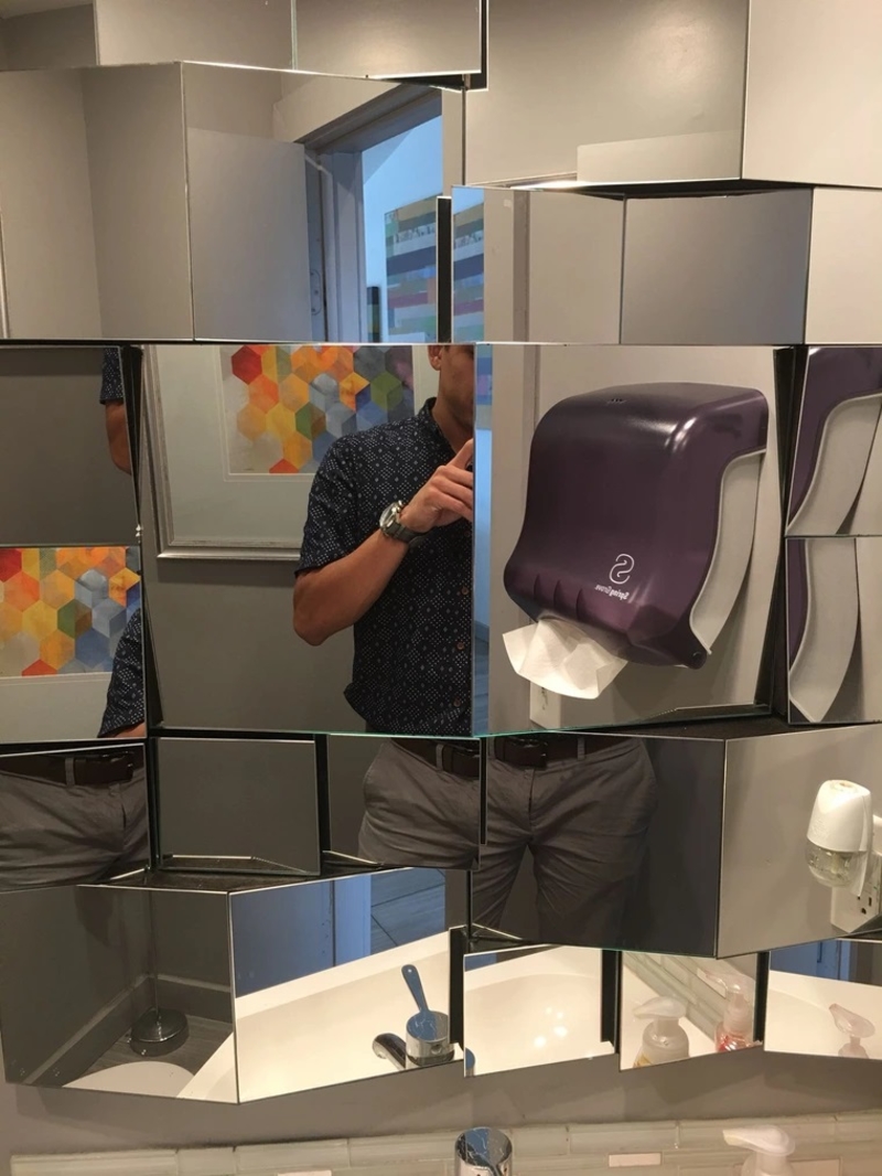
What happened here and why? Who is responsible? We may never know. This mirror design probably attempted to be avant-garde and missed the brief entirely. On the flip side, you get to take a closer look at all the pieces of you.
Non-Gluten Gluten
This menu item is it. It’s everything humanity wished to evolve into — having gluten while being gluten-free! Somehow, through bioengineering, alchemy, or sheer magic, someone in this establishment has managed to take high-gluten flour and use it to bake gluten-free bread.

Someone give this person a Nobel Prize or fire whoever is in charge of this atrocious design/editing making it to customers’ hands.

America’s Wealthiest: A State-by-State Look at the Nation’s Richest People

Top Hazardous Household Items for Dogs

Food and Nutrition: Kelp Noodles

Photos of the Vietnam War: The Real Story
The Greatest American Rock Bands: A Musical Trip Down Memory Lane
Here’s What Your Favorite Stars from Cheers Are up to Today
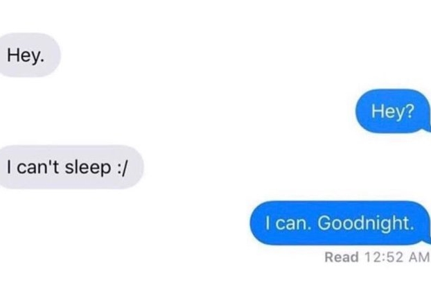
These Savagely Hilarious Texts Will Make Your Day

Honest Depictions of History’s Greatest Figures
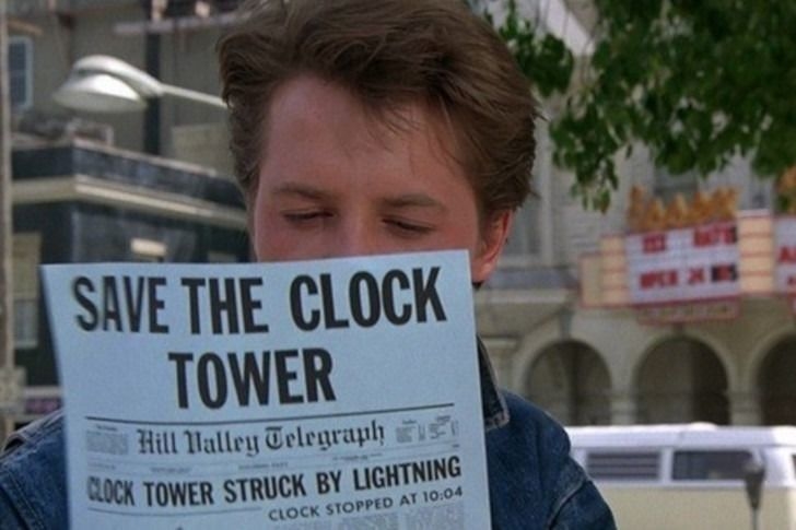
Let’s Go Back: Facts and Trivia From the Back to the Future Movies
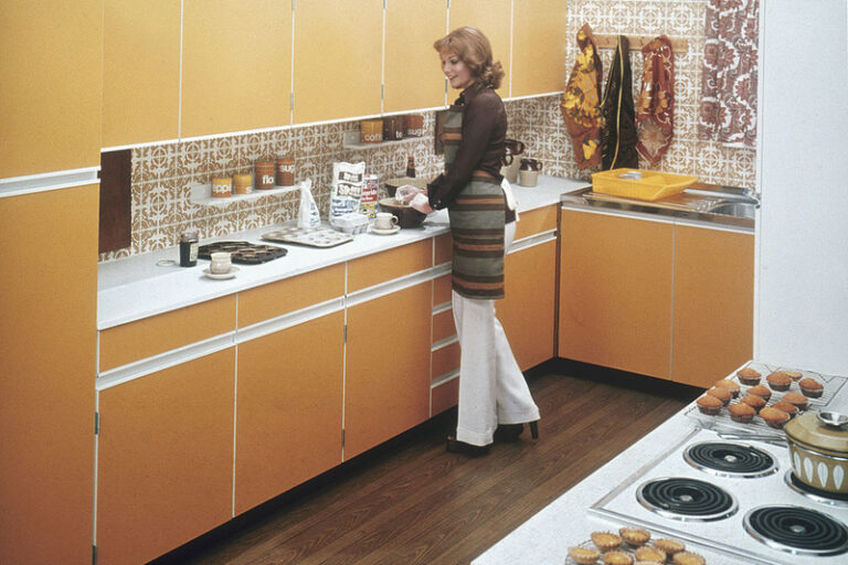
More Home Decor Trends That Should Stay In The Past